High-Contrast Display Serif

Gardenia + Vanielst Elegant Serif Display Stylistic
Pairs sculptural editorial warmth with Gardenia's clean modern geometry.
Inspect Vanielst Elegant Serif Display Stylistic specimenDisclosure: MakerFileHub may earn a commission from qualifying purchases via paid links on this page. How our links work.
Distressed angular capitals with chamfered bowls and dense straight sides
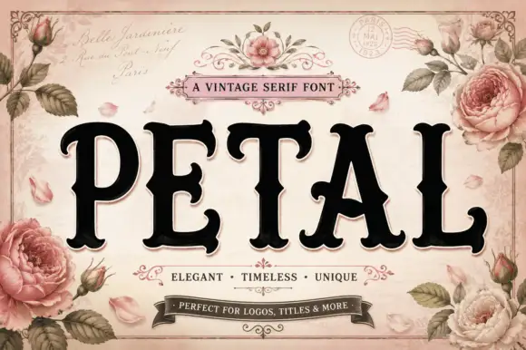
Gardenia is a distressed angular capital face in which the stems run dense and straight, the bowls chamfer at the corners, the E sets flat arms and pale specks break through the surfaces, so a title reads as an old apothecary label.
Paid link
Get this fontProject & layout blueprintsAt-a-glance maker compatibility
Fine grain and micro-texture excel in 300 DPI print, sublimation, and screen print rather than small vinyl weeding.
Visual anatomy & craft review
The G clips its bowl into straight sides, the R runs a heavy leg, the D chamfers two corners and the A keeps a narrow opening, while scratches and specks scatter across the strokes rather than clustering at the edges. The chamfer is the character: it keeps a heavy block from looking mechanical, which is why the sample sets one title inside an ornate botanical frame. Because the wear is fine, the face wants 34 pt before the specks read as ageing and not as print dirt, and it is best printed rather than cut small in vinyl. The frame, flowers and ribbon are artwork; the black capitals are the face.
Apothecary · Chamfered · Worn
Two-font hierarchy recipes
Tested contrast partners — pairing Gardenia with grounded secondary typography.
Gardenia + Vanielst Elegant Serif Display Stylistic
Pairs sculptural editorial warmth with Gardenia's clean modern geometry.
Inspect Vanielst Elegant Serif Display Stylistic specimen
Gardenia + Hello Honey
Introduces organic movement on pull-quotes, signatures and gift tags.
Inspect Hello Honey specimenPractical applications
Concrete hierarchy, scale and production guidance tailored to Gardenia’s stroke geometry.
The apothecary tone suits a product label, and the dense stems stay solid at 20 pt on a 60 mm paper label printed in one ink on uncoated stock.
Hierarchy & layout recipe
Print a 60 by 40 mm label: set the brand name at 20 pt, set the botanical note in an 8 pt serif beneath, and keep 5 mm of border so the chamfered corners stay whole.
Pre-production check
Fine specks printed at 14 pt read as a dirty plate; check the proof and keep the name at 18 pt or above.
The worn capitals read at a market distance, and the straight sides hold a two-word title at 60 mm on a painted board in one colour.
Hierarchy & layout recipe
Paint a 600 by 250 mm board: set the title at 60 mm, keep 22 mm of border all round so the chamfers are not trimmed, and set the prices in a 14 mm caps beneath.
Pre-production check
Scratches painted over a frame edge look like damage; check the mounted sign and keep 20 mm of margin.
The old-world weight suits a folklore poster, and the dense forms hold a title at 70 pt across a printed sheet in two inks.
Hierarchy & layout recipe
Print an A2 poster: set the title at 70 pt on the upper half, set the time and place at 16 pt in a serif in the lower third, and keep 28 mm of border all round the poster.
Pre-production check
A heavy block printed over a textured ground loses its outline; check the proof and keep the title on a plain band.
Technical & licence verification
Confirm included OTF/TTF/WOFF formats, full glyph tables and licence coverage on the live store page before batch production.
Closest visual alternatives
Matched across letterform anatomy, stroke behaviour and craft applications.

Tall distressed vintage capitals with speckled edges and tight fit
Modern Vintage is a tall capital alphabet with a distressed print texture, tight letterfit and vertical proportions, so a word reads as letterpress that has been used a hundred times.
Ideas for this font
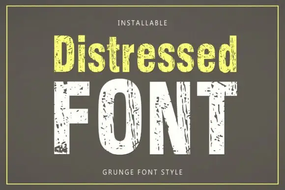
Tall condensed sans with chipped, distressed texture
Distressed is a tall condensed sans whose strokes are eaten away by irregular chips, so the letters look printed, worn and flaked rather than cleanly drawn.
Ideas for this font
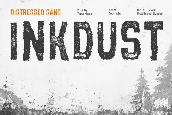
Narrow distressed capitals with broken interiors and ragged edges
Inkdust is a narrow distressed sans in which the stems stay tall, the bowls stay simple and heavy erosion breaks the fill with white gaps and ragged edges, so a single name reads as paint worn off a shipping crate.
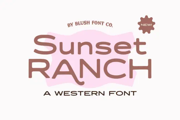
Wide rounded western sans
Sunset Ranch is a wide rounded sans in clay brown on white: mixed case with heavy rounded strokes, an unusually long curved leg on the capital A and open bowls, set in two lines over a torn pink shape, with a small arced line above, a sun badge at the corner and a tracked line beneath.
Same independent foundry
Allow optional Google Analytics to measure visits and catalogue actions. Your search words and notes are not included. Privacy & storage