Modern Grotesque Body

Honey Biscuit + Clyne Sans
Creates crisp high-hierarchy contrast beneath Honey Biscuit headlines across menus, websites and labels.
Inspect Clyne Sans specimenDisclosure: MakerFileHub may earn a commission from qualifying purchases via paid links on this page. How our links work.
Bold retro serif with heavy bracketed slabs and narrow counters
Honey Biscuit is a bold retro serif in which the bracketed slabs are heavy, the stems are fat and the counters pinch narrow, so a word reads like a printed biscuit tin rather than a book title.
Paid link
Get this fontProject & layout blueprintsAt-a-glance maker compatibility
Sturdy stroke walls and open counters weed cleanly on adhesive vinyl, HTV apparel film, and cut cardstock.
Visual anatomy & craft review
The capital H carries two heavy stems and a thick crossbar, the O closes a pinched counter, the N keeps a wide diagonal and the B holds two fat bowls, all with bracketed slabs that flare into the stems rather than sitting beside them. The contrast is moderate and the weight is uniformly heavy, which is what gives the face its packaging voice at display sizes. Counters are narrow, so the face closes up below 18 pt and should not be used for long text. Because the slabs are generous, the letterfit stays tight and a two-word line builds a solid block, which is how a biscuit or bakery brand gets shelf presence. The cream ground, the dark red ink, the scalloped panel, the decorative leaf marks and the small caption are presentation; the typeface is the two words.
Bold · Retro · Slabbed
Two-font hierarchy recipes
Tested contrast partners — pairing Honey Biscuit with grounded secondary typography.
Honey Biscuit + Clyne Sans
Creates crisp high-hierarchy contrast beneath Honey Biscuit headlines across menus, websites and labels.
Inspect Clyne Sans specimen
Honey Biscuit + Hello Honey
Adds a warm human signature touch for 1-to-3-word callouts without competing against structured serif capitals.
Inspect Hello Honey specimenPractical applications
Concrete hierarchy, scale and production guidance tailored to Honey Biscuit’s stroke geometry.
The bold slabs give a printed box the look of an old confectionery label, and the heavy weight reads at 16 pt where a modern serif would fade.
Hierarchy & layout recipe
Print a 90 by 60 mm box label: set the bakery name at 16 pt across the top, set the contents in an 8 pt caps serif beneath, and keep 6 mm of margin so the bracketed slabs are not clipped by the scalloped edge.
Pre-production check
A scalloped die cuts into the margin; check the die line against the letterforms and pull the type block inside the shallowest part of the curve.
The retro weight carries dish headings at 20 pt on a menu card, and the heavy slabs keep the card readable in low reception light.
Hierarchy & layout recipe
Print an A5 menu: set the course headings at 20 pt, set the dishes in a 9 pt serif at 13 pt leading, and hold 10 mm between a heading and the dish list so the narrow counters keep their air.
Pre-production check
Heavy slabs at 20 pt can overpower the dish list beneath; check the card at final size and keep the headings to one word each.
The bold retro serif reads at 12 cm from a market aisle, and the heavy bracketed slabs suit a printed or painted board equally well.
Hierarchy & layout recipe
Print an 800 by 500 mm board: set the stall name at 12 cm across the upper half, set the price band in a 4 cm caps serif below, and leave 8 cm of border so the heavy slabs sit clear of the frame.
Pre-production check
A heavy serif painted on a board thickens further; check the sign at three metres and open the narrow counters before the final coat.
Technical & licence verification
Confirm included OTF/TTF/WOFF formats, full glyph tables and licence coverage on the live store page before batch production.
Closest visual alternatives
Matched across letterform anatomy, stroke behaviour and craft applications.

Tall ornamental serif with inward curls and heavy vertical stress
Billvane is a tall ornamental serif in which the stems carry heavy vertical stress, the terminals curl inward and the bowls close on small counters, so a single word reads as a Victorian playbill.
Ideas for this font
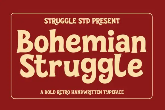
Soft chunky retro letters with uneven serifs and rounded bowls
Bohemian Struggle is a soft chunky face in which the bowls are round, the serifs sit unevenly and the strokes stay heavy, so a word reads as lettering drawn on a sixties shop poster.
Ideas for this font
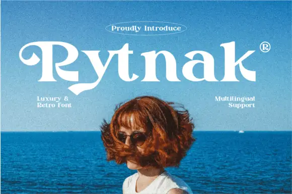
Heavy retro serif
Rytnak is a heavy retro serif in white over a photograph of a figure against a blue sea: fat stems, a hooked R, a pointed y tail and wide bowls, set as one word with a tracked line above in an oval rule and two small notes at the sides.
Ideas for this font
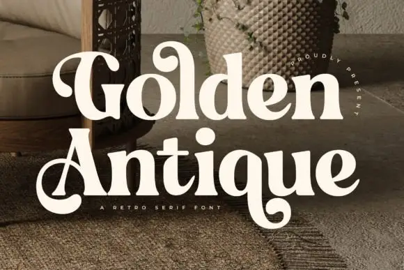
Retro serif with bulbous ball terminals and a swash tail
Golden Antique is a retro serif in which the stems swell, the terminals turn into balls and the final letter drops a swash, so a two-word title reads as a 1970s record sleeve rather than as a classical serif.
Ideas for this font
Allow optional Google Analytics to measure visits and catalogue actions. Your search words and notes are not included. Privacy & storage