Modern Grotesque Body

Stay Chunky + Clyne Sans
Creates crisp high-hierarchy contrast beneath Stay Chunky headlines across menus, websites and labels.
Inspect Clyne Sans specimenDisclosure: MakerFileHub may earn a commission from qualifying purchases via paid links on this page. How our links work.
Retro groovy chunky display
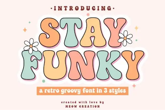
Stay Chunky is a retro groovy display in black on pale pink: very heavy rounded caps with curled tails that drop below the baseline, an R with a swash leg, a Y and an A with hooked stems, and a curved note above, with flowers at the corners.
Paid link
Get this fontProject & layout blueprintsAt-a-glance maker compatibility
Sturdy stroke walls and open counters weed cleanly on adhesive vinyl, HTV apparel film, and cut cardstock.
Visual anatomy & craft review
The two words are stacked and each letter is a fat rounded form with an unexpected tail: the R swings a leg out, the Y drops a hook, and the A carries a curl, which is what gives the block its seventies rhythm. The weight is heavy enough to hold on a tote or a poster, and the counters stay open enough to read at a distance. The tails extend below the baseline, so the pair needs vertical room, which the specimen provides by keeping the plate empty around the words. The palette is two colours on a soft pink ground with line-drawn flowers at the corners, and the note above the block curves along the top edge so it does not compete with the letterforms.
Retro, groovy, chunky, playful
Two-font hierarchy recipes
Tested contrast partners — pairing Stay Chunky with grounded secondary typography.
Stay Chunky + Clyne Sans
Creates crisp high-hierarchy contrast beneath Stay Chunky headlines across menus, websites and labels.
Inspect Clyne Sans specimen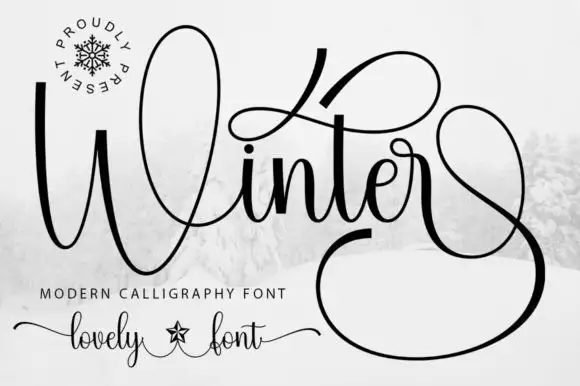
Stay Chunky + Winter
Adds a warm human signature touch for 1-to-3-word callouts without competing against structured serif capitals.
Inspect Winter specimenPractical applications
Concrete hierarchy, scale and production guidance tailored to Stay Chunky’s stroke geometry.
A groovy display reads as a period graphic on fabric, and the fat silhouette survives a screen print where a fine retro face would break up.
Hierarchy & layout recipe
Print a 300 by 300 mm tote graphic: the phrase at 45 mm cap height, the shop at 8 mm, and one ink on a natural canvas. Keep the smallest counter at 5 mm and leave 30 mm between the tails and the bag seam.
Pre-production check
Check the screen at actual mesh, where a 5 mm counter fills; open it. Wash-test one bag and confirm the tails still read after five cycles.
A groovy face sets the decade in one word, and the curled tails give the card a decorated look without an illustration or a second typeface on the sheet.
Hierarchy & layout recipe
A6 card: the greeting at 30 pt, the details in a 9 pt sans, and two flowers. Keep 12 mm margins, leave 8 mm below the tails, and print one ink on a pale card.
Pre-production check
Check the 30 pt greeting, where a tail can touch the border; pull the block up by 4 mm. Confirm the 9 pt details keep a 4.5:1 contrast and that the flowers clear the trim.
A retro label gives a small soda a period look on a crowded shelf, and the heavy letters hold at 15 pt where a thin retro face would disappear.
Hierarchy & layout recipe
Print a 60 by 90 mm label: the flavour at 16 pt, the volume in a 7 pt sans, and a 4 mm rule. Keep 5 mm inside the die and print two colours on a coated stock so the tails stay sharp.
Pre-production check
Check the 16 pt flavour on a curved can, where the outer letters distort; reduce the width. Confirm the 7 pt volume reads in the chiller and that the tails clear the die.
Technical & licence verification
Confirm included OTF/TTF/WOFF formats, full glyph tables and licence coverage on the live store page before batch production.
Closest visual alternatives
Matched across letterform anatomy, stroke behaviour and craft applications.
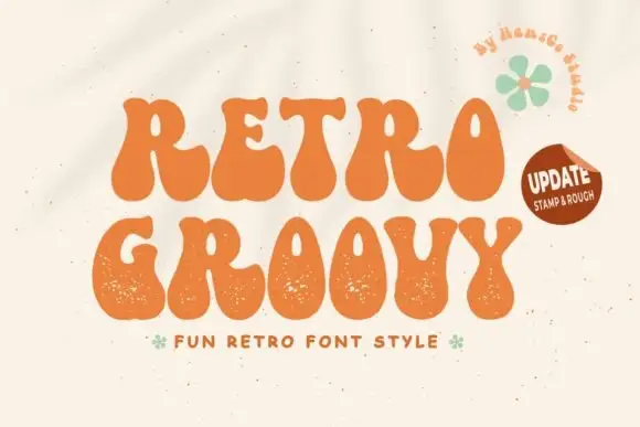
Groovy fat display with grainy edges
Retro Groovy is a groovy display face in orange on cream: fat blobby letters with wavy contours and a grainy surface, set as two stacked lines with a small tracked line beneath and a green flower beside them.
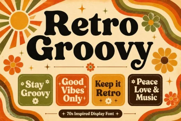
Heavy quirky serif with irregular counters
Retro Groovy is a heavy display serif in black on cream: fat letters with uneven serifs and rounded counters, shown over a seventies sunburst with wavy stripes and daisies, and repeated on four rounded badges of slogans.
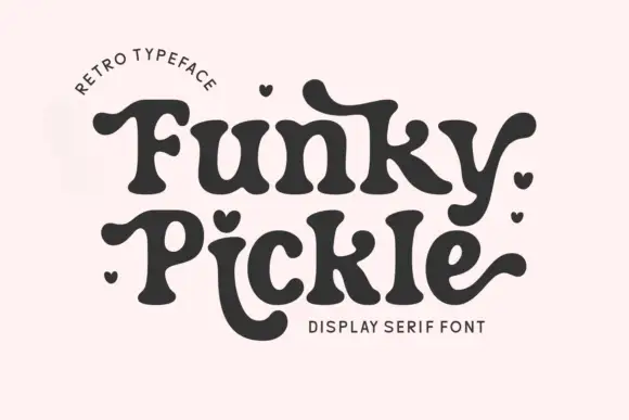
Retro display serif with bulbous terminals and rounded flair
Funky Pickle is a retro display serif in which the stems swell, the terminals turn into bulbs and the arms curl, so a two-word title reads as a 1970s record sleeve rather than as a modern serif.
Ideas for this font
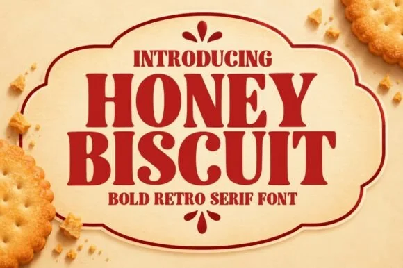
Bold retro serif with heavy bracketed slabs and narrow counters
Honey Biscuit is a bold retro serif in which the bracketed slabs are heavy, the stems are fat and the counters pinch narrow, so a word reads like a printed biscuit tin rather than a book title.
Ideas for this font
Same independent foundry
Allow optional Google Analytics to measure visits and catalogue actions. Your search words and notes are not included. Privacy & storage