Neutral Sans Workhorse

Ebon Crest + Borsen
Lets Ebon Crest own the focal silhouette while handling secondary copy, sizing and subheads cleanly.
Inspect Borsen specimenDisclosure: MakerFileHub may earn a commission from qualifying purchases via paid links on this page. How our links work.
Split Gothic capitals beside narrow angular lowercase
Ebon Crest sets a tall gothic blackletter in bone white on a dark ground and frames it with a crest, a sword and fleur ornaments, then lists the uses along the foot of the cover.
Paid link
Get this fontProject & layout blueprintsAt-a-glance maker compatibility
Sturdy stroke walls and open counters weed cleanly on adhesive vinyl, HTV apparel film, and cut cardstock.
Visual anatomy & craft review
Ebon over Crest fills the middle of the card, the E built from heavy verticals and the C closing into a hooked bowl, with diamond finials on the ascenders. Above the words sits a small crest with a sword and a red stone, and crosses and fleurs mark the corners of a thin rule that frames the composition. Below, five small icons name the intended work: logos, tattoos, posters, apparel and branding. The face is a display cut, so it needs a dark ground and a large size, and the narrow counters fill first when the word is reduced.
Split Gothic capitals beside narrow angular lowercase
Two-font hierarchy recipes
Tested contrast partners — pairing Ebon Crest with grounded secondary typography.
Ebon Crest + Borsen
Lets Ebon Crest own the focal silhouette while handling secondary copy, sizing and subheads cleanly.
Inspect Borsen specimen
Ebon Crest + Auretha
Grounds bold display lettering with classic typographic authority on posters, badges and apparel.
Inspect Auretha specimenPractical applications
Concrete hierarchy, scale and production guidance tailored to Ebon Crest’s stroke geometry.
The crest and the blackletter give a bar a seasonal identity in one object, and the heavy strokes hold on a painted board.
Hierarchy & layout recipe
Print a 700 by 400 mm board: set the bar name at 70 mm on one row, keep 26 mm of clear ground beneath before the hours at 15 pt, and keep 30 mm of border so the crest and the corners stay on the board.
Pre-production check
Fleur details vanish in paint; check a mask proof before the sign is cut. Ask the printer for a sample at the finished size.
The crest reads as a maker's stamp, and the heavy letterforms survive a small blind emboss on a thick leather luggage tag.
Hierarchy & layout recipe
Print a 45 by 80 mm tag: set the maker at 13 pt on one row, keep 6 mm of clear ground beneath before the style at 5 pt, and keep 5 mm from the lettering to the punch hole.
Pre-production check
Embossing fills narrow counters; check a stamped sample before the tag run. Confirm it on a printed sample, not on screen.
The lettering gives a genre cover its period voice, and the heavy weight still holds at thumbnail size in an online store.
Hierarchy & layout recipe
Print a 152 by 229 mm cover: set the title at 54 pt across two lines, keep 20 mm of clear ground beneath before the author at 12 pt, and keep 18 mm of margin from the trim edge.
Pre-production check
Thin finials break at small sizes; check a reduced proof before the cover is finalised. Have the printer send a physical sample first.
Technical & licence verification
Confirm included OTF/TTF/WOFF formats, full glyph tables and licence coverage on the live store page before batch production.
Closest visual alternatives
Matched across letterform anatomy, stroke behaviour and craft applications.
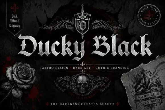
Wide blackletter with sweeping D and a densely split B
Ducky Black is a tattoo and dark-art blackletter with wide stems, sharp spurs and a distressed silver fill, framed by drawn roses, a skull and a fleur.
Ideas for this font
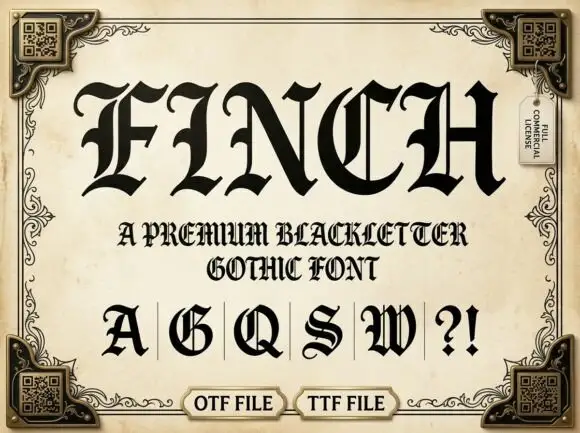
Ornate Gothic capitals with split interiors and curled upper tips
Finch sets a heavy blackletter in black on aged parchment, its stems broad, its finials drawn to diamonds and a few letters carrying fine parallel stripes inside the stroke.
Ideas for this font
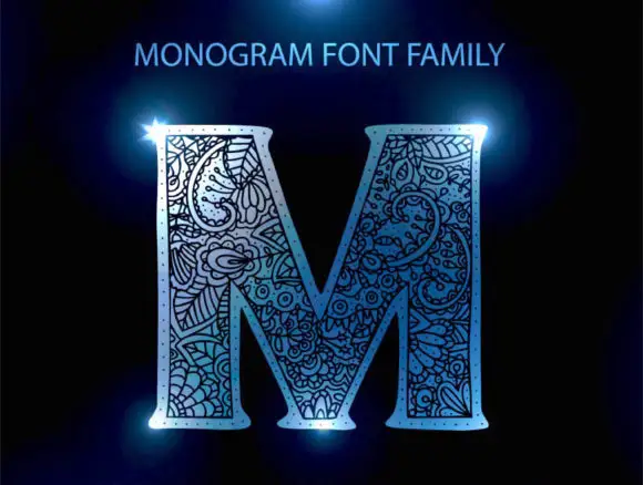
Floral-packed monogram initial
Monogram Font Family is a single ornate initial in pale blue on black: a broad serif M whose every stroke is packed with curling floral and paisley-like linework, lit with a blue flare at two corners and labelled above with the family name.

Narrow Gothic strokes with curled descenders and split terminals
Kingsbridge sets silver-blackletter capitals on a dark heraldic scene, the strokes tall and angular, the K throwing a long entry swash and the g closing in a hooked tail that curls under the word.
Ideas for this font
Same independent foundry
Allow optional Google Analytics to measure visits and catalogue actions. Your search words and notes are not included. Privacy & storage


