Modern Grotesque Body

Fantasy Narratives + Furion
Creates crisp high-hierarchy contrast beneath Fantasy Narratives headlines across menus, websites and labels.
Inspect Furion specimenDisclosure: MakerFileHub may earn a commission from qualifying purchases via paid links on this page. How our links work.
Sweeping ligature high-fantasy RPG & storybook serif
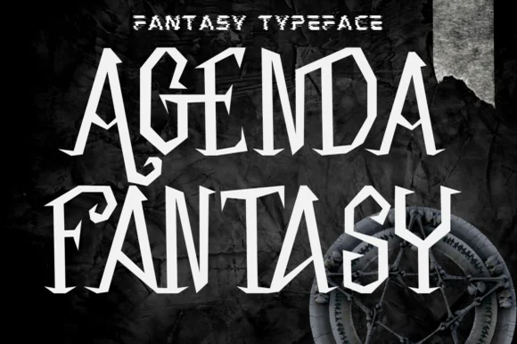
Fantasy Narratives is an enchanting high-contrast fantasy serif weaving dramatic diagonal 'FA', 'AN', 'NA', and 'AR' ligatures across kingdom titles!
Paid link
Get this fontProject & layout blueprintsAt-a-glance maker compatibility
Sturdy stroke walls and open counters weed cleanly on adhesive vinyl, HTV apparel film, and cut cardstock.
Visual anatomy & craft review
Fantasy Narratives is a high-contrast serif whose capitals fuse into diagonal ligatures across word boundaries, so paired letters like F-A and N-A become single sweeping strokes with a curved crossbar that unifies the pair. Ivory forms against dark grounds suggest manuscript illumination rather than a modern display serif, and the fused joins force a designer to set titles as deliberate pairs instead of relying on spacing. Hairlines are delicate, so the face wants 24 pt and up, and it should be treated as a title device; long text in it would lose the ligature logic that gives it character.
Sweeping-FA-AR-ligatures · Castle-storybook · High-contrast
Two-font hierarchy recipes
Tested contrast partners — pairing Fantasy Narratives with grounded secondary typography.
Fantasy Narratives + Furion
Creates crisp high-hierarchy contrast beneath Fantasy Narratives headlines across menus, websites and labels.
Inspect Furion specimen
Fantasy Narratives + I Heart You
Adds a warm human signature touch for 1-to-3-word callouts without competing against structured serif capitals.
Inspect I Heart You specimenPractical applications
Concrete hierarchy, scale and production guidance tailored to Fantasy Narratives’s stroke geometry.
Fused diagonal ligatures give a game title a single graphic silhouette that reads as a wordmark rather than a set of letters, which is what a title screen needs at 200 px. High contrast separates the title from a painted background without an outline.
Hierarchy & layout recipe
Title screen 1920 x 1080, wordmark 700 px wide, subtitle 34 px, safe margin 5 percent. Jacket 152 x 229 mm, title 46 pt, author 16 pt, 18 mm margins, spine 8 pt. Spread 420 x 297 mm, drop cap area 90 x 90 mm, body 10/15 pt companion serif.
Pre-production check
Delicate hairlines over a busy painted background vibrate and disappear at streamed bitrates. Export a title screen at the delivery bitrate and check the ligature joins on a phone, then add a subtle dark scrim behind the word if the hairlines break up.
Manuscript-style ligatures read as an engraved invitation without the stiffness of a formal script, which suits a castle or masquerade party where guests expect theatre. Fused pairs give the guest names one focal ornament each.
Hierarchy & layout recipe
Invitation 120 x 180 mm, names 24 pt, details 9/13 pt, 15 mm margins, 3 mm bleed. Programme A5, headings 18 pt, running order 8.5/12 pt. Menu 120 x 300 mm, course heads 16 pt, dishes 8/11 pt, 20 mm foot margin.
Pre-production check
Printed at 24 pt on an uncoated invitation card, the ligature hairline is under 0.15 mm and fills solid. Request a press proof on the real stock, and if the join closes, print the names on a coated card or reduce the contrast rather than the size.
The illuminated-serif character matches a venue with stone arches and tapestries, so the stationery reads as belonging to the place instead of a generic romantic script. Fused capitals let a couple's initials become a single monogram at no extra cost.
Hierarchy & layout recipe
Invitation 148 x 210 mm, initials monogram 40 mm, names 22 pt, details 9/14 pt, 18 mm margins. Booklet A5, 8 pages, headings 16 pt, hymns 9/12 pt. Table plan 600 x 400 mm, table names 24 pt, guest names 9 pt on a 7 mm grid.
Pre-production check
Guest names at 9 pt on a table plan are usually set in the companion text face, not the display serif; check that no second display line has been used, because high-contrast hairlines at 9 pt are illegible at standing distance. Print a 1:1 crop and read it at one metre.
Technical & licence verification
Confirm included OTF/TTF/WOFF formats, full glyph tables and licence coverage on the live store page before batch production.
Closest visual alternatives
Matched across letterform anatomy, stroke behaviour and craft applications.
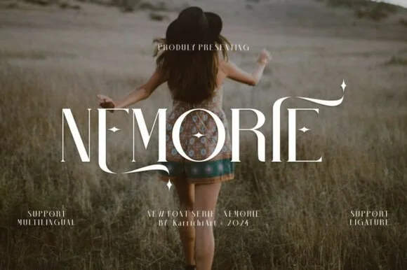
Celestial high-contrast art-nouveau & fantasy ligature serif
Nemorie is a refined high-contrast display serif featuring sweeping scythe-like swash bars, sculpted ligatures, and four-point star accents.
Ideas for this font
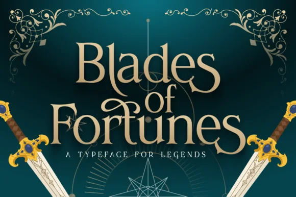
Heroic sword-flared epic fantasy display serif
Blades of Fortunes is a sculpted epic-fantasy display serif featuring sword-hilted crossbars, sweeping swash loops, and sharp triangular terminals.
Ideas for this font
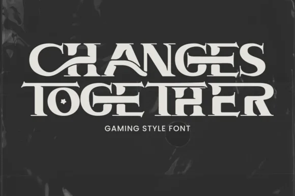
Interlocking ligature fantasy-RPG & gaming title serif
Changes Together is a bold, wide fantasy-gaming serif bridging extended horizontal crossbars ('H-A', 'T-O-G-E-T-H-E-R') and carving a star inside 'O'!
Ideas for this font
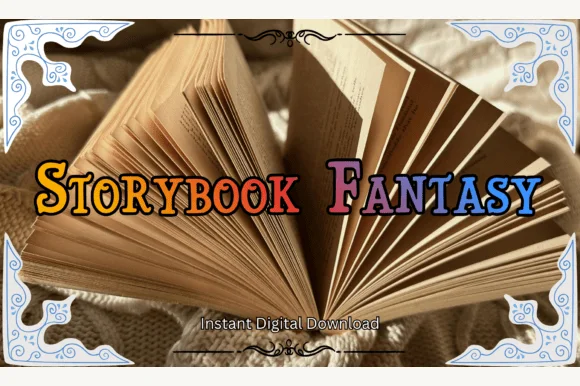
Swash-capped enchanted fairytale & medieval storybook serif
Storybook Fantasy is an ornate fairytale display serif featuring dramatic curled initial capitals alongside sturdy small-caps-style letters.
Ideas for this font
Same independent foundry
Allow optional Google Analytics to measure visits and catalogue actions. Your search words and notes are not included. Privacy & storage