Neutral Sans Workhorse

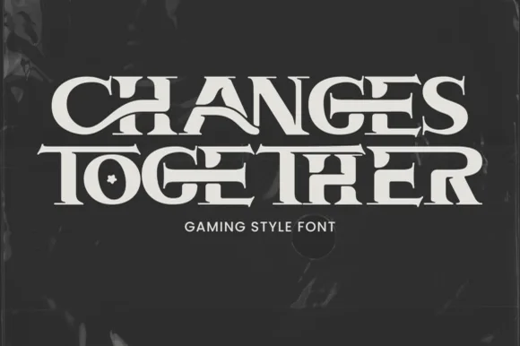
Agenda Fantasy + Bareum
Lets Agenda Fantasy own the focal silhouette while handling secondary copy, sizing and subheads cleanly.
Inspect Bareum specimenDisclosure: MakerFileHub may earn a commission from qualifying purchases via paid links on this page. How our links work.
Angular blade-hooked dark-fantasy & Halloween display
Agenda Fantasy is a creepy, razor-angled dark-fantasy display font hooking jagged scythe spurs onto tall Gothic-inspired capitals.
Paid link
Get this fontProject & layout blueprintsAt-a-glance maker compatibility
Sturdy stroke walls and open counters weed cleanly on adhesive vinyl, HTV apparel film, and cut cardstock.
Visual anatomy & craft review
Agenda Fantasy is a razor-angled dark-fantasy display that hooks jagged scythe spurs onto tall narrow Gothic-inspired capitals, so a word reads as a blade rather than as a blackletter. The spurs extend beyond the letter body, which means the artwork box grows in both directions, and the hairlines between them are what makes the letter look sharp. It needs roughly 30 mm before the hooks read as blades, and it is at its best in bone-white on dark stone, or in a single dark ink for a print piece.
Scythe-hooked · Dark-fantasy · Spooky-serif
Two-font hierarchy recipes
Tested contrast partners — pairing Agenda Fantasy with grounded secondary typography.
Agenda Fantasy + Bareum
Lets Agenda Fantasy own the focal silhouette while handling secondary copy, sizing and subheads cleanly.
Inspect Bareum specimen
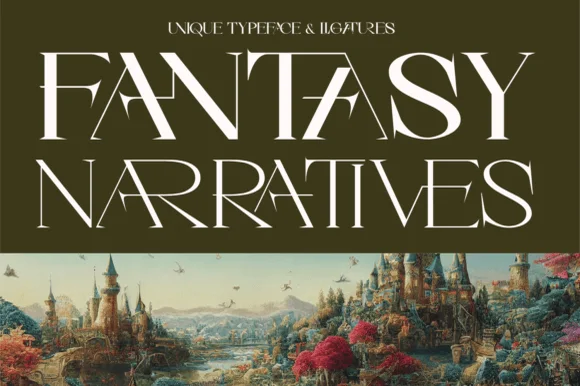
Agenda Fantasy + Cronelo
Grounds bold display lettering with classic typographic authority on posters, badges and apparel.
Inspect Cronelo specimenPractical applications
Concrete hierarchy, scale and production guidance tailored to Agenda Fantasy’s stroke geometry.
Scythe-hooked capitals read as a horror prop, which is what a haunted house sells at the gate. The narrow forms fit a long venue name on a porch sign, and one colour keeps the poster cheap enough to overprint for several nights.
Hierarchy & layout recipe
Sign 600 x 900 mm, word 110 mm with 30 mm spur clearance, 50 mm margins. Poster A2, word 260 mm, times 22/28 pt, 30 mm margins and 20 mm trim. Label 90 x 60 mm, word 16 mm, 4 mm die margin.
Pre-production check
Hooked spurs cut past the bleed and get trimmed when the poster is guillotined to A3. Declare the true artwork box, keep 20 mm of trim, and inspect one cut poster before the run.
Blade-hooked caps read as a genre cover, which is what a fantasy novel or role-playing supplement needs on a shelf. The narrow forms stack a long title in two lines without shrinking the type, and the hairlines survive offset on coated stock.
Hierarchy & layout recipe
Cover 152 x 229 mm, title 60 pt with 10 mm spur margin, author 14 pt, 18 mm margins. Opener 420 x 297 mm, chapter 90 mm, body 10/15 pt. Supplement 210 x 297 mm, box 24 pt, notes 8/11 pt.
Pre-production check
Web offset drops a 0.1 mm hook tip and the title looks chipped. Confirm coated stock and a 0.12 mm minimum, and check one printed signature before the full run.
Jagged capitals read as a seasonal fright bill, which is what a December horror screening wants against a Christmas calendar. The bone-white on a dark ground matches cold-weather promotion and the narrow forms fit a ticket stub.
Hierarchy & layout recipe
Poster A2, word 250 mm with 20 mm trim, details 22/28 pt, 30 mm margins. Ticket 70 x 180 mm, title 20 mm, seat 7 pt, 8 mm margins. Marquee card 300 x 200 mm, word 70 mm, 30 mm margins and 20 mm frame clearance.
Pre-production check
A backlit marquee card blooms a bone-white hairline into a glow and the hooks dissolve. Reduce the hook weight or print dark on light, and check one card lit in the frame before the screening.
Technical & licence verification
Confirm included OTF/TTF/WOFF formats, full glyph tables and licence coverage on the live store page before batch production.
Closest visual alternatives
Matched across letterform anatomy, stroke behaviour and craft applications.
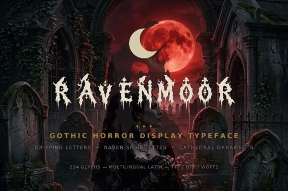
Dripping gothic horror display
Ravenmoor is a gothic horror display in bone white on a crimson moonlit graveyard: jagged stems, drips falling from every baseline, points that extend into long spikes, with a tracked subtitle and a specification line beneath in small caps.
Ideas for this font
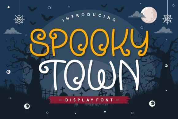
Playful rounded monoline display with curls
Spooky Town is a playful rounded display in mustard and cream on a navy Halloween scene: an even monoline stroke, wide rounded bowls, curls at the ends of the S and the y, and a bounce that lifts alternate letters off the baseline.
Ideas for this font
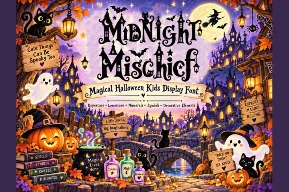
Whimsical witchy storybook Halloween font with curls, stars & spiders
Midnight Mischief is an enchanted children's Halloween display font curling fairy-tale serif stems with hanging spiders, stars, and moons! (Full charset + elements).
Ideas for this font
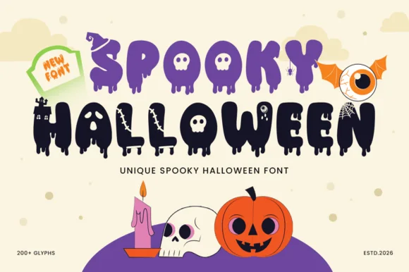
200+ glyph melting-ooze, witch-hat & haunted-castle horror alphabet
Spooky Halloween (by Umitype) is a loaded 200+ glyph Halloween display font crowning melting slime letters with witch hats, haunted castles, skulls & eyeballs!
Ideas for this font
Same independent foundry
Allow optional Google Analytics to measure visits and catalogue actions. Your search words and notes are not included. Privacy & storage