Neutral Sans Workhorse

Ez Arvent + Furion
Lets Ez Arvent own the focal silhouette while handling secondary copy, sizing and subheads cleanly.
Inspect Furion specimenDisclosure: MakerFileHub may earn a commission from qualifying purchases via paid links on this page. How our links work.
Uneven upright mixed case with a broad rounded A and lifted r shoulder
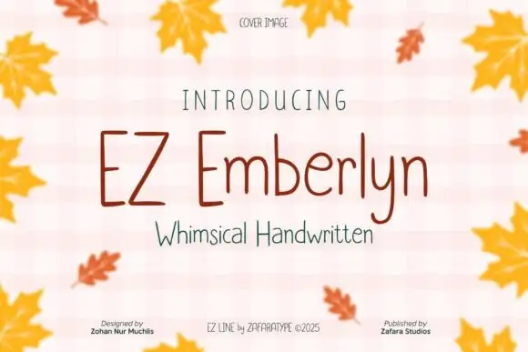
Ez Arvent is an uneven upright display in which the capital E sets a flat-armed block, the rounded A opens wide, the r lifts its shoulder and the t turns a soft rightward foot, so a playful title reads as hand-drawn signage.
Paid link
Get this fontProject & layout blueprintsAt-a-glance maker compatibility
Sturdy stroke walls and open counters weed cleanly on adhesive vinyl, HTV apparel film, and cut cardstock.
Visual anatomy & craft review
The EZ row stays broad and flat-armed, the A opens a rounded top, the r raises its shoulder above the x-height, the t finishes with a soft foot and the baseline shifts slightly between letters. The uneven baseline is the character: it keeps a friendly tone without turning into a script, which is why the sample sets the name over a cream ground with doodles. Because the letters wobble, keep 14 mm between rows from 30 pt and check numbers separately for a timetable. The sun, clouds and leaf marks are artwork; the lettering is the face.
Playful · Upright · Uneven
Two-font hierarchy recipes
Tested contrast partners — pairing Ez Arvent with grounded secondary typography.
Ez Arvent + Furion
Lets Ez Arvent own the focal silhouette while handling secondary copy, sizing and subheads cleanly.
Inspect Furion specimen
Ez Arvent + Papillon Serif – Elegant Modern Luxury
Grounds bold display lettering with classic typographic authority on posters, badges and apparel.
Inspect Papillon Serif – Elegant Modern Luxury specimenPractical applications
Concrete hierarchy, scale and production guidance tailored to Ez Arvent’s stroke geometry.
The playful letters suit a club sign, and the broad forms stay readable at 44 pt on an A3 sheet in two inks. The flat arms keep a club name legible across a room, which matters more than the wobble.
Hierarchy & layout recipe
Print an A3 sign: set the club name at 44 pt, keep 18 mm of clear ground beneath for the uneven baseline, and set the meeting day in a 14 pt rounded sans with 12 mm of clear space.
Pre-production check
Numbers in a playful display often sit lower than letters; check a timetable proof with the actual dates set. Set a real date on the proof before printing.
The wobbly baseline suits a young birthday, and the even weight keeps a name and an age clear at 30 pt on an A6 card. The soft foot on the t keeps a name friendly at card size.
Hierarchy & layout recipe
Print an A6 card: set the name at 30 pt, set the age at 20 pt beneath with 10 mm of clear ground, and keep 14 mm of margin all round so the flat arms stay inside the card. Keep the age on its own row.
Pre-production check
An uneven baseline printed tight to a border looks like a slip; check the card and keep 12 mm of margin. Check the apostrophe in the name.
The friendly display suits a cafe label, and the rounded A stays open at 22 pt on a 60 mm panel in one colour. The lifted r shoulder is the letter to check in a new word.
Hierarchy & layout recipe
Print a 60 by 40 mm label: set the cafe name at 22 pt, set the opening hours in a 7 pt rounded sans beneath with 5 mm of clear ground, and keep 5 mm of border on each side. Keep the hours to two lines.
Pre-production check
Small counters close in a matte laminate at 16 pt; check the proof and keep the name at 20 pt or above. Check a laminated sample first.
Technical & licence verification
Confirm included OTF/TTF/WOFF formats, full glyph tables and licence coverage on the live store page before batch production.
Closest visual alternatives
Matched across letterform anatomy, stroke behaviour and craft applications.
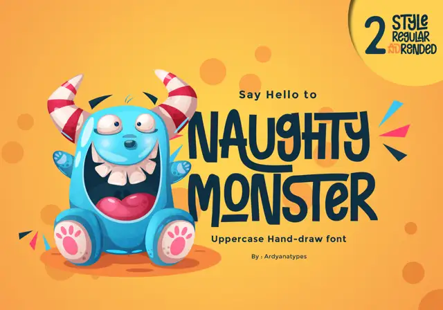
Tall eccentric cartoon capitals
Naughty Monster stretches cartoon letterforms into tall narrow capitals whose cross-strokes run out past their neighbouring letters and whose tops refuse to line up.
Ideas for this font
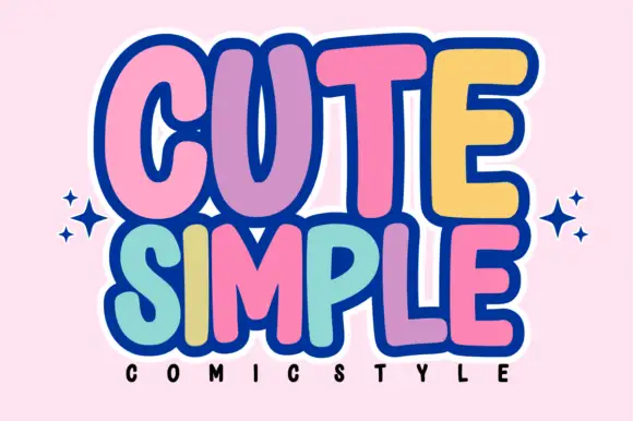
Tall rounded comic blocks with bubble outlines and per-letter colour
Cute Simple is a tall rounded comic alphabet in which the blocks stack tightly, the outlines bubble outward and each letter can take its own colour without breaking the composition.
Ideas for this font
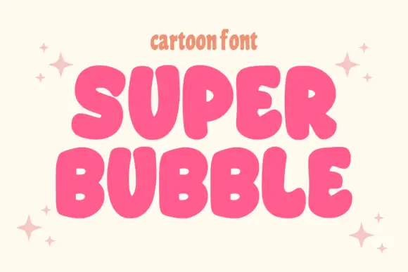
Heavy rounded cartoon capitals with small counters and uneven widths
Super Bubble is a heavy rounded cartoon display in which the capitals inflate, the counters shrink to small openings and the widths vary, so two stacked words read as gently over-full balloons.
Ideas for this font
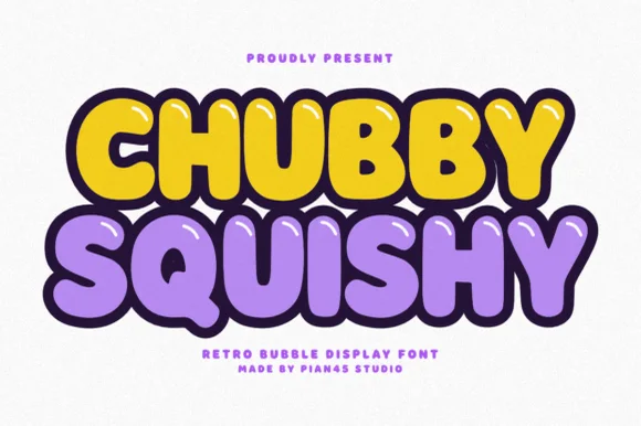
Retro bubble display with glossy highlights and a thick dark outline
Chubby Squishy is a retro bubble display alphabet in which the strokes swell into round cushions, the counters shrink to dots and a thick outline wraps every letter, so a word reads as a rubber sticker.
Ideas for this font
Same independent foundry
Allow optional Google Analytics to measure visits and catalogue actions. Your search words and notes are not included. Privacy & storage