Editorial Serif Anchor

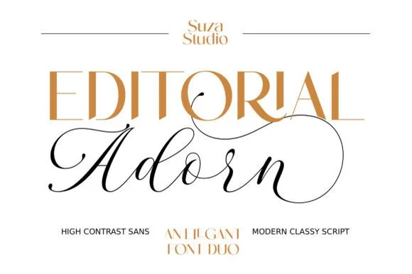
Quens Letter + Medvilea Editorial
Anchors Quens Letter's fluid strokes with crisp Roman proportions on wedding suites, headers and packaging.
Inspect Medvilea Editorial specimenDisclosure: MakerFileHub may earn a commission from qualifying purchases via paid links on this page. How our links work.
Elegant calligraphic script with swashed capitals
Quens Letter is an elegant calligraphic script in white over a handwritten-manuscript mockup: hairline upstrokes, thick downstrokes, capitals that open into long curled swashes, and a note that the file carries over four hundred glyphs with stylistic sets and an italic.
Paid link
Get this fontProject & layout blueprintsAt-a-glance maker compatibility
Weld or Unite overlapping script joins into one continuous vector path before sending to the blade.
Visual anatomy & craft review
The two words are set on one line and the drawing is a formal calligraphy rather than a signature: the pen angle is steep, the downstrokes are heavy and the upstrokes reduce almost to a hair, and the capitals Q and L both launch long entry swashes that loop back above the following letters. The lower case keeps the same rhythm with narrow loops on the h and the l, and the final r closes with a flourish that rises above the x-height, so the word ends as deliberately as it began. Spacing is loose enough for the swashes to clear each other, which is why the sample reads even at the small size the image is displayed at. The caption block beneath the word is set in spaced capitals and lists the glyph count, stylistic sets and languages, which is unusually honest for a specimen and tells a buyer exactly what they are checking for.
Calligraphic, elegant, swashed, formal
Two-font hierarchy recipes
Tested contrast partners — pairing Quens Letter with grounded secondary typography.
Quens Letter + Medvilea Editorial
Anchors Quens Letter's fluid strokes with crisp Roman proportions on wedding suites, headers and packaging.
Inspect Medvilea Editorial specimen
Quens Letter + Homies
Keeps small-scale dates, URLs, nutrition facts and care instructions crisp and legible below script titles.
Inspect Homies specimenPractical applications
Concrete hierarchy, scale and production guidance tailored to Quens Letter’s stroke geometry.
A calligraphic script with proper swashes sets the names of a formal invitation in the register guests expect, and the italic companion covers the detail lines without a second typeface.
Hierarchy & layout recipe
A5 portrait: the names at 30 pt on one line, the ceremony details in the accompanying italic at 9.5 pt, and the reply line at 8 pt. Keep 25 mm between the script and the italic block so the swashes never cross the smaller text.
Pre-production check
Check the swashes at 30 pt on the intended stock, where a hairline under 0.2 pt will drop out; proof on uncoated paper before printing. Confirm the 9.5 pt italic keeps a 4.5:1 contrast and that the final flourish clears the trim by 8 mm.
A calligraphic script gives a photo album the look of a bound keepsake rather than a printed book, which is the tone a milestone gift needs.
Hierarchy & layout recipe
Set the name at 42 pt across a 300 mm square cover, the date in the italic at 10 pt beneath, and a 0.5 pt rule above the credit at the foot. Keep the swashes inside a 20 mm margin and print in one ink on a coated stock so the hairlines stay sharp.
Pre-production check
Check the hairlines at 42 pt on the coated stock, where they hold better than on uncoated but can still break at the tips; inspect a proof with a loupe. Confirm the date line sits at least 12 mm below the lowest descender and that the rule clears the credit.
A calligraphy sets a formal sign-off apart from the body text, and the italic in the same family keeps the letter from looking like two unrelated pieces of design.
Hierarchy & layout recipe
Set the phrase at 20 pt at the foot of a letterhead, right aligned, with the body in the companion italic at 10.5 pt and 15 mm of clear space above the sign-off. Print one ink so the fine joins stay crisp on the office printer.
Pre-production check
Check the phrase at 20 pt on a laser printer, which fills hairlines under 0.3 pt; thicken slightly for that output. Confirm the sign-off clears the letterhead's footer rule by 10 mm and stays legible when the letter is scanned and emailed.
Technical & licence verification
Confirm included OTF/TTF/WOFF formats, full glyph tables and licence coverage on the live store page before batch production.
Closest visual alternatives
Matched across letterform anatomy, stroke behaviour and craft applications.
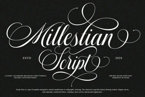
2-style PUA luxury Copperplate ornamental calligraphy family
Mallestian Script ('Millestian Script') is a PUA-encoded 2-style luxury Copperplate calligraphy family crowned with regal looping flourishes!
Ideas for this font
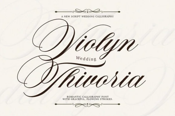
Grand copperplate wedding calligraphy with multi-looped capitals
Violyn Wedding Thivoria is a formal slanted calligraphy script distinguished by sweeping multi-looped capitals and smooth shaded lowercase.
Ideas for this font
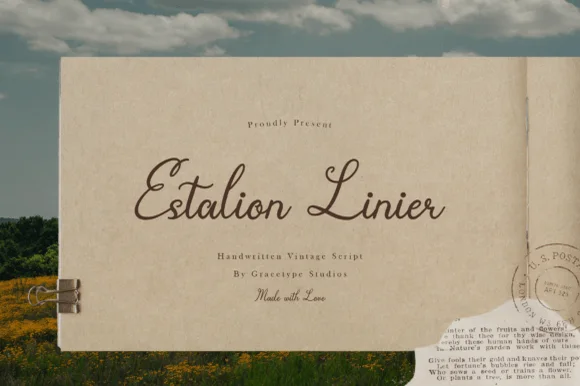
Nostalgic 1940s postal-letter & archival fountain-pen script
Estalion Linier is a nostalgic vintage letter-writing script mimicking 1940s fountain-pen ink on aged airmail and journal paper.
Ideas for this font
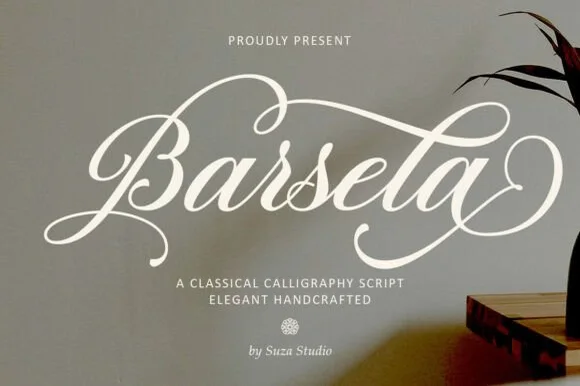
Flourished classical copperplate calligraphy script
Barsela Calligraphy is a sweeping classical calligraphy script (not a slab serif) draped in grand oval capital loops and figure-eight flourishes.
Ideas for this font
Same independent foundry
Allow optional Google Analytics to measure visits and catalogue actions. Your search words and notes are not included. Privacy & storage