Neutral Sans Workhorse

Weaksblue Champion + Monure
Lets Weaksblue Champion own the focal silhouette while handling secondary copy, sizing and subheads cleanly.
Inspect Monure specimenDisclosure: MakerFileHub may earn a commission from qualifying purchases via paid links on this page. How our links work.
Dry brush capitals with spatter
Weaksblue Champion is a rough dry-brush display in black: heavy capital strokes with spattered edges, set on white inside printer's marks, a grid corner and a barcode.
Paid link
Get this fontProject & layout blueprintsAt-a-glance maker compatibility
Sturdy stroke walls and open counters weed cleanly on adhesive vinyl, HTV apparel film, and cut cardstock.
Visual anatomy & craft review
Weaksblue sits above Champion in capitals, and the brushwork is deliberately crude: the strokes break into dry channels, small flecks of paint spray off the ends, the crossbar of the A is uneven and the letters lean at slightly different angles. The weight is heavy enough to stay solid at a distance, and the spatter is part of the glyph rather than an added texture. The ground is white with technical detail — a registration crosshair at each corner, a small grid at the lower left, a strip of tape at the top right and a barcode at the bottom — so the specimen reads as a print proof. Three lines at the foot list the coverage in a small sans. The face is a rough display for posters, apparel and music graphics: it needs a large size, one colour, and it should be reserved for a few words.
A rough brush display with paint spatter
Two-font hierarchy recipes
Tested contrast partners — pairing Weaksblue Champion with grounded secondary typography.
Weaksblue Champion + Monure
Lets Weaksblue Champion own the focal silhouette while handling secondary copy, sizing and subheads cleanly.
Inspect Monure specimen
Weaksblue Champion + Evoire
Grounds bold display lettering with classic typographic authority on posters, badges and apparel.
Inspect Evoire specimenPractical applications
Concrete hierarchy, scale and production guidance tailored to Weaksblue Champion’s stroke geometry.
A rough brush mark says the studio works by hand, and one black on white keeps the printed sample honest about what the press can do.
Hierarchy & layout recipe
Print an 85 by 55 mm card: set the studio name at 16 pt on one row, keep 6 mm of clear ground beneath before the contact block at 6.5 pt, and hold 5 mm from the spatter to the trim.
Pre-production check
Spatter at card size reads as dirt; print one card at the real size and check the flecks before the order.
A rough brush cover word signals a subject rather than a style section, and the crude edges survive newsprint better than a fine display face.
Hierarchy & layout recipe
Print a 230 by 300 mm cover: set the cover word at 120 pt on one row, keep 30 mm of clear ground beneath before the cover lines at 12 pt, and hold 20 mm of margin on all sides.
Pre-production check
Dry channels fill in on uncoated paper; print one cover on the actual stock and check a stroke before the run.
A rough brush board tells guests the dress code before they read the schedule, and one colour on plywood is a realistic budget for a party.
Hierarchy & layout recipe
Print a 600 by 400 mm board: set the greeting at 130 pt across two rows, keep 26 mm of clear ground beneath before the times at 24 pt, and hold 22 mm of border on all sides.
Pre-production check
Painting a rough edge by hand rarely matches the file; print one board on the real material and check before the set.
Technical & licence verification
Confirm included OTF/TTF/WOFF formats, full glyph tables and licence coverage on the live store page before batch production.
Closest visual alternatives
Matched across letterform anatomy, stroke behaviour and craft applications.
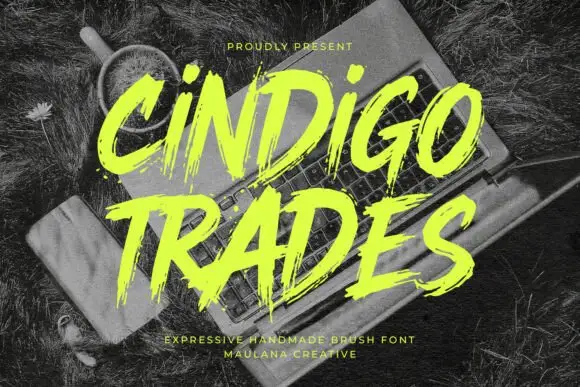
Ragged slanted brush lettering with dry edges and uneven pressure
Cindigo Trades is expressive brush lettering that leans hard to the right, its strokes ragged at the edges and uneven in pressure, so the words look sprayed or painted rather than drawn.
Ideas for this font
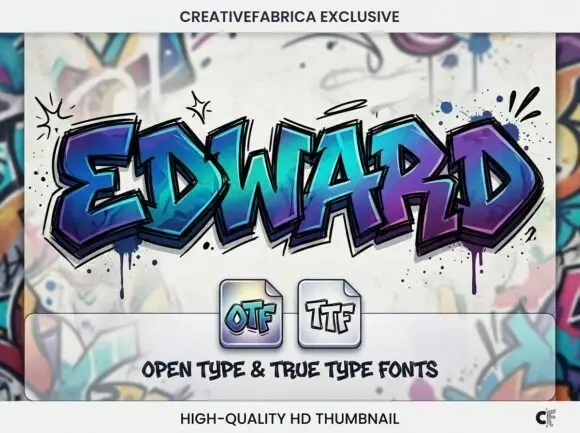
Angular graffiti capitals with overlapping facets and a dripped edge
Edward is an angular graffiti display alphabet in capitals only, built from overlapping faceted strokes in two colours, with short drips running off the lower edges and a hard shadow behind each letter.
Ideas for this font
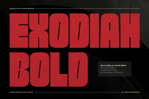
Very heavy block capitals with slanted slit counters and broad flat arm ends
Exodiah stacks dark red capitals on black, where huge squared bodies leave only fine slanted slits inside O, D and B, the X narrows sharply at its middle, flat-ended E arms and a wide L foot reinforce the block silhouette, and the curved letters keep rounded outer corners.
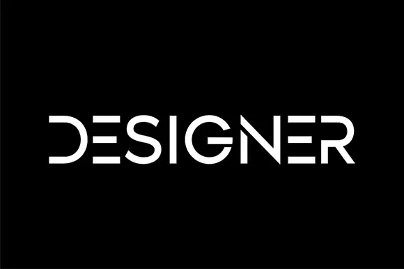
Segmented geometric capitals
Designer shows a thin geometric wordmark in white on black, where the E is reduced to three horizontal bars, the D loses its upright stem, the R opens at the join and the gaps between segments read as part of the drawing rather than as damage.
Ideas for this font
Same independent foundry
Allow optional Google Analytics to measure visits and catalogue actions. Your search words and notes are not included. Privacy & storage