Neutral Sans Workhorse

Thanksgiving + Bareum
Lets Thanksgiving own the focal silhouette while handling secondary copy, sizing and subheads cleanly.
Inspect Bareum specimenDisclosure: MakerFileHub may earn a commission from qualifying purchases via paid links on this page. How our links work.
Ornamented autumn display
Thanksgiving 10 is an ornamented display in burnt orange on white: rounded caps with small dot ornaments set inside the strokes, a light bounce and slightly irregular heights, framed by an autumn illustration of mushrooms and pumpkins along the foot and leaves at the corners.
Paid link
Get this fontProject & layout blueprintsAt-a-glance maker compatibility
Sturdy stroke walls and open counters weed cleanly on adhesive vinyl, HTV apparel film, and cut cardstock.
Visual anatomy & craft review
The two words are stacked and each letter carries a scatter of small dots inside the stroke, which reads as a hand-painted textile pattern rather than as a texture. The letterforms themselves are rounded and slightly irregular, and the bounce keeps the block warm and made rather than mechanical. Because the ornaments sit inside the letters, the silhouette stays simple and the words remain legible at a distance, which is the discipline of a decorated face. The illustration along the foot and the leaves at the corners are part of the seasonal styling, and the tracked label above is set in a condensed caps face, which keeps the plate informative rather than purely pictorial.
Decorative, ornamented, seasonal, warm
Two-font hierarchy recipes
Tested contrast partners — pairing Thanksgiving with grounded secondary typography.
Thanksgiving + Bareum
Lets Thanksgiving own the focal silhouette while handling secondary copy, sizing and subheads cleanly.
Inspect Bareum specimen
Thanksgiving + Augler
Grounds bold display lettering with classic typographic authority on posters, badges and apparel.
Inspect Augler specimenPractical applications
Concrete hierarchy, scale and production guidance tailored to Thanksgiving’s stroke geometry.
An ornamented seasonal face reads as a hand-made invitation, and the dot detail survives on a card printed at home where a fine texture would not.
Hierarchy & layout recipe
A6 card: the greeting at 28 pt, the details in a 9 pt sans, and a small leaf. Keep 12 mm margins and print one ink on a cream card so the ornaments stay distinct.
Pre-production check
Check the 28 pt greeting at home-print resolution, where the dots can merge into the stroke; enlarge them slightly. Confirm the 9 pt details keep a 4.5:1 contrast and that the leaf clears the trim.
A decorated label reads as a seasonal gift item, and the flat single ink keeps a short run affordable on a kraft sticker.
Hierarchy & layout recipe
Print a 60 by 80 mm label: the preserve at 15 pt, the weight in a 6 pt sans, and the date at 5 pt. Keep 4 mm inside the die and print one ink on a kraft stock so the dots read as print.
Pre-production check
Check the 15 pt preserve on kraft, where a dot can fill; keep them above 1 mm. Confirm the 5 pt date reads on the jar and that the label survives a chilled cabinet.
A decorated display gives a cookbook the feel of a printed booklet, and the ornament inside the letters carries the seasonal tone without an illustration.
Hierarchy & layout recipe
Set the title at 80 mm cap height across 200 mm, the subtitle in a 12 pt serif, and the author at 9 pt. Print one ink on a cream stock and keep the illustration along the foot only.
Pre-production check
Check the title at thumbnail size, where the dotted detail can disappear; keep the dots coarse. Confirm the 9 pt author survives lamination and that the title clears the trim by 12 mm.
Technical & licence verification
Confirm included OTF/TTF/WOFF formats, full glyph tables and licence coverage on the live store page before batch production.
Closest visual alternatives
Matched across letterform anatomy, stroke behaviour and craft applications.
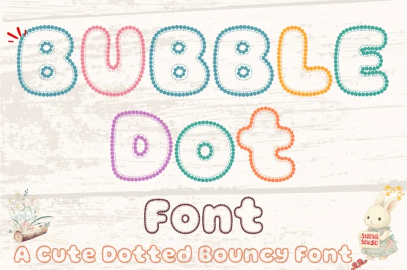
Beaded-pearl outline bouncy kids' bubble font (OTF & TTF)
Bubble Dot traces plump, bouncy cartoon bubble letters entirely out of tiny pearl-bead rings with cozy hollow centers (OTF & TTF)!
Ideas for this font
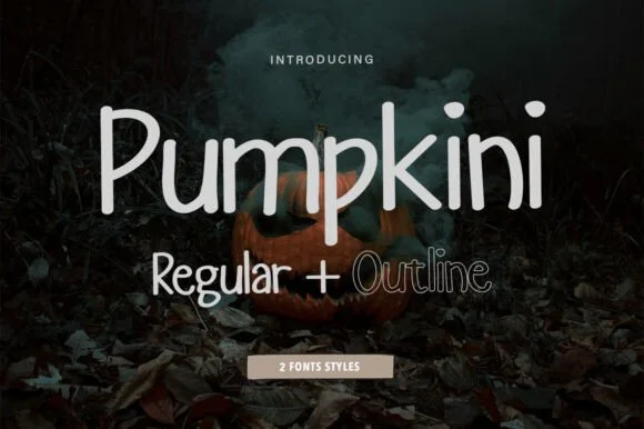
2-style clean rounded upright print sans (Regular + Outline)
Pumpkini is a neat, rounded 2-style handwritten print family ('Regular + Outline') with zero pumpkin clipart attached—usable for autumn AND year-round!
Ideas for this font
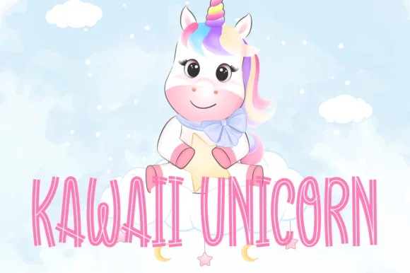
Tall skinny hollow-inline pastel nursery display
Kawaii Unicorn is a tall, slender hollow-inline display font tracing whimsical narrow capitals with an airy interior channel.
Ideas for this font
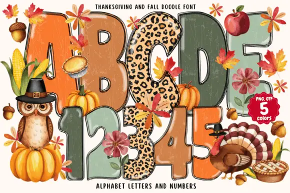
Tall rounded autumn blocks mixing weathered warm fills and spotted patterns
Thanksgiving and Fall Doodle draws fat autumn letters in five colours, fills them with knitted, plaid and leopard textures, and hangs leaves, pumpkins and a turkey around the shapes.
Ideas for this font
Same independent foundry
Allow optional Google Analytics to measure visits and catalogue actions. Your search words and notes are not included. Privacy & storage