Neutral Sans Workhorse

Donna + Inkora
Lets Donna own the focal silhouette while handling secondary copy, sizing and subheads cleanly.
Inspect Inkora specimenDisclosure: MakerFileHub may earn a commission from qualifying purchases via paid links on this page. How our links work.
Angular capitals with diamond-like bowls and narrow rune-like internal marks
Donna shows gold-toned angular capitals on a carved-looking dark slab, where the D and O use sharp diagonal outer sides and diamond-like counters, the N repeats broad diagonal strokes and thin rune-like marks sit inside several stems.
Paid link
Get this fontProject & layout blueprintsAt-a-glance maker compatibility
Sturdy stroke walls and open counters weed cleanly on adhesive vinyl, HTV apparel film, and cut cardstock.
Visual anatomy & craft review
The outlines turn angular, the counters become diamonds, the diagonals repeat and thin internal marks break the fill. That diamond counter is the character: the word reads as a carved crest rather than a modern geometric, which is why the sample sets it on stone. The carved depth and knotwork are presentation, so check the real contours and internal marks, keep 40 pt so the diamonds stay open and proof the fine cuts without the texture. The internal marks are the finest cuts: at 24 pt they merge with the outline and the letter prints as a plain block, so keep 40 pt and proof without the carved texture behind it.
Angular capitals with diamond-like bowls and narrow rune-like internal marks
Two-font hierarchy recipes
Tested contrast partners — pairing Donna with grounded secondary typography.
Donna + Inkora
Lets Donna own the focal silhouette while handling secondary copy, sizing and subheads cleanly.
Inspect Inkora specimen
Donna + Flowsky Editorial
Grounds bold display lettering with classic typographic authority on posters, badges and apparel.
Inspect Flowsky Editorial specimenPractical applications
Concrete hierarchy, scale and production guidance tailored to Donna’s stroke geometry.
The angular caps set a fantasy title, and the diamond counters hold a two-word line at 52 pt on a jacket, where the rune marks add detail at press size.
Hierarchy & layout recipe
Print a 135 by 216 mm jacket: set the title at 52 pt on one row, keep 24 mm of clear ground beneath before the author line at 12 pt, and keep the artwork above the title so the marks stay legible.
Pre-production check
Fine internal cuts disappear on a busy cover; check the proof and keep the title on flat colour.
The carved caps give a bottle age, and the angular forms hold a two-word name at 22 pt on a 60 by 45 mm label, where the gold tone reads on a dark ground.
Hierarchy & layout recipe
Print a 60 by 45 mm label: set the name at 22 pt on one row, keep 9 mm of clear ground beneath before the volume at 6 pt, and keep the ground dark so the pale marks stay visible.
Pre-production check
Thin rune marks fill at label size; check the plate proof and hold the name at 20 pt or above.
The angular letters suit a medieval theme, and one capital fills a 40 mm crest, where the diamond counter supplies the ornament without extra art.
Hierarchy & layout recipe
Print a 105 by 148 mm invitation: place one initial at 40 mm inside a 55 mm panel, keep 18 mm of clear ground beneath before the names at 16 pt, and keep the knotwork outside the letter.
Pre-production check
The carved texture does not ship with the file; check the actual contours before planning the crest.
Technical & licence verification
Confirm included OTF/TTF/WOFF formats, full glyph tables and licence coverage on the live store page before batch production.
Closest visual alternatives
Matched across letterform anatomy, stroke behaviour and craft applications.
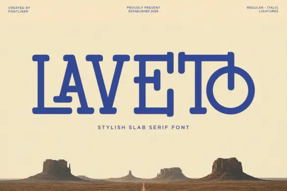
Rounded slab with overlapping bars
Laveto is a rounded slab display in ultramarine on a bleached desert landscape: wide capitals with long overlapping horizontal bars, rounded stroke ends and a final letter drawn as a circular bowl pierced by a stem, with a tracked line beneath and three small credits in the corners.

Narrow Gothic strokes with curled descenders and split terminals
Kingsbridge sets silver-blackletter capitals on a dark heraldic scene, the strokes tall and angular, the K throwing a long entry swash and the g closing in a hooked tail that curls under the word.
Ideas for this font
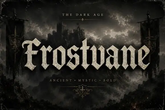
Chunky faceted blackletter with a curled F and triangular feet
Frostvane is a bold blackletter display face with wide letters, diamond-shaped spurs and a surface that looks pressed into old parchment rather than printed on it.
Ideas for this font
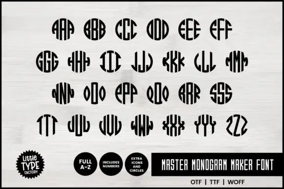
Narrow monogram letters fitted into circles
Master Monogram is a monogram set in black on white: narrow capitals drawn to be repeated and mirrored inside a circular silhouette, so each pair of letters fills a disc with stripes, plus digits and circle icons in the same weight.
Ideas for this font
Same independent foundry
Allow optional Google Analytics to measure visits and catalogue actions. Your search words and notes are not included. Privacy & storage