Modern Grotesque Body

Dixie + Bargain Condensed
Creates crisp high-hierarchy contrast beneath Dixie headlines across menus, websites and labels.
Inspect Bargain Condensed specimenDisclosure: MakerFileHub may earn a commission from qualifying purchases via paid links on this page. How our links work.
Chunky uneven slab capitals with sharp downward points and sloping top edges
Dixie is a chunky pointed serif with heavy square stems, sharp triangular spurs on every terminal and a western flavour that sits between varsity and saloon signage.
Paid link
Get this fontProject & layout blueprintsAt-a-glance maker compatibility
Sturdy stroke walls and open counters weed cleanly on adhesive vinyl, HTV apparel film, and cut cardstock.
Visual anatomy & craft review
DIXIE fills the middle of the card in a dark brown on a warm gradient ground, and the letters are the shape of the idea: wide square bowls, thick stems, and terminals that end in sharp points pointing outward on the D, the X and the E. The counters are narrow and the spacing tight, so the word reads as a solid slab with spikes rather than as five separate letters. Two small cotton bolls are drawn in the lower corners, and a line under the word names the style with the file formats beneath it. The face is a display cut with a strong period flavour, and it needs a good size: the points that give it character disappear under about 24 pt, and the heavy stems close their counters when letter spacing is tightened. It suits saloon-style signage, packaging, posters and sports graphics.
Chunky uneven slab capitals with sharp downward points and sloping top edges
Two-font hierarchy recipes
Tested contrast partners — pairing Dixie with grounded secondary typography.
Dixie + Bargain Condensed
Creates crisp high-hierarchy contrast beneath Dixie headlines across menus, websites and labels.
Inspect Bargain Condensed specimen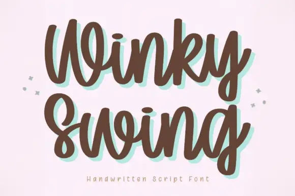
Dixie + Winky Swing
Adds a warm human signature touch for 1-to-3-word callouts without competing against structured serif capitals.
Inspect Winky Swing specimenPractical applications
Concrete hierarchy, scale and production guidance tailored to Dixie’s stroke geometry.
The chunky pointed letters carry a western flavour that suits slow-cooked food, and the weight holds up on a fascia seen from the road.
Hierarchy & layout recipe
Print a 1200 by 400 mm fascia: set the smokehouse name at 140 pt on one row, keep 30 mm of clear ground beneath before the hours at 16 pt, and hold 34 mm at each end so the pointed spurs are not cropped.
Pre-production check
Routed signs blunt sharp spurs; print one panel with the real process and check the points before the second copy.
The period flavour suits a seasonal fair, and the heavy letters stay legible on a board hung above a long table of produce and preserves.
Hierarchy & layout recipe
Print a 400 by 300 mm board: set the stall name at 70 pt on one row, keep 20 mm of clear ground beneath before the prices at 12 pt, and hold 22 mm of border on all four sides.
Pre-production check
Warm browns look flat on foam board; print one sign and check the contrast of the points against the ground.
The face is part of the subject of the book, so a cover set in it needs no photograph of a roadside sign to explain what it is about.
Hierarchy & layout recipe
Print a 210 by 280 mm cover: set the title at 84 pt across two rows, keep 24 mm of clear ground beneath before the author at 11 pt, and hold 18 mm from the widest letter to the trim.
Pre-production check
Heavy coverage on a matte cover scuffs at the corners; print one cover and rub an edge before the run is approved.
Technical & licence verification
Confirm included OTF/TTF/WOFF formats, full glyph tables and licence coverage on the live store page before batch production.
Closest visual alternatives
Matched across letterform anatomy, stroke behaviour and craft applications.
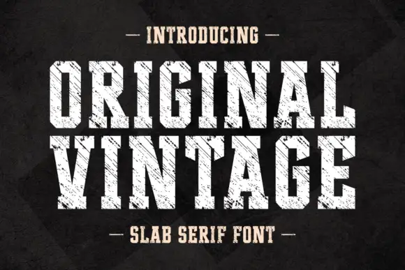
Tall angular slabs covered by diagonal scratches
Original Vintage uses tall white slab capitals with clipped corners and dense diagonal cuts. The scratch direction crosses both rows with a consistent angle, producing a striated surface rather than scattered chip damage, while the black charcoal background stays separate from the letter texture.
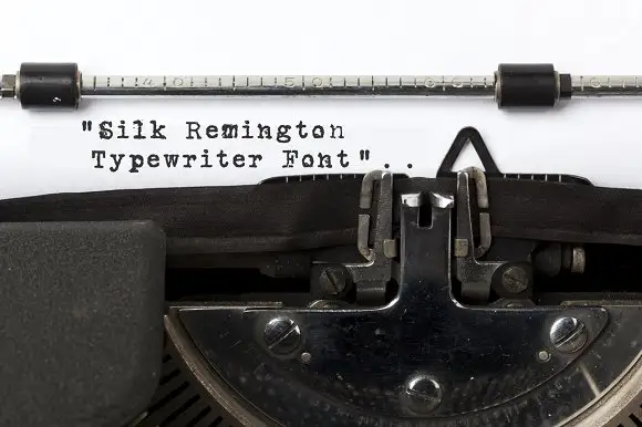
Typewriter slab lettering
Silk Remington is a typewriter face photographed on paper in a machine: uneven letter spacing, dark slab ends, broken ink texture and a few misaligned characters, shown as three short lines in black on a white sheet.
Ideas for this font
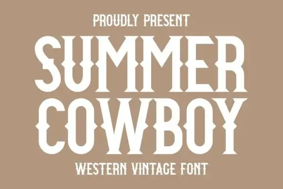
Western vintage display with spurs
Summer Cowboy is a western vintage display in cream on tan: tall capitals with bifurcated serifs, spurred stems and a sharp waist, set in two stacked lines with a small tracked caption beneath, so the pair reads as a printed rodeo handbill rather than a modern slab.
Ideas for this font
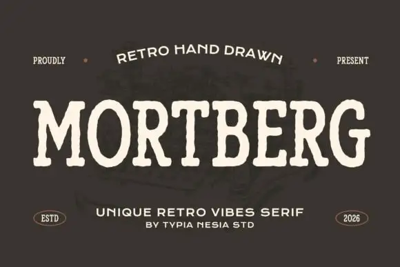
Drawn retro slab display
Mortberg is a drawn retro slab in cream on dark brown: wide capitals with slightly uneven strokes, soft slab ends, open bowls and hand-drawn edges, set as one word beneath an arced line, with small notes at the shoulders and two lines at the foot.
Ideas for this font
Same independent foundry
Allow optional Google Analytics to measure visits and catalogue actions. Your search words and notes are not included. Privacy & storage