High-Contrast Display Serif

Bitblastserif Regular + Lumera Editorial
Pairs sculptural editorial warmth with Bitblastserif Regular's clean modern geometry.
Inspect Lumera Editorial specimenDisclosure: MakerFileHub may earn a commission from qualifying purchases via paid links on this page. How our links work.
Pixel-glitch distressed Y2K serif & sans font duo
Bitblastserif Regular (Bitblast) is an edgy neo-Y2K font duo pairing a pixelated-edge italic serif with a matching bit-crunched sans!
Paid link
Get this fontProject & layout blueprintsAt-a-glance maker compatibility
Fine grain and micro-texture excel in 300 DPI print, sublimation, and screen print rather than small vinyl weeding.
Visual anatomy & craft review
Bitblastserif is a duo: an italic display serif whose contours are chewed into square pixel steps, and a matching bit-crunched sans that stacks under it. The stepped edges are aligned to an implied pixel grid, so the pair reads as a corrupted screen rather than as a distressed texture, and the italic serif carries the upper line while the sans holds the support copy. Because both styles share one grid, the layers line up predictably at 40 mm and above, and the face is a graphic device for covers, flyers and drops rather than for reading.
Pixel-glitch · Y2K-duo · Distressed
Two-font hierarchy recipes
Tested contrast partners — pairing Bitblastserif Regular with grounded secondary typography.
Bitblastserif Regular + Lumera Editorial
Pairs sculptural editorial warmth with Bitblastserif Regular's clean modern geometry.
Inspect Lumera Editorial specimen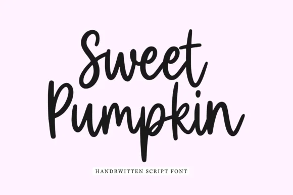
Bitblastserif Regular + Sweet Pumpkin
Introduces organic movement on pull-quotes, signatures and gift tags.
Inspect Sweet Pumpkin specimenPractical applications
Concrete hierarchy, scale and production guidance tailored to Bitblastserif Regular’s stroke geometry.
Pixel-stepped contours read as a corrupted render, which is the native language of breakcore artwork, and the two styles let a cover carry a title and a support line from one system. Square steps survive being printed small on a flyer.
Hierarchy & layout recipe
Cover 312 x 312 mm plus 3 mm bleed, italic title 150 mm, sans support line 30 mm beneath, credits 7 pt. Poster A2, title 260 mm, details 20/26 pt. Zine A5, header 30 mm, body 8.5/12 pt in a plain text face.
Pre-production check
Square steps set on a non-integer scale become uneven, and the corruption looks accidental. Scale in whole multiples of the source grid, and check the final PDF at 100 percent for mismatched pixel widths.
The pair gives a small label a coherent system without a designer: the italic sets the name, the bit-crunched sans sets the date and the price. Stepped shapes read at tag size where a fine texture would vanish.
Hierarchy & layout recipe
Hangtag 50 x 90 mm, name 12 mm, date 4 mm on a 5 mm leading, 5 mm clearance around the punch, 3 mm trim margin. Flyer A6, title 40 mm, lineup 6.5/9 pt in two 40 mm columns. Sticker 60 mm round, word 10 mm, 2 mm die margin and 3 mm clear of the release cut.
Pre-production check
Crashed pixel steps on a die-cut sticker can leave a 0.3 mm sliver that tears away from the backing. Keep the fill 2 mm inside the die, and pull one sticker before printing the pack.
A corrupted-screen aesthetic makes a techno-horror reference that a classic gothic cannot reach, which suits an arcade-themed haunt. Two styles keep the poster structured without a third face.
Hierarchy & layout recipe
Poster 500 x 700 mm, title 300 mm, times 24/30 pt, 40 mm margins. Invite A6, title 24 mm, details 4.5 mm. Lanyard 90 x 60 mm, name 14 mm, 8 mm clip clearance.
Pre-production check
Lanyard cards are printed on both faces and punched at the top, where a stepped contour can crack on the punch. Keep 10 mm of solid card around the punch, and test one card on a clip before the event.
Technical & licence verification
Confirm included OTF/TTF/WOFF formats, full glyph tables and licence coverage on the live store page before batch production.
Closest visual alternatives
Matched across letterform anatomy, stroke behaviour and craft applications.
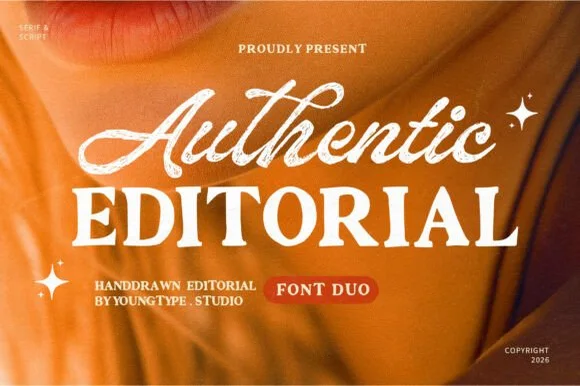
Textured brush signature script & warm hand-crafted serif duo
Authentic Editorial pairs an expressive, textured brush script with a sturdy, softly organic all-caps editorial serif partner.
Ideas for this font
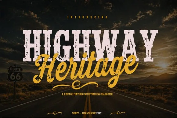
Distressed Route-66 slab serif + bold sign-painter brush script duo
Highway Heritage is a rugged Americana font duo pairing an eroded, stamp-distressed all-caps slab serif with an energetic sign-painter brush script!
Ideas for this font
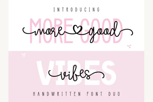
Heart-connected monoline script & tall rounded sans duo
More Good Vibes Duo pairs a bouncy heart-swashed monoline cursive script with a tall, soft-cornered uppercase sans backdrop partner.
Ideas for this font
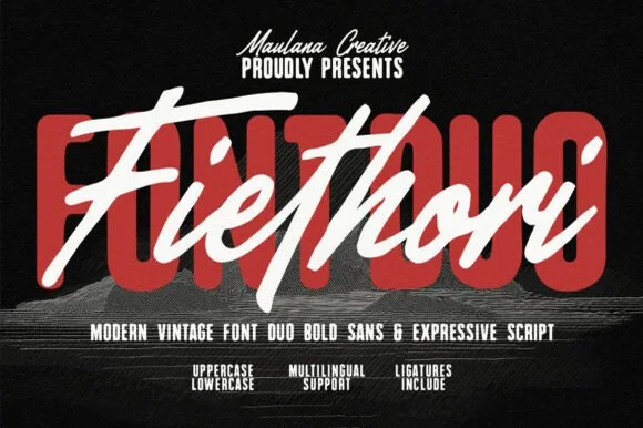
Heavy soft-cornered retro block sans + fast street-brush script duo
Fiethori is a punchy retro-streetwear font duo slamming a massive soft-cornered block sans behind an energetic slanted brush script (Multilingual + Ligatures)!
Ideas for this font
Same independent foundry
Allow optional Google Analytics to measure visits and catalogue actions. Your search words and notes are not included. Privacy & storage