Editorial Serif Anchor

Creative Soul + The Avenue Editorial
Anchors Creative Soul's fluid strokes with crisp Roman proportions on wedding suites, headers and packaging.
Inspect The Avenue Editorial specimenDisclosure: MakerFileHub may earn a commission from qualifying purchases via paid links on this page. How our links work.
Soft rounded handwriting with a low shadow
Creative Soul is a soft rounded handwriting in two stacked lines, drawn with thick even strokes and a gentle lift that gives the words the calm of a planner page rather than the energy of a display face.
Paid link
Get this fontProject & layout blueprintsAt-a-glance maker compatibility
Weld or Unite overlapping script joins into one continuous vector path before sending to the blade.
Visual anatomy & craft review
The C opens wide and round, the r carries a short arm, and the e, a, t, i, v and e keep an almost circular geometry with small counters and blunt, rounded terminals. Weight is heavy and consistent with no thinning at the joins, and the letters stand apart rather than linking, so the two words read as hand-printed rather than cursive. The second line repeats the first at the same width, which is what makes the pair look set rather than written freely, and the slight shadow under each stroke is a printed effect rather than part of the drawing. The tracked label above, the two-line credit at the foot and the pale pink ground are the cover's presentation, and the small diamonds beside the words are drawn decoration.
Soft · Rounded · Warm
Two-font hierarchy recipes
Tested contrast partners — pairing Creative Soul with grounded secondary typography.
Creative Soul + The Avenue Editorial
Anchors Creative Soul's fluid strokes with crisp Roman proportions on wedding suites, headers and packaging.
Inspect The Avenue Editorial specimen
Creative Soul + Swaraga
Keeps small-scale dates, URLs, nutrition facts and care instructions crisp and legible below script titles.
Inspect Swaraga specimenPractical applications
Concrete hierarchy, scale and production guidance tailored to Creative Soul’s stroke geometry.
Soft rounded lettering reads as calm on a shelf full of busy covers, and the heavy even strokes survive the small printed size of a notebook spine where a fine script would disappear.
Hierarchy & layout recipe
Set the title at 46 mm wide on an A5 cover, keep the range name in a small sans at 8 pt at the foot, and hold 20 mm from the lowest letter to the trim so the cover still feels open.
Pre-production check
The printed shadow is the first thing to clog at small sizes; check the spine version at 100 percent, where a heavy stroke plus a shadow can close into a solid line.
A warm, legible hand suits a workshop where people are learning to keep a notebook, and the even weight prints cleanly on the cheap inserts a class will handle.
Hierarchy & layout recipe
Set the workshop title at 30 mm wide on a 105 by 70 mm card, keep the date and time in a plain sans at 9 pt at the foot, and leave the centre clear for a handwritten name.
Pre-production check
Inserts are handled and creased; print on a slightly heavier stock than usual and check that the rounded terminals do not scuff at the corners.
A legible hand-printed face lets a child's folder carry a title that still reads from a stack on a desk, and the calm tone suits work that is meant to be looked at rather than performed.
Hierarchy & layout recipe
Set the subject name at 40 mm wide on an A4 folder, keep the child's name in a plain sans at 12 pt in the corner, and hold 15 mm of clear space so a sticker can be added later.
Pre-production check
Labels on a plastic folder need a matte finish; check the print on the actual folder because gloss plastic makes heavy strokes glare.
Technical & licence verification
Confirm included OTF/TTF/WOFF formats, full glyph tables and licence coverage on the live store page before batch production.
Closest visual alternatives
Matched across letterform anatomy, stroke behaviour and craft applications.
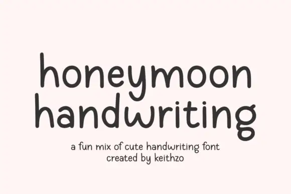
Rounded handwritten sans with tall x-height and evenly spaced letters
Honeymoon Handwriting is rounded handwritten lettering in which the x-height stays tall, the stroke holds one even weight and the letters keep a regular spacing, so a phrase reads as neat handwriting rather than a script.
Ideas for this font
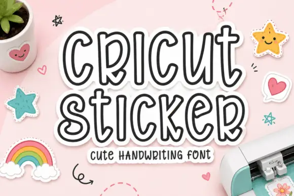
Tall hollow handwritten letters with rounded terminals and an inner contour
Cricut Sticker is tall hollow lettering in which every letter is drawn as an outline with a second contour inside it, so a word reads as a die-cut sticker waiting to be peeled.
Ideas for this font
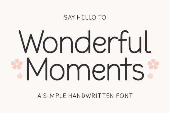
Thin rounded handwritten sans
Wonderful Moments is a thin rounded handwritten sans set in mixed caps: wide open letterforms, a light even stroke with rounded terminals and a small bounce that keeps the line from feeling ruled.
Ideas for this font
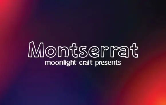
Outline handwritten sans
Montserrat is an outline handwritten sans in white on a dark gradient: unfilled letters drawn with a single rounded line, a small x-height and wide open counters that let the background read through the word.
Ideas for this font
Same independent foundry
Allow optional Google Analytics to measure visits and catalogue actions. Your search words and notes are not included. Privacy & storage