Editorial Serif Anchor

Honeymoon Handwriting + Raffined
Anchors Honeymoon Handwriting's fluid strokes with crisp Roman proportions on wedding suites, headers and packaging.
Inspect Raffined specimenDisclosure: MakerFileHub may earn a commission from qualifying purchases via paid links on this page. How our links work.
Rounded handwritten sans with tall x-height and evenly spaced letters
Honeymoon Handwriting is rounded handwritten lettering in which the x-height stays tall, the stroke holds one even weight and the letters keep a regular spacing, so a phrase reads as neat handwriting rather than a script.
Paid link
Get this fontProject & layout blueprintsAt-a-glance maker compatibility
Weld or Unite overlapping script joins into one continuous vector path before sending to the blade.
Visual anatomy & craft review
The h opens as a tall rounded stem with a wide shoulder, and the letters after it keep that proportion: the o and the e close round bowls, the m holds three even arches, the n repeats the shoulder and the g drops a rounded bowl with a straight tail. Nothing connects and nothing slants, the weight is a consistent monoline with fully rounded ends, and the spacing is regular enough that a long word reads as one tidy line. The tall x-height is the useful property: a phrase set at 14 pt reads almost like a sans, which makes the face suitable for notes, worksheets and small labels where a script would fail. The pale ground, the charcoal ink and the two small caption lines are presentation; the lettering is the two words.
Rounded · Even · Handwritten
Two-font hierarchy recipes
Tested contrast partners — pairing Honeymoon Handwriting with grounded secondary typography.
Honeymoon Handwriting + Raffined
Anchors Honeymoon Handwriting's fluid strokes with crisp Roman proportions on wedding suites, headers and packaging.
Inspect Raffined specimen
Honeymoon Handwriting + Olline
Keeps small-scale dates, URLs, nutrition facts and care instructions crisp and legible below script titles.
Inspect Olline specimenPractical applications
Concrete hierarchy, scale and production guidance tailored to Honeymoon Handwriting’s stroke geometry.
The neat rounded hand reads as a personal note without becoming illegible at small sizes, and the even spacing keeps a short message tidy at 16 pt.
Hierarchy & layout recipe
Set the message at 16 pt on a 105 by 148 mm card, keep the order line in a 7 pt sans at the foot, and leave 12 mm of margin so the tallest stems stay inside the trim.
Pre-production check
A tall x-height at 16 pt can look like a sans rather than handwriting; check the proof and keep the message short so it still reads as a note.
The even hand stays legible at 11 pt on a small tag, and the regular spacing keeps a pair of names from looking cramped.
Hierarchy & layout recipe
Set both names at 11 pt on a 45 by 25 mm label, keep the date in a 5 pt sans beneath, and leave 4 mm of margin so the rounded ends stay inside the cut.
Pre-production check
Small labels printed four-up can drift in registration; check the second impression and confirm the spacing has stayed even.
The tall x-height reads at a distance on a board, and the even stroke keeps a printed sign looking hand-written rather than typeset.
Hierarchy & layout recipe
Set the greeting at 10 cm on a 600 by 400 mm board, set both names at 6 cm beneath it, and leave 10 cm of clear margin so the shoulders stay on the board.
Pre-production check
A monoline painted at 10 cm looks thin from a distance; check the sign in place and use a wider flat brush rather than repeating the stroke.
Technical & licence verification
Confirm included OTF/TTF/WOFF formats, full glyph tables and licence coverage on the live store page before batch production.
Closest visual alternatives
Matched across letterform anatomy, stroke behaviour and craft applications.
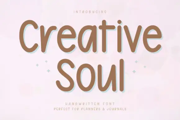
Soft rounded handwriting with a low shadow
Creative Soul is a soft rounded handwriting in two stacked lines, drawn with thick even strokes and a gentle lift that gives the words the calm of a planner page rather than the energy of a display face.
Ideas for this font
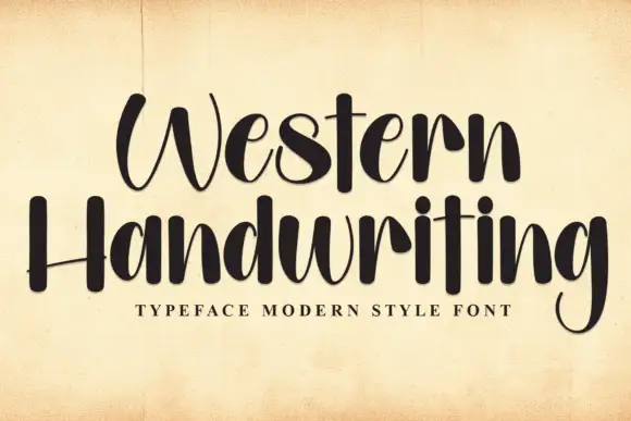
Tall brush handwriting
Western Handwriting is a tall handwritten display in near-black on aged paper: very tall ascenders, a thick-to-thin brush stroke, a bounce across both lines and blunt terminals, with a tracked line beneath naming the category.
Ideas for this font
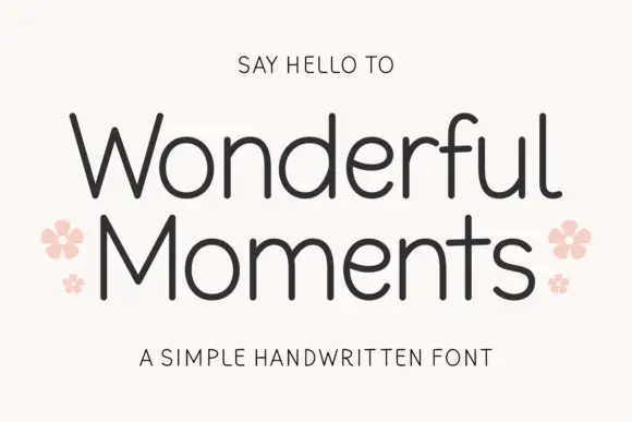
Thin rounded handwritten sans
Wonderful Moments is a thin rounded handwritten sans set in mixed caps: wide open letterforms, a light even stroke with rounded terminals and a small bounce that keeps the line from feeling ruled.
Ideas for this font
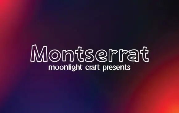
Outline handwritten sans
Montserrat is an outline handwritten sans in white on a dark gradient: unfilled letters drawn with a single rounded line, a small x-height and wide open counters that let the background read through the word.
Ideas for this font
Same independent foundry
Allow optional Google Analytics to measure visits and catalogue actions. Your search words and notes are not included. Privacy & storage



