Editorial Serif Anchor

Crayon + Svara
Anchors Crayon's fluid strokes with crisp Roman proportions on wedding suites, headers and packaging.
Inspect Svara specimenDisclosure: MakerFileHub may earn a commission from qualifying purchases via paid links on this page. How our links work.
Rounded separate lettering with a grainy crayon texture
Crayon is rounded separate lettering with a speckled, grainy fill and letters that never join, so every word reads as a row of soft wax shapes with visible tooth in the edges.
Paid link
Get this fontProject & layout blueprintsAt-a-glance maker compatibility
Weld or Unite overlapping script joins into one continuous vector path before sending to the blade.
Visual anatomy & craft review
Each letter is built from a thick rounded stroke drawn with a dry texture that leaves pinholes of white inside the fill, which is what makes the word look like wax on paper rather than a vector outline. Nothing connects: the r, a, y, o and n all stand apart with even gaps, and the stems of the r and the n are shortened to keep the x-height uniform. The capital C is a single crescent with thick even arms, the y drops a straight diagonal descender with a blunt end, and the o is a near circle. Colour is handled as separate inks in the sample, but the typeface itself carries the texture, so one colour still reads as crayon. The drawn clouds, flowers and stars around the word are presentation; the lettering is the word.
Rounded · Grainy · Playful
Two-font hierarchy recipes
Tested contrast partners — pairing Crayon with grounded secondary typography.
Crayon + Svara
Anchors Crayon's fluid strokes with crisp Roman proportions on wedding suites, headers and packaging.
Inspect Svara specimen
Crayon + Bargain Condensed
Keeps small-scale dates, URLs, nutrition facts and care instructions crisp and legible below script titles.
Inspect Bargain Condensed specimenPractical applications
Concrete hierarchy, scale and production guidance tailored to Crayon’s stroke geometry.
A grainy rounded alphabet signals that a book is for children without a cartoon mascot, and the separated letters are easy to read for a child still learning letter shapes.
Hierarchy & layout recipe
Set the title at 54 pt on an A4 cover, keep the subtitle in a plain 12 pt sans underneath, and leave a 30 mm band at the bottom for the child's name and class.
Pre-production check
Printing a grainy texture on economical school stock can lose the tooth; check one copy on the actual paper and confirm the texture still reads as crayon rather than noise.
The wax texture matches what a child's own drawing looks like, which makes a printed invitation feel homemade, and the separated letters stay legible on a small card passed between parents.
Hierarchy & layout recipe
Set the party line at 30 pt on a 105 by 148 mm invitation, keep the date, time and address in a plain 10 pt sans, and leave the lower third clear for a hand-drawn map.
Pre-production check
Home printers handle texture unevenly on glossy paper; print a test on the actual card stock and keep the lettering off any glare-prone varnish.
A crayon texture names the product category visually, and because the letters stand apart, the shop name stays readable on a shelf tag seen from a metre away.
Hierarchy & layout recipe
Set the shop name at 22 pt on a 70 by 40 mm shelf tag, keep the price in a bold 12 pt grotesque, and leave 4 mm of margin so the rounded terminals do not touch the tag edge.
Pre-production check
Shelf tags are printed cheaply and often in one colour; proof one tag on the real stock and confirm the texture does not break down into a grey smear.
Technical & licence verification
Confirm included OTF/TTF/WOFF formats, full glyph tables and licence coverage on the live store page before batch production.
Closest visual alternatives
Matched across letterform anatomy, stroke behaviour and craft applications.
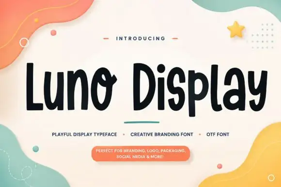
Playful rounded display with an uneven edge
Luno Display is a playful display face in black on cream: fat rounded letters with a slightly uneven outline, a bouncy baseline and quirky joins, shown among soft pastel shapes with a small capital line and a pill-shaped note.
Ideas for this font
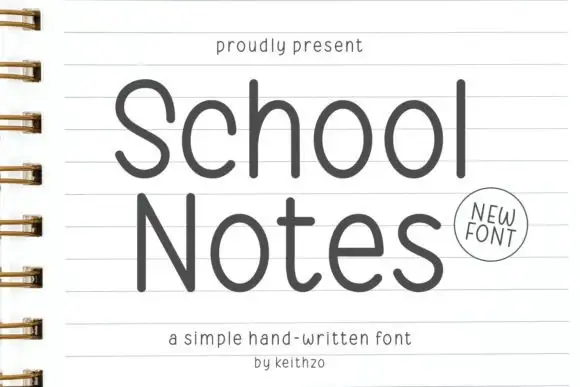
Open rounded notebook print
School Notes is a simple hand-written print in dark grey on ruled notebook paper: tall open letters, thin even strokes and round counters, drawn large enough to fill the page.
Ideas for this font
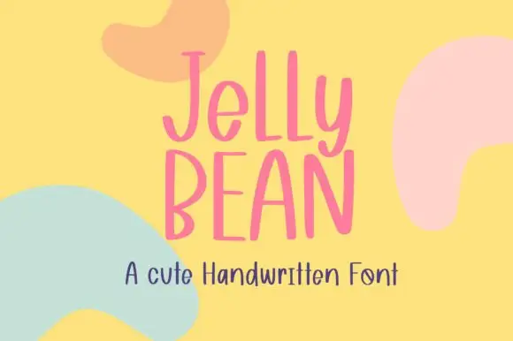
Tall narrow irregular lettering
Jelly Bean Font sets tall narrow capitals in a soft pink over pastel blob shapes, with a rounded sans caption sitting beneath the display line as a second voice.
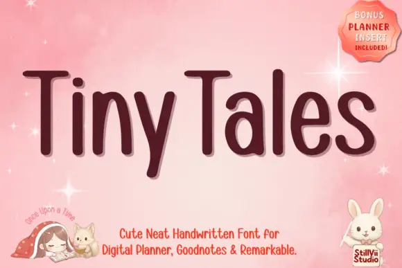
Narrow rounded upright lettering
Tiny Tales is a narrow rounded upright hand in deep plum on pink: compact letters with a high x-height, a light monoline stroke and short ascenders, sold for digital planners and long notes.
Ideas for this font
Same independent foundry
Allow optional Google Analytics to measure visits and catalogue actions. Your search words and notes are not included. Privacy & storage