Editorial Serif Anchor

Jelly Bean Font + Things
Anchors Jelly Bean Font's fluid strokes with crisp Roman proportions on wedding suites, headers and packaging.
Inspect Things specimenDisclosure: MakerFileHub may earn a commission from qualifying purchases via paid links on this page. How our links work.
Tall narrow irregular lettering
Jelly Bean Font sets tall narrow capitals in a soft pink over pastel blob shapes, with a rounded sans caption sitting beneath the display line as a second voice.
Paid link
Get this fontProject & layout blueprintsAt-a-glance maker compatibility
Weld or Unite overlapping script joins into one continuous vector path before sending to the blade.
Visual anatomy & craft review
The display word is drawn very tall and narrow, with uneven stroke widths, small rounded corners and a baseline that shifts a little from letter to letter, which is what keeps it from looking like a condensed sans. The J drops below the baseline, the E keeps a narrow middle arm, and the double letters do not match exactly, so the word reads as hand-drawn even at large sizes. Capitals dominate: the caption beneath is a separate rounded sans and belongs to a different voice. The pastel blobs and the organic shape behind the word are artwork, and the small tracked note at the bottom of the card is a listing label.
Tall · Narrow · Playful
Two-font hierarchy recipes
Tested contrast partners — pairing Jelly Bean Font with grounded secondary typography.
Jelly Bean Font + Things
Anchors Jelly Bean Font's fluid strokes with crisp Roman proportions on wedding suites, headers and packaging.
Inspect Things specimen
Jelly Bean Font + Sailors
Keeps small-scale dates, URLs, nutrition facts and care instructions crisp and legible below script titles.
Inspect Sailors specimenPractical applications
Concrete hierarchy, scale and production guidance tailored to Jelly Bean Font’s stroke geometry.
Tall narrow capitals read from across a room while the uneven drawing keeps the tone playful rather than corporate or clinical.
Hierarchy & layout recipe
Set the headline at 2-inch cap height on A4, keep the caption in a rounded sans at 10 pt beneath, and allow 8 mm below the baseline for the J descender.
Pre-production check
Check the double letters: the face varies them by hand, so a repeated letter can look like a mistake to a client who expects symmetry.
Narrow capitals fit a long phrase into a chart column, which is where a wider display face would force an awkward break.
Hierarchy & layout recipe
Keep the heading at 40 pt across a chart column, set the names in a plain sans at 12 pt, and leave the letters at their drawn spacing rather than tracking them out.
Pre-production check
At 40 pt the uneven baseline is charming; at 12 pt it reads as misalignment, so do not reuse the display face for the list itself.
A tall narrow word fits the curved face of a jar better than a wide display face, and the hand-drawn wobble suits small-batch sweets.
Hierarchy & layout recipe
Print the name at 1-inch cap height on a 45 mm label, keep the flavour in a rounded sans at 8 pt, and leave 5 mm clear above the top of the tallest letter.
Pre-production check
On a curved jar the letters spread apart at the edges, so test the label wrapped around a real jar rather than flat on screen.
Technical & licence verification
Confirm included OTF/TTF/WOFF formats, full glyph tables and licence coverage on the live store page before batch production.
Closest visual alternatives
Matched across letterform anatomy, stroke behaviour and craft applications.
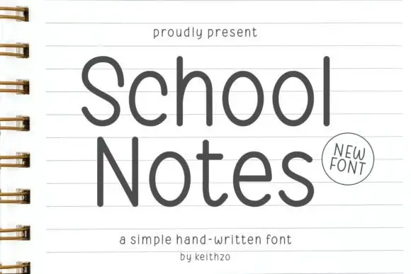
Open rounded notebook print
School Notes is a simple hand-written print in dark grey on ruled notebook paper: tall open letters, thin even strokes and round counters, drawn large enough to fill the page.
Ideas for this font
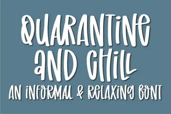
Informal tall hand with soft shadow
Quarantine and Chill is an informal handwritten display in white on slate blue: tall narrow letters, uneven spacing and a soft shadow that lifts the strokes off the ground, with a second line in the same hand.
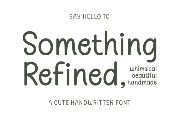
Gentle rounded handwritten print
Something Refined is a gentle rounded handwritten print in charcoal on cream: tall ascenders, open round bowls and a slight forward tilt, calm enough to set a short paragraph.
Ideas for this font
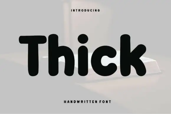
Heavy rounded separate print
Thick is a very heavy rounded hand-drawn sans: fat monoline stems, small round counters and blunt terminals, drawn separately and set in solid black against a pale architectural photograph.
Ideas for this font
Allow optional Google Analytics to measure visits and catalogue actions. Your search words and notes are not included. Privacy & storage