Neutral Sans Workhorse

College Distressed + Lemon Milk Pro FTR
Lets College Distressed own the focal silhouette while handling secondary copy, sizing and subheads cleanly.
Inspect Lemon Milk Pro FTR specimenDisclosure: MakerFileHub may earn a commission from qualifying purchases via paid links on this page. How our links work.
Distressed varsity block capitals with a speckled, chipped edge
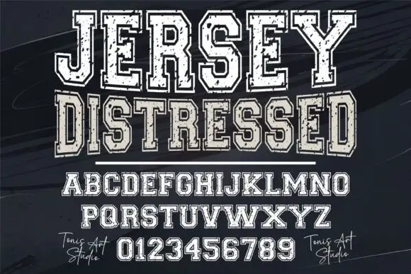
College Distressed is a varsity block capital alphabet in which the slabs stay thick and the contour chips into speckles, so a team name reads as a stencil sprayed on a locker room wall.
Paid link
Get this fontProject & layout blueprintsAt-a-glance maker compatibility
Fine grain and micro-texture excel in 300 DPI print, sublimation, and screen print rather than small vinyl weeding.
Visual anatomy & craft review
The C cuts a thick crescent, the O closes a rectangular bowl, the L turns a slab corner, the E stacks three heavy arms and the G carries a low spur, all at a block weight with square slabs and a heavily broken contour. The distress is the character: the chips are drawn into the outline, so the face carries the worn look without a texture filter, which is why the sample sets two words over a dragged brush. Because the shapes are solid, the face holds from 24 pt and prints in one ink on a light ground. The white ground, the black and tan brush marks and the small script signature are presentation; the distressed words are the face.
Distressed · Varsity · Block
Two-font hierarchy recipes
Tested contrast partners — pairing College Distressed with grounded secondary typography.
College Distressed + Lemon Milk Pro FTR
Lets College Distressed own the focal silhouette while handling secondary copy, sizing and subheads cleanly.
Inspect Lemon Milk Pro FTR specimen
College Distressed + Glofi
Grounds bold display lettering with classic typographic authority on posters, badges and apparel.
Inspect Glofi specimenPractical applications
Concrete hierarchy, scale and production guidance tailored to College Distressed’s stroke geometry.
The chipped slabs suit a worn varsity shirt, and the block weight holds a long class name at 70 mm across a printed chest.
Hierarchy & layout recipe
Print a 300 mm chest print: set the name at 70 mm in one ink, keep every chip at 1 mm minimum so the screen holds, and leave 35 mm of clear shirt below for the year.
Pre-production check
Chips under 1 mm block up in a screen print; check the film at full size and simplify the smallest breaks.
The worn block reads from the end of a car park, and the chipped edge suits a timber market sign at 130 mm in one colour.
Hierarchy & layout recipe
Print a 600 by 400 mm panel: set the headline at 130 mm, keep 30 mm of border, and print on a matte panel so the chips read as texture rather than as gloss.
Pre-production check
A glossy panel under sunlight hides the chipped contour; check the venue and choose a matte substrate.
The distressed varsity caps carry a homecoming poster, and the heavy slabs stay readable at 100 pt beside a match photograph.
Hierarchy & layout recipe
Print an A2 poster: set the headline at 100 pt across the upper third, set the fixture line in a 20 pt caps beneath, and keep 30 mm of clearance so the chips are not crowded by the image.
Pre-production check
Distress printed over a busy photograph looks like noise; check the poster and keep the headline on a plain ground.
Technical & licence verification
Confirm included OTF/TTF/WOFF formats, full glyph tables and licence coverage on the live store page before batch production.
Closest visual alternatives
Matched across letterform anatomy, stroke behaviour and craft applications.
Varsity blocks with a double outline and wear
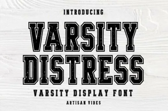
Varsity Distress is a varsity display face in black on white wood: heavy slab capitals described by a double outline, with the interior filled by a speckled, worn texture that reads as a screen printed block.
Ideas for this font
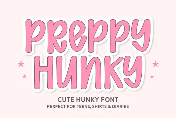
Tall rounded casual letters on a sticker ground
Preppy Hunky is a tall rounded display face in pink on a pale pink ground: fat rounded capitals with a heavy white sticker outline and a soft shadow, set over two lines with small stars at either side.
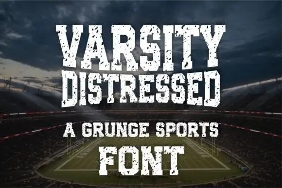
Condensed distressed athletic slab
Varsity Distressed is a condensed athletic slab in white on a stadium photograph: heavy caps with narrow counters and flat slabs, chipped and speckled through the fill, set on four lines in decreasing sizes with a tracked line between them and a credit at the foot.

Tall quirky graduation display
Summer Graduation is a tall quirky display in near-black on a pale blue illustration: narrow letters with small flares at the stems, an open R, a curled G and a slightly irregular rhythm, set in two lines with a tracked caption beneath, so the pair reads as a graduation card rather than a formal diploma face.
Ideas for this font
Same independent foundry
Allow optional Google Analytics to measure visits and catalogue actions. Your search words and notes are not included. Privacy & storage