Neutral Sans Workhorse

Varsity Distress + Homies
Lets Varsity Distress own the focal silhouette while handling secondary copy, sizing and subheads cleanly.
Inspect Homies specimenDisclosure: MakerFileHub may earn a commission from qualifying purchases via paid links on this page. How our links work.
Varsity blocks with a double outline and wear
Varsity Distress is a varsity display face in black on white wood: heavy slab capitals described by a double outline, with the interior filled by a speckled, worn texture that reads as a screen printed block.
Paid link
Get this fontProject & layout blueprintsAt-a-glance maker compatibility
Fine grain and micro-texture excel in 300 DPI print, sublimation, and screen print rather than small vinyl weeding.
Visual anatomy & craft review
Two words are stacked and set very large, and the face is a varsity slab: the stems are heavy, the serifs are flat blocks, the A and the V come to flat apexes, the S closes into squared shoulders and the R has a straight leg. Each letter is drawn twice, once as a solid block and once as an outline offset from it, so the word reads as a printed patch; the interior carries a fine speckle of missing ink, which is the only texture in the design and sits evenly across the letters rather than in patches. The letters are set tight enough that each word becomes a brick, and the ground is a pale wood surface with visible grain. Two tracked capital lines name the product at the foot, and a small maker line closes the page. Varsity Distress is a display face for team wear, school signs, posters and merchandise, and it wants capitals at a large size and a light ground so the speckle can be seen.
Blocked, outlined, distressed
Two-font hierarchy recipes
Tested contrast partners — pairing Varsity Distress with grounded secondary typography.
Varsity Distress + Homies
Lets Varsity Distress own the focal silhouette while handling secondary copy, sizing and subheads cleanly.
Inspect Homies specimen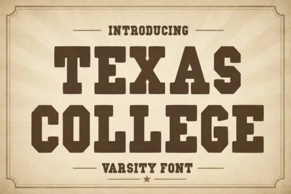
Varsity Distress + Texas College
Grounds bold display lettering with classic typographic authority on posters, badges and apparel.
Inspect Texas College specimenPractical applications
Concrete hierarchy, scale and production guidance tailored to Varsity Distress’s stroke geometry.
A double outline holds its shape when stitched on a heavy fabric, and the worn fill matches a garment that is meant to look used from the first day.
Hierarchy & layout recipe
Print a 250 mm back width: set the team name at 70 mm cap height, keep 25 mm of clear ground above before the number at 180 mm, and hold 55 mm from each shoulder seam.
Pre-production check
A fine speckle can vanish in embroidery; ask for one stitched sample and check the texture before the squad order.
A varsity block reads from across a hall, and the double outline gives the sign a printed depth without a second colour plate.
Hierarchy & layout recipe
Print a 1000 by 350 mm panel: set the name at 180 pt on one line, keep 50 mm of clear ground beneath before the hours at 34 pt, and hold 40 mm of margin on all four sides.
Pre-production check
Speckle texture on a large panel can look like dirt at a distance; view one printed panel from ten metres before the run.
A varsity face marks a section divider without the noise of a photograph, and the outline lets the title sit over a busy page.
Hierarchy & layout recipe
Print a 210 by 280 mm divider: set the section title at 76 pt on one line, keep 26 mm of clear ground beneath before the introduction at 11 pt, and hold 20 mm of margin on all four sides.
Pre-production check
A tight double outline can close at small sizes; keep this face for the divider and set the running text in a plain serif.
Technical & licence verification
Confirm included OTF/TTF/WOFF formats, full glyph tables and licence coverage on the live store page before batch production.
Closest visual alternatives
Matched across letterform anatomy, stroke behaviour and craft applications.
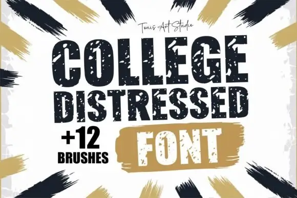
Distressed varsity block capitals with a speckled, chipped edge
College Distressed is a varsity block capital alphabet in which the slabs stay thick and the contour chips into speckles, so a team name reads as a stencil sprayed on a locker room wall.
Ideas for this font
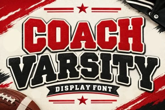
Stadium varsity block with layered outlines and a heavy shadow cut
Coach Varsity is a stadium-style block alphabet supplied with layered outlines, so one word can be built as a red fill, a white inner keyline and a black shadow without redrawing.
Ideas for this font
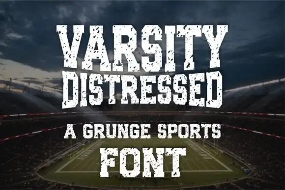
Condensed distressed athletic slab
Varsity Distressed is a condensed athletic slab in white on a stadium photograph: heavy caps with narrow counters and flat slabs, chipped and speckled through the fill, set on four lines in decreasing sizes with a tracked line between them and a credit at the foot.
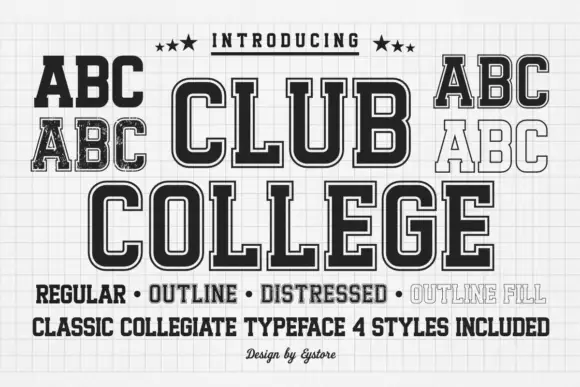
Tall collegiate blocks supplied in regular, outline, distressed and filled styles
Club College is a tall collegiate capital alphabet supplied in four treatments — regular, outline, distressed and outline fill — all built on the same squared skeleton with heavy slabs.
Ideas for this font
Same independent foundry
Allow optional Google Analytics to measure visits and catalogue actions. Your search words and notes are not included. Privacy & storage