Modern Grotesque Body

Club College Distressed + Furion
Creates crisp high-hierarchy contrast beneath Club College Distressed headlines across menus, websites and labels.
Inspect Furion specimenDisclosure: MakerFileHub may earn a commission from qualifying purchases via paid links on this page. How our links work.
Rounded athletic slabs with a fine inner contour and a worn fill
Club College Distressed is a rounded athletic slab in which the black blocks carry a thin pale inner contour and small chips eat into the fill, so a club name reads as a varsity patch already gone soft with wear.
Paid link
Get this fontProject & layout blueprintsAt-a-glance maker compatibility
Fine grain and micro-texture excel in 300 DPI print, sublimation, and screen print rather than small vinyl weeding.
Visual anatomy & craft review
The C rounds its terminals, the O closes a soft ring inside a fine outline, the B stacks two squared bowls and the S turns through rounded curves, all at a collegiate weight with a hairline contour inset and irregular chips through both the face and the contour. Two detail scales run at once, which is why the sample sets a short club name large and keeps the stars and branches well away from the letters. The contour is the wear: print it, do not add it. The face wants 40 pt before the chip pattern reads as texture rather than as a printing fault, and it holds from three quarters of an inch of cap height in vinyl. The gold stars, the laurel and the pale ground are presentation.
Athletic · Outlined · Distressed
Two-font hierarchy recipes
Tested contrast partners — pairing Club College Distressed with grounded secondary typography.
Club College Distressed + Furion
Creates crisp high-hierarchy contrast beneath Club College Distressed headlines across menus, websites and labels.
Inspect Furion specimen
Club College Distressed + Bunglon
Adds a warm human signature touch for 1-to-3-word callouts without competing against structured serif capitals.
Inspect Bunglon specimenPractical applications
Concrete hierarchy, scale and production guidance tailored to Club College Distressed’s stroke geometry.
The worn collegiate blocks read as a long-standing club, and the outline keeps the name legible at 60 mm on a printed banner in two inks.
Hierarchy & layout recipe
Print a 900 by 300 mm banner: set the name at 60 mm, keep the inner contour at 1 mm, and leave 40 mm of clear banner at both ends for the stars rather than pushing them against the letters.
Pre-production check
Chips printed at 1 mm fill in and read as dirt; check the banner at final size and keep the name at 60 mm or above.
The rounded slabs suit fabric, and the distressed fill survives a single-colour screen print at 45 mm across a canvas tote.
Hierarchy & layout recipe
Print a 300 mm tote: set the words at 45 mm on two lines, keep 20 mm between the lines, and burn the screen from the finished artwork rather than adding a distress layer.
Pre-production check
A second distress filter printed over the outline muddies the contour; check the film and print the texture that ships in the file.
The collegiate tone suits a team gift, and the rounded blocks stay clear at 22 pt on a 60 mm kraft tag with a punched hole.
Hierarchy & layout recipe
Print a 60 by 90 mm tag: set the line at 22 pt, punch a 4 mm hole 12 mm from the top, and keep 8 mm between the hole and the outline so the tag does not tear.
Pre-production check
A hole punched inside the outline splits along the contour; check the die and move the hole clear of the letter.
Technical & licence verification
Confirm included OTF/TTF/WOFF formats, full glyph tables and licence coverage on the live store page before batch production.
Closest visual alternatives
Matched across letterform anatomy, stroke behaviour and craft applications.

Distressed athletic varsity display
Sports Varsity Bundle is an athletic display in white on a stadium photograph: heavy condensed caps with thick flat serifs removed in favour of squared terminals, plus a distress that eats both edges, presented with three feature pills naming its bold, distressed and sports character.
Ideas for this font
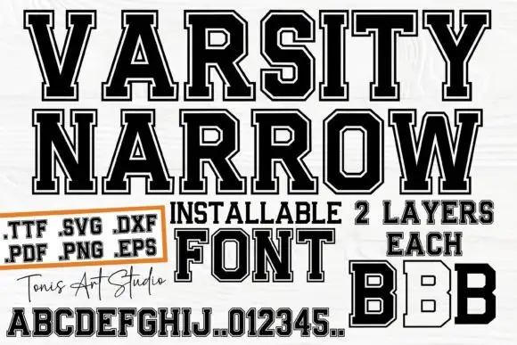
Narrow outlined varsity slabs with clipped corners and an inner border
Varsity Narrow is a narrow athletic slab in which the capitals compress, the corners clip, the O turns an octagonal counter and a fine inner border runs inside the letter, so a long team name fits a narrow board.
Ideas for this font
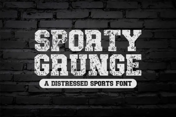
Distressed sports slab
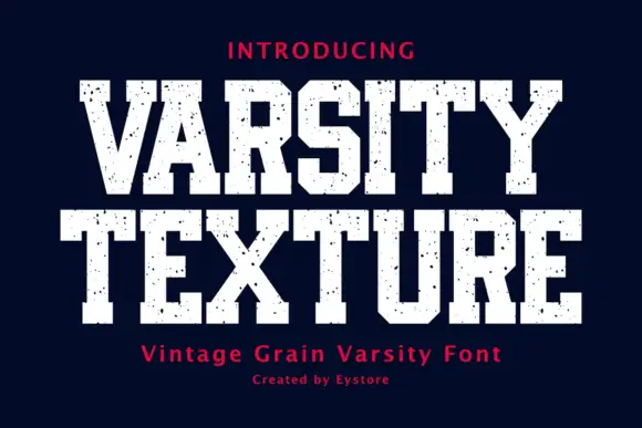
Sporty Grunge is a distressed sports slab in off-white on a dark brick wall: heavy caps with flat tops and thick slabs, the surface eaten by a coarse speckle, a slight arch on the second line, and a tracked caption in a rounded label beneath.
Ideas for this font
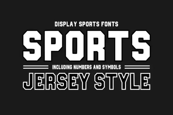
Octagonal sports display with number set
Sports Jersey Style is an octagonal sports display in white on charcoal: heavy caps with cut corners, a flat apex and closed counters, offered solid and outlined, with a double hairline rule, a subtitle in small caps and a note about the numbers and symbols in the family.
Ideas for this font
Same independent foundry
Allow optional Google Analytics to measure visits and catalogue actions. Your search words and notes are not included. Privacy & storage