Modern Grotesque Body

Sports Varsity + Bielchon
Creates crisp high-hierarchy contrast beneath Sports Varsity headlines across menus, websites and labels.
Inspect Bielchon specimenDisclosure: MakerFileHub may earn a commission from qualifying purchases via paid links on this page. How our links work.
Distressed athletic varsity display
Sports Varsity Bundle is an athletic display in white on a stadium photograph: heavy condensed caps with thick flat serifs removed in favour of squared terminals, plus a distress that eats both edges, presented with three feature pills naming its bold, distressed and sports character.
Paid link
Get this fontProject & layout blueprintsAt-a-glance maker compatibility
Fine grain and micro-texture excel in 300 DPI print, sublimation, and screen print rather than small vinyl weeding.
Visual anatomy & craft review
The two words are stacked and each is set in the same skeleton: wide, heavy capitals with flat shoulders and a squared O, which is the standard lettering of a team jersey. The wear is heavy and concentrated on the edges rather than the centres, so the letters look screen printed and worn rather than speckled, and the counters survive because the stems are so thick. The size is large enough that the distress reads as texture rather than damage, and the spacing is tight, so the pair fills the frame as one block. Above the display, a trophy and a line of stars; below it, three small pills with labels, all in the same white, so the specimen reads as a product listing plate rather than a poster. The ground is a floodlit stadium, which gives the type its value contrast.
Athletic, distressed, bold, collegiate
Two-font hierarchy recipes
Tested contrast partners — pairing Sports Varsity with grounded secondary typography.
Sports Varsity + Bielchon
Creates crisp high-hierarchy contrast beneath Sports Varsity headlines across menus, websites and labels.
Inspect Bielchon specimen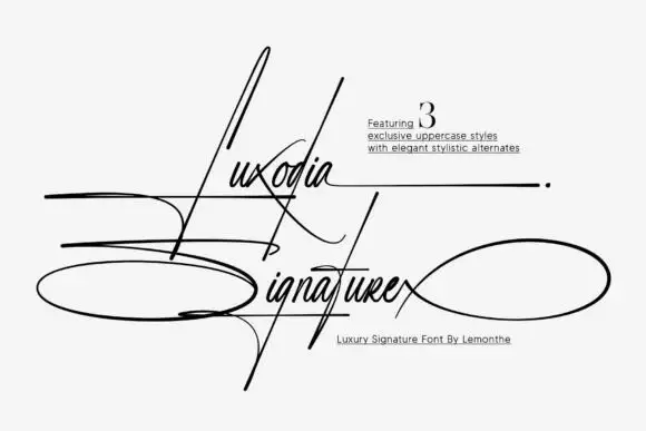
Sports Varsity + Luxodia Signature
Adds a warm human signature touch for 1-to-3-word callouts without competing against structured serif capitals.
Inspect Luxodia Signature specimenPractical applications
Concrete hierarchy, scale and production guidance tailored to Sports Varsity’s stroke geometry.
A distressed athletic face gives a team kit the look of a garment that has been through a season, and the heavy stems hold up in garment print and embroidery.
Hierarchy & layout recipe
Set the team name at 80 mm cap height on a 300 mm chest width, the number in the same face at 130 mm below, and keep the distress moderate for the small details. Print white on a dark jersey in one pass.
Pre-production check
Check the distressed edges at full size, where a 1 mm flake can vanish in the mesh; reduce the wear for garment print. Confirm the number stays legible at 130 mm and that the name clears the shoulder seam on the largest size.
A varsity display gives a gym's merchandise the credibility of athletic kit, and the two-layer screen keeps a small run affordable.
Hierarchy & layout recipe
Print a 280 mm chest graphic: the word at 70 mm in white, the gym name in a 12 mm condensed sans beneath, and a 2 mm keyline. Use one ink on a dark garment so the distress reads as fabric showing through.
Pre-production check
Check the screen at actual mesh, where heavy distress needs a lower mesh to hold flakes; confirm the shop's choice. Wash-test one shirt and verify the wear does not grow until the letterforms weaken.
A varsity display gives a sports annual the look of team kit, and the distressed texture keeps a large cover headline from reading as a flat block.
Hierarchy & layout recipe
Set the title at 140 pt in two lines on a 234 mm cover, the year in a 14 pt sans, and a 0.5 pt rule at the foot. Keep the title over the darkest part of the stadium image and print one ink in white.
Pre-production check
Check the title at 140 pt over the photograph, where a light crowd background can swallow white type; add a gradient scrim behind the headline. Confirm the 14 pt year reads at newsstand distance and that the rule clears the type.
Technical & licence verification
Confirm included OTF/TTF/WOFF formats, full glyph tables and licence coverage on the live store page before batch production.
Closest visual alternatives
Matched across letterform anatomy, stroke behaviour and craft applications.
Distressed sports slab
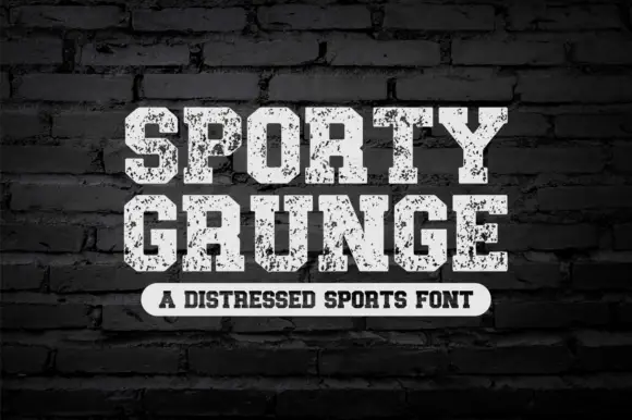
Sporty Grunge is a distressed sports slab in off-white on a dark brick wall: heavy caps with flat tops and thick slabs, the surface eaten by a coarse speckle, a slight arch on the second line, and a tracked caption in a rounded label beneath.
Ideas for this font
Outlined collegiate slabs with speckled wear
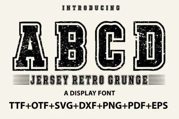
Jersey Retro Grunge shows large collegiate A, B, C and D forms with broad slabs and clipped corners, where a pale inset outline separates the dark letter bodies from an outer black edge and small scratches and holes roughen both the fill and the contour.
Ideas for this font
Varsity slab with double outline and wear
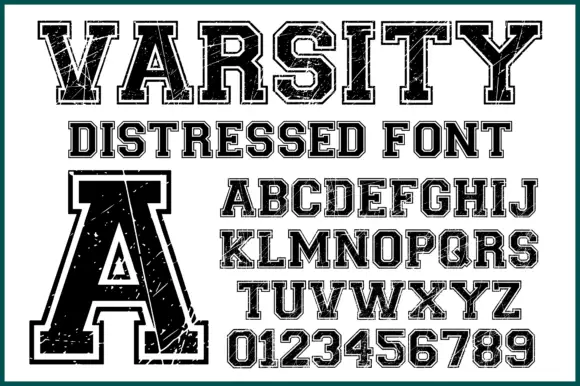
Varsity Distressed is a varsity slab in black on white: heavy capitals with flat serifs, a double outline that follows the silhouette, and a worn texture across the fill, shown with a full alphabet and a digit set.
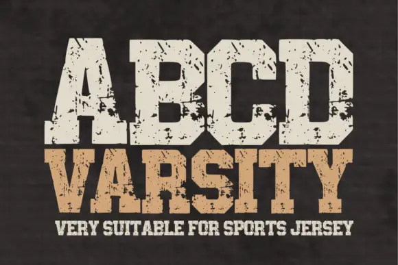
Wide athletic capitals with chamfered bowls and rough chips through the slabs
Abcd Varsity is a wide athletic slab in which the flat ends sit close, the bowls chamfer at the corners and irregular chips eat through the heavy slabs, so a two-word title reads as a weathered collegiate board.
Same independent foundry
Allow optional Google Analytics to measure visits and catalogue actions. Your search words and notes are not included. Privacy & storage



