Neutral Sans Workhorse

Chunky Funky + Sailors
Lets Chunky Funky own the focal silhouette while handling secondary copy, sizing and subheads cleanly.
Inspect Sailors specimenDisclosure: MakerFileHub may earn a commission from qualifying purchases via paid links on this page. How our links work.
Extra-heavy bouncy block with chalk texture and rounded corners
Chunky Funky is an extra-heavy block alphabet with a chalk texture, rounded corners and a bounce across the baseline, so a word reads as something drawn thick on a blackboard.
Paid link
Get this fontProject & layout blueprintsAt-a-glance maker compatibility
Fine grain and micro-texture excel in 300 DPI print, sublimation, and screen print rather than small vinyl weeding.
Visual anatomy & craft review
The C opens a wide crescent, the h keeps a fat stem and a rounded shoulder, the u holds a deep bowl and the n keeps a wide shoulder, all at a maximal weight with fully rounded ends and a grain inside each stroke. The bounce shifts letters up and down by a few millimetres, which keeps a short word from looking rigid at 60 pt. That combination — the extreme weight and the chalk grain — is what makes the face read as hand-drawn rather than as a heavy grotesque, and it survives a print on a dark ground where the grain shows as lighter flecks. Counters are small, so 24 pt is the floor. The blackboard, the wooden shelf, the chalks and the two small credits are presentation; the display face is the two words.
Ultra-bold · Bouncy · Chalky
Two-font hierarchy recipes
Tested contrast partners — pairing Chunky Funky with grounded secondary typography.
Chunky Funky + Sailors
Lets Chunky Funky own the focal silhouette while handling secondary copy, sizing and subheads cleanly.
Inspect Sailors specimen
Chunky Funky + Evoire
Grounds bold display lettering with classic typographic authority on posters, badges and apparel.
Inspect Evoire specimenPractical applications
Concrete hierarchy, scale and production guidance tailored to Chunky Funky’s stroke geometry.
The chalk grain and the bounce give a printed heading the look of real board writing at 40 mm, which is what a classroom display wants without the dust.
Hierarchy & layout recipe
Print a 700 by 450 mm board: set the heading at 40 mm across the upper half, set the class list in a 12 mm rounded sans beneath, and keep 25 mm of border so the bounced letters sit inside the printed panel.
Pre-production check
A chalk grain printed at small sizes reads as dust; check the proof and keep the textured cut above 25 mm.
The heavy bouncing letters carry a printed backdrop at 70 mm, and the chalk texture gives a flat print some material character.
Hierarchy & layout recipe
Print a 1.2 by 1 m backdrop: set the greeting at 70 mm, keep 10 mm between letters so the rounded ends stay separate, and leave 12 cm of blank paper at each end so the fixings land on plain ground.
Pre-production check
A chalk texture on glossy backdrop paper looks like noise; check a printed sample and choose a matte stock for the grain.
The heavy grain reads on a folder cover at 24 pt, and the bounce makes a routine school label feel made rather than typed out.
Hierarchy & layout recipe
Print an A4 folder cover: set the club name at 24 pt across the upper half, set the pupil's name in a 10 pt rounded sans at the foot, and keep a 25 mm band in the middle for the spine fold so no letter crosses it.
Pre-production check
A fold running through a letter cracks the print; check the artwork against the spine position and shift the type clear of the crease.
Technical & licence verification
Confirm included OTF/TTF/WOFF formats, full glyph tables and licence coverage on the live store page before batch production.
Closest visual alternatives
Matched across letterform anatomy, stroke behaviour and craft applications.
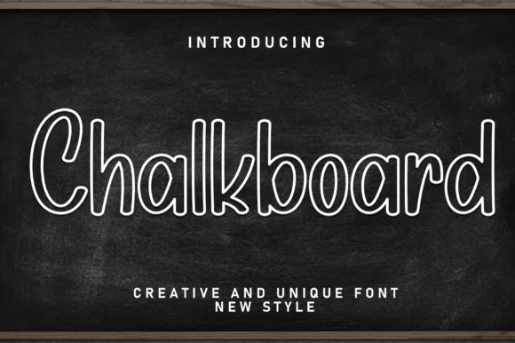
Hollow outlined school print with rounded counters and even strokes
Chalkboard is a clean hollow-outline print in which every letter is drawn as a double contour, so a word reads as chalk lettering on a board without the texture of real chalk.
Ideas for this font
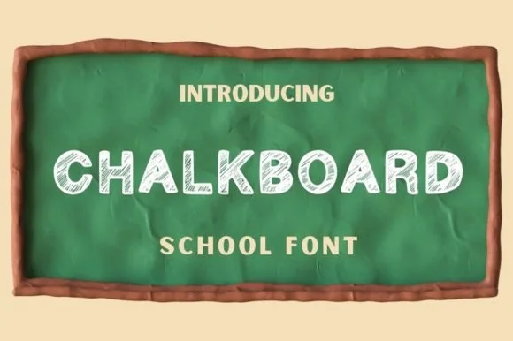
Hand-shaded classroom chalk capitals with hatched texture
Chalkboard is a classroom display alphabet in capitals, drawn with a hatched interior so each stroke reads as chalk dragged across a board rather than a solid fill.
Ideas for this font
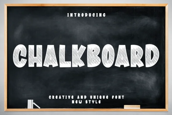
Chunky comic-block display shaded with dense chalk strokes
Chalkboard (by andikastudio) is a wide, chunky cartoon-block display font densely shaded inside with diagonal white-chalk strokes.
Ideas for this font
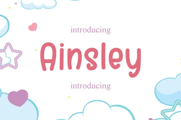
Solid marker-weight print with rounded joins and open counters
Ainsley is a solid marker-weight print in which the strokes keep an even thickness, the corners round off and the counters stay open, so a name reads as lettering written with a felt tip and then cleaned up for cutting.
Ideas for this font
Same independent foundry
Allow optional Google Analytics to measure visits and catalogue actions. Your search words and notes are not included. Privacy & storage