High-Contrast Display Serif

Digital Paper + Alerigue
Pairs sculptural editorial warmth with Digital Paper's clean modern geometry.
Inspect Alerigue specimenDisclosure: MakerFileHub may earn a commission from qualifying purchases via paid links on this page. How our links work.
Dense lowercase with slanted bowls, upright ascenders and deep descenders
Digital Paper sets a heavy condensed sans in lowercase on a collage of pastel paper, the letters tall and close together so the two words read as one dark block against the pattern.
Paid link
Get this fontProject & layout blueprintsAt-a-glance maker compatibility
Sturdy stroke walls and open counters weed cleanly on adhesive vinyl, HTV apparel film, and cut cardstock.
Visual anatomy & craft review
The name runs in two stacked rows, the d and the p dropping long ascenders and descenders that nearly meet between the lines, and the bowls kept narrow so the weight does not turn the word into a slab. Spacing is tight and the strokes even, so the face reads as a modern headline cut rather than as a poster display. A small drop shadow separates the words from the busy background, which is a treatment rather than a feature of the face. Two captions name the style. It is a useful headline weight, and its weakness is the same as its strength: at small sizes the tight letters touch.
Dense lowercase with slanted bowls, upright ascenders and deep descenders
Two-font hierarchy recipes
Tested contrast partners — pairing Digital Paper with grounded secondary typography.
Digital Paper + Alerigue
Pairs sculptural editorial warmth with Digital Paper's clean modern geometry.
Inspect Alerigue specimen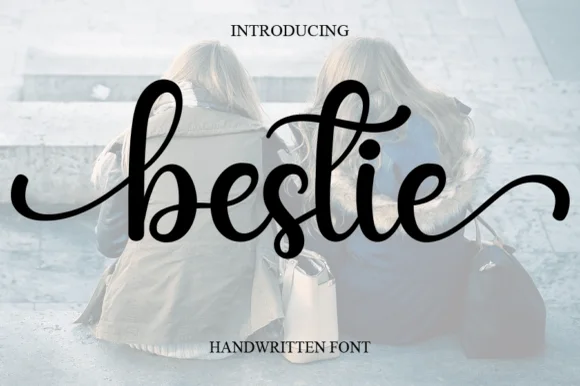
Digital Paper + Bestie
Introduces organic movement on pull-quotes, signatures and gift tags.
Inspect Bestie specimenPractical applications
Concrete hierarchy, scale and production guidance tailored to Digital Paper’s stroke geometry.
The condensed weight fits a long product name on a slim box face, and the dark block reads clearly against a patterned wrap.
Hierarchy & layout recipe
Print a 60 by 160 mm box face: set the product at 16 pt on one row, keep 9 mm of clear ground beneath before the count at 6 pt, and keep 6 mm of margin so the ascenders are not trimmed.
Pre-production check
The pattern behind the type needs contrast; check a proof on the printed wrap first. Verify the result on the printed piece, then approve.
The heavy condensed line holds a long headline over a full-bleed photograph, and the tight spacing keeps the whole block compact.
Hierarchy & layout recipe
Print a 210 by 280 mm page: set the headline at 60 pt across three lines, keep 18 mm of clear ground beneath before the standfirst at 10 pt, and keep 16 mm of margin from the text block.
Pre-production check
Tight lines can touch at small leading; check the printed page before the issue is signed.
The heavy words read across a crowded hall, and the condensed proportions fit the fair name and the opening date on one sheet.
Hierarchy & layout recipe
Print an A2 poster: set the name at 110 pt across two rows, keep 28 mm of clear ground beneath before the date at 18 pt, and keep 26 mm of border so the descenders stay inside.
Pre-production check
Descenders can cross the trim; check the layout at final size before the print order. Print a sample and re-check it at final size.
Technical & licence verification
Confirm included OTF/TTF/WOFF formats, full glyph tables and licence coverage on the live store page before batch production.
Closest visual alternatives
Matched across letterform anatomy, stroke behaviour and craft applications.

Bold modern geometric sans
Olline is a bold geometric sans in red on black: circular counters, a heavy even stroke, a lowercase with a straight-sided o and a dot that floats away from the i, presented at extreme size with small tracked captions in the corners, so the plate reads as a contemporary identity study.
Ideas for this font

Open rounded mixed case with a tall t and broad circular bowls
Cultivo shows a large black title-case name across the lower part of a pale beige cover, where light to moderate nearly even strokes form an open C, a broad u and near-circular bowls, the t finishes with a rounded lower turn and the v opens a clean diagonal.
Ideas for this font
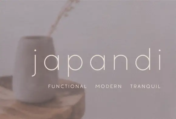
Widely spaced thin lowercase with circular bowls and a hooked j descender
Japandi draws its lowercase in a hairline geometric line, keeps the bowls almost circular and sets the words far apart on a soft photographic ground so the type feels like a room rather than a label.
Ideas for this font

Soft substantial mixed case with rounded ends and a long diagonal a join
Inkora shows pale title-case lettering along the bottom of a near-black field: substantial nearly even strokes end in gentle rounds, with a tall plain I, open k arms, a circular o and a broad r shoulder.
Ideas for this font
Same independent foundry
Allow optional Google Analytics to measure visits and catalogue actions. Your search words and notes are not included. Privacy & storage