Neutral Sans Workhorse

Lucky Retro + Saltriver Grotesk
Lets Lucky Retro own the focal silhouette while handling secondary copy, sizing and subheads cleanly.
Inspect Saltriver Grotesk specimenDisclosure: MakerFileHub may earn a commission from qualifying purchases via paid links on this page. How our links work.
Retro display with extrusion
Lucky Retro is a retro display in pink with a maroon extrusion on a striped ground: wide caps with rounded corners, a thin inline highlight, a hard shadow that steps down and right, and four-point sparkles at the sides, so the plate reads as a seventies poster headline.
Paid link
Get this fontProject & layout blueprintsAt-a-glance maker compatibility
Sturdy stroke walls and open counters weed cleanly on adhesive vinyl, HTV apparel film, and cut cardstock.
Visual anatomy & craft review
Two words are stacked and the drawing is a wide display sans with soft corners: the strokes are even, the counters are large, and each letter carries a thin highlight along one edge and a solid extrusion behind, which builds two layers of depth without a gradient. The extrusion is consistent, so the pair reads as one object, and the wide letters let a short word fill a poster without extra spacing. The ground is a set of diagonal stripes in four muted tones, which gives the plate its period energy, and the sparkles at either side echo the shape language. Two tracked captions above and below are set in a small sans, so the display does all the work and the stripe pattern supplies the context.
Retro, extruded, bold, playful
Two-font hierarchy recipes
Tested contrast partners — pairing Lucky Retro with grounded secondary typography.
Lucky Retro + Saltriver Grotesk
Lets Lucky Retro own the focal silhouette while handling secondary copy, sizing and subheads cleanly.
Inspect Saltriver Grotesk specimen
Lucky Retro + Amor Hadena
Grounds bold display lettering with classic typographic authority on posters, badges and apparel.
Inspect Amor Hadena specimenPractical applications
Concrete hierarchy, scale and production guidance tailored to Lucky Retro’s stroke geometry.
A striped ground and an extruded display read as a seventies poster, and the flat layers keep the print cheap while the extrusion gives the type presence at distance.
Hierarchy & layout recipe
A2 portrait: the headline at 120 mm cap height, the stalls in a 14 mm sans, and the dates at 22 mm. Keep 30 mm margins, print four flat colours, and align the stripes to the sheet edges so they read as a design choice.
Pre-production check
Check the poster at five metres, where the extrusion can merge with the stripes; keep the stripes low in contrast behind the type. Confirm the 14 mm stalls read at two metres and that the dates sit on one baseline.
A retro display sets a decade theme on a small card, and the two-layer build keeps the type readable against a patterned ground where a flat face would vibrate.
Hierarchy & layout recipe
A6 card: the phrase at 28 pt, the details in a 9 pt sans, and a 3 mm border. Keep 12 mm margins and print three flat colours on a cream card so the extrusion reads as a separate layer.
Pre-production check
Check the 28 pt phrase, where the inline highlight can close; keep the highlight at least 0.5 mm. Confirm the 9 pt details keep a 4.5:1 contrast and that the stripes do not run behind the small type.
A retro label stands out in a chiller of clean designs, and the extrusion gives the brand depth on a flat can where a shadow effect would print poorly.
Hierarchy & layout recipe
Print a 60 by 90 mm label: the flavour at 17 pt, the volume in a 7 pt sans, and the brand at 8 pt. Keep 5 mm inside the die and print three flat colours on a coated stock so the extrusion stays crisp.
Pre-production check
Check the 17 pt flavour on a curved can, where the outer letters distort; reduce the tracking. Confirm the 7 pt volume reads in the chiller and that the extrusion does not fill the counters.
Technical & licence verification
Confirm included OTF/TTF/WOFF formats, full glyph tables and licence coverage on the live store page before batch production.
Closest visual alternatives
Matched across letterform anatomy, stroke behaviour and craft applications.
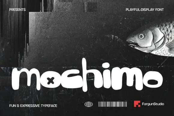
Playful fat rounded display
Mochimo is a playful fat display in white on a dark collage: lowercase letters with inflated bowls, tight spacing, an x cut into one counter and a bouncing baseline, presented with small agency marks at the corners, so the plate reads as a contemporary brand experiment.
Ideas for this font
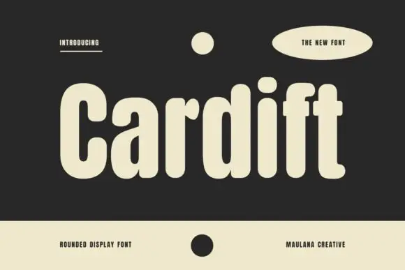
Tall heavy mixed case with deeply rounded bowls and short projecting crossbars
Cardift shows pale lettering on charcoal: a high narrow C opens beside rounded a and d bowls, the heavy stems finish softly and the f and t crossbars project only a short distance past the stroke, with a large round i dot above a compact centre.
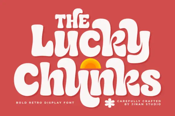
Bulging retro forms with curled joins
Lucky Chunks is a bold retro display face in cream on terracotta: very fat letters whose bowls bulge past the stems, curled joins between the letters of a word, and a half-sun arch drawn between the two lines.
Ideas for this font
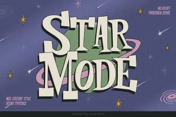
Mid-century retro display
Star Mode is an uneven retro display in cream on a lilac space scene: tall slabs with exaggerated triangular feet, a bouncing baseline, a dark offset shadow and a bowl-like counter, set on two lines around a ringed planet and scattered stars.
Ideas for this font
Same independent foundry
Allow optional Google Analytics to measure visits and catalogue actions. Your search words and notes are not included. Privacy & storage



