Neutral Sans Workhorse

Caelan + Miniplate
Lets Caelan own the focal silhouette while handling secondary copy, sizing and subheads cleanly.
Inspect Miniplate specimenDisclosure: MakerFileHub may earn a commission from qualifying purchases via paid links on this page. How our links work.
Dense blackletter capitals filled with curled leaves and narrow pale channels
Caelan is an ornate blackletter calligraphic face in which the capitals carry drawn ornament inside their stems, while the lowercase keeps a clean textura rhythm.
Paid link
Get this fontProject & layout blueprintsAt-a-glance maker compatibility
Sturdy stroke walls and open counters weed cleanly on adhesive vinyl, HTV apparel film, and cut cardstock.
Visual anatomy & craft review
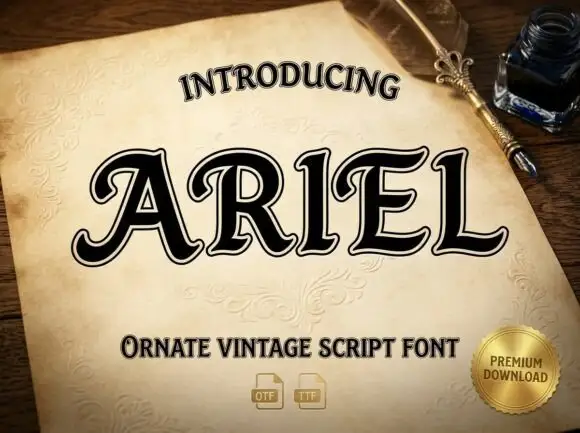
CAELAN fills the middle of a scroll of parchment held by a candle and an ink pot, drawn in solid black with a heavy outline and a mass of interior curls on the C, the A and the E. Around the scroll a printed grid shows the full set: capitals each with their own flourishes, a lowercase row, numerals and punctuation, all laid out with small labels in a technical hand. Three lines under the word name the style and the formats, and a printed line at the very bottom credits the foundry. The contrast is deliberate: the capitals are the ornamented showpieces and the lowercase is a working textura that can carry a sentence, which is what makes the set usable on a title page rather than only on a cover.
Dense blackletter capitals filled with curled leaves and narrow pale channels
Two-font hierarchy recipes
Tested contrast partners — pairing Caelan with grounded secondary typography.
Caelan + Miniplate
Lets Caelan own the focal silhouette while handling secondary copy, sizing and subheads cleanly.
Inspect Miniplate specimen
Caelan + Papillon Serif – Elegant Modern Luxury
Grounds bold display lettering with classic typographic authority on posters, badges and apparel.
Inspect Papillon Serif – Elegant Modern Luxury specimenPractical applications
Concrete hierarchy, scale and production guidance tailored to Caelan’s stroke geometry.
The ornamented capitals give a title page the look of an illuminated manuscript, and the plain lowercase keeps the subtitle readable at text size.
Hierarchy & layout recipe
Print a 135 by 216 mm title page: set the title at 40 pt with a decorated capital on the first word, keep 30 mm of clear ground beneath before the imprint at 9 pt, and hold 20 mm of margin left and right of the widest flourish.
Pre-production check
Decorated stems fill in on uncoated paper; print one page on the actual stock and check the curls before the signatures.
The ornamented letters suggest an old book rather than a costume party, and the heavy black fills read across a dim room without a picture behind them.
Hierarchy & layout recipe
Print a 420 by 594 mm poster: set the event name at 100 pt across two rows, keep 28 mm of clear ground beneath before the time at 14 pt, and hold 26 mm of margin so the flourishes stay inside the sheet.
Pre-production check
Large decorated capitals lose their interior detail when printed at speed; print one poster and check the ornament first.
The illuminated capitals suit a bottle that carries a recipe older than the brand, and the small lowercase keeps the ingredients legible.
Hierarchy & layout recipe
Print a 60 by 105 mm label: set the brand name at 20 pt with a decorated first letter, keep 7 mm of clear ground beneath before the strength at 4.5 pt, and hold 5 mm from the flourish to the die line.
Pre-production check
Fine curls close up on a small label; print one label on the real stock and check the decorated C before the order.
Technical & licence verification
Confirm included OTF/TTF/WOFF formats, full glyph tables and licence coverage on the live store page before batch production.
Closest visual alternatives
Matched across letterform anatomy, stroke behaviour and craft applications.
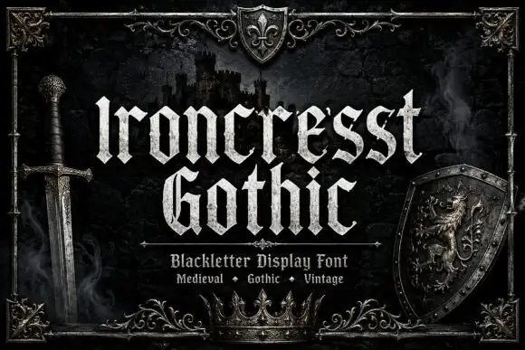
Dense angular blackletter with forked tops and textured fill
Ironcrest Gothic is a medieval display blackletter with a strong vertical stress, diamond feet and a slightly worn fill, framed by heraldic pieces: a shield, a crown, a sword and a lion.
Ideas for this font
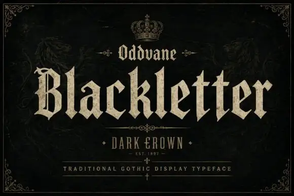
Angular gothic display
Oddvane is an angular gothic display in cream on black: narrow broken strokes with sharp spurs, a split B, broad notched feet and a small crown above the title, with a boxed line beneath naming the collection and a ruled line under that.
Ideas for this font
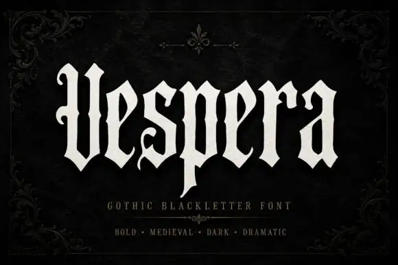
Tall open blackletter
Vespera is a tall open blackletter in bone on a black damask ground: a hooked V, a descending p, fine hairlines between the heavy strokes and open counters, set as one word with a plain descriptor and three style words beneath, framed by a fine corner ornament.
Ideas for this font
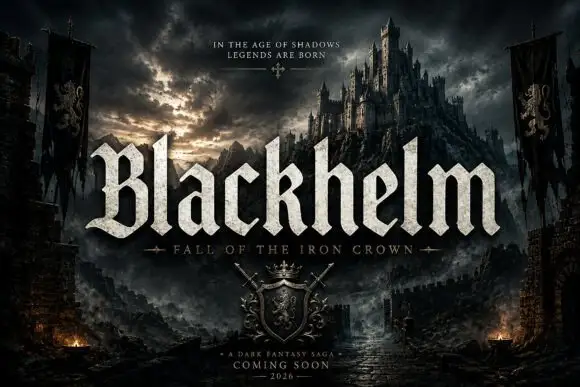
Broad blackletter with sharply peaked shoulders and forked B
Blackhelm is a bold blackletter display face with wide letters, a heavy stem weight and a surface that looks chiselled from weathered stone rather than drawn with a broad nib.
Ideas for this font
Same independent foundry
Allow optional Google Analytics to measure visits and catalogue actions. Your search words and notes are not included. Privacy & storage