Neutral Sans Workhorse

Captain Tall Ship + Corven
Lets Captain Tall Ship own the focal silhouette while handling secondary copy, sizing and subheads cleanly.
Inspect Corven specimenDisclosure: MakerFileHub may earn a commission from qualifying purchases via paid links on this page. How our links work.
Tall distressed capitals on a curved nautical banner
Captain Tall Ship reads as a tall capital line on broad cream ribbon panels: narrow bodies with clipped corners carry rough pale gaps across the strokes, the row follows a curve and the weathered surface covers the whole cover.
Paid link
Get this fontProject & layout blueprintsAt-a-glance maker compatibility
Fine grain and micro-texture excel in 300 DPI print, sublimation, and screen print rather than small vinyl weeding.
Visual anatomy & craft review
The letters stay narrow and tall, the corners clip, the wear arrives as pale gaps along the strokes and the row bends with the banner it sits on. The curved placement is the character: the title reads as painted signage rather than set type, which is why the sample arranges it on ribbon panels with rope edges. Because the wear is presentation until the files prove otherwise, proof the chosen words at final size, and note the cover advertises two fonts whose differences are not shown.
Nautical · Distressed · Curved
Two-font hierarchy recipes
Tested contrast partners — pairing Captain Tall Ship with grounded secondary typography.
Captain Tall Ship + Corven
Lets Captain Tall Ship own the focal silhouette while handling secondary copy, sizing and subheads cleanly.
Inspect Corven specimen
Captain Tall Ship + The Bilstein Editorial
Grounds bold display lettering with classic typographic authority on posters, badges and apparel.
Inspect The Bilstein Editorial specimenPractical applications
Concrete hierarchy, scale and production guidance tailored to Captain Tall Ship’s stroke geometry.
The tall capitals suit a waterfront sign, and the clipped corners hold a two-word name at 70 mm on a painted board. The narrow bodies also keep a long name inside one row.
Hierarchy & layout recipe
Paint a 700 by 300 mm board: set the name at 70 mm on a gentle arc, keep 24 mm of border so the clipped corners stay inside, and set the opening hours in a 15 mm caps beneath.
Pre-production check
An arc drawn too tight buckles the narrow stems; check the layout and keep the curve under 15 degrees. Check the mounted sign in daylight.
The nautical lettering suits a bottle, and the narrow caps stay solid at 22 pt on a 55 mm label. The wear also gives a bottle age without a second ink.
Hierarchy & layout recipe
Print a 55 by 70 mm label: set the brand at 22 pt, keep the wear marks at 1 mm minimum, and set the volume in a 6 pt caps at the foot with 5 mm of clear ground. Keep the volume line small.
Pre-production check
Wear marks printed under 0.8 mm read as dirt; check the plate proof and keep the brand at 20 pt or above. Ask for a plate proof of the label.
The curved row sets a nautical feature, and the tall bodies hold a two-word title at 52 pt across a page. The narrow letters also hold a feature title.
Hierarchy & layout recipe
Print a 210 mm page: set the title at 52 pt along a shallow arc, keep 20 mm of clear ground beneath before the standfirst at 10 pt, and keep the block on the upper third. Keep the block on the upper third.
Pre-production check
Two fonts are advertised but their differences are not shown; confirm which cut carries the wear before styling a full page.
Technical & licence verification
Confirm included OTF/TTF/WOFF formats, full glyph tables and licence coverage on the live store page before batch production.
Closest visual alternatives
Matched across letterform anatomy, stroke behaviour and craft applications.
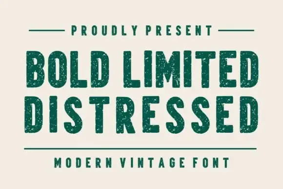
Condensed plain blocks with fine worn texture
Bold Limited Distressed shows tall heavy capitals with softly squared corners and tight inner spaces, where small pale speckles interrupt the green stems without greatly changing the outer silhouettes.
Ideas for this font
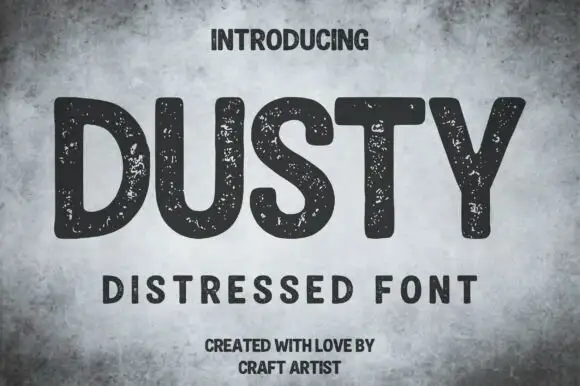
Rounded distressed capitals with broad strokes
Dusty shows thick mostly upright capitals with rounded corners and wide open letter spaces on a mottled grey field, where numerous small pale speckles interrupt the dark strokes without turning the letters into thin outlines.
Ideas for this font
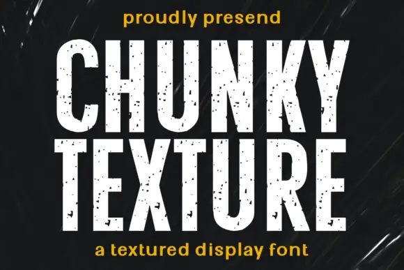
Condensed heavy capitals with sparse chips across pale faces
Chunky Texture is a condensed heavy display in which the stems run straight, the bowls stay compact and fine specks plus occasional larger chips interrupt the faces, so a heading reads as painted stencil with light wear.
Ideas for this font
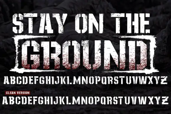
Grunge stamped display with clean cut
Stay On The Ground is a grunge display in red and white over a dark texture: heavy squared caps with a coarse stamp-like wear, a second line boxed inside a rough rectangle, and beneath it a full alphabet shown twice — once worn and once clean — with a small note marking the clean version.
Ideas for this font
Allow optional Google Analytics to measure visits and catalogue actions. Your search words and notes are not included. Privacy & storage