Neutral Sans Workhorse

Moonscythe + Mango Dream
Lets Moonscythe own the focal silhouette while handling secondary copy, sizing and subheads cleanly.
Inspect Mango Dream specimenDisclosure: MakerFileHub may earn a commission from qualifying purchases via paid links on this page. How our links work.
Experimental gothic display with long ligatures
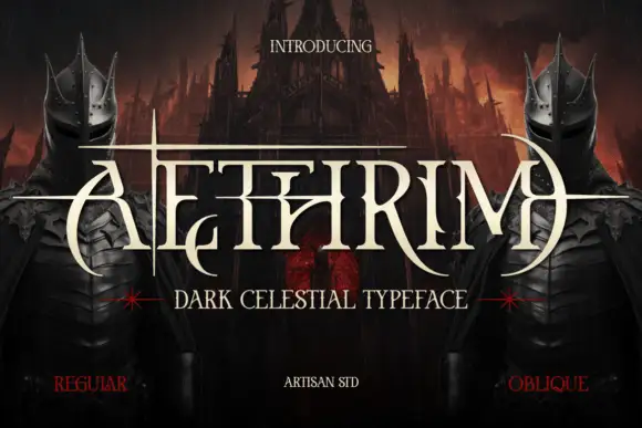
Moonscythe is an experimental gothic display face in red on cream: tall narrow letters built from thin straight strokes, with long horizontal ligatures running between them and a diamond ornament in the middle, presented as an elaborate masthead with two crowned figures and a moon.
Paid link
Get this fontProject & layout blueprintsAt-a-glance maker compatibility
Sturdy stroke walls and open counters weed cleanly on adhesive vinyl, HTV apparel film, and cut cardstock.
Visual anatomy & craft review
The word is set as a wide band across the page, and the face is a display gothic rather than a text blackletter: the stems are thin and straight, the letters are tall and narrow with flat tops and bases, and the spaces between them are bridged by long horizontal strokes and hairline ligatures that turn the word into a single ruled shape. One letter carries a diamond finial in the middle, another splits into a fork at the top, and the effect is closer to a ritual inscription than to a printed alphabet. The sample surrounds it with a full masthead: two crowned women in dark metal headdresses flank a large moon, a torn red banner carries a line of the face in a small size, and the corners carry small capitals about the styles and glyph count. The palette is a deep red, bone and bronze. Moonscythe is a decorative face for music artwork, fantasy covers, event posters and packaging with a ceremonial mood, and it needs a wide measure and a large size.
Gothic, stretched, ritual
Two-font hierarchy recipes
Tested contrast partners — pairing Moonscythe with grounded secondary typography.
Moonscythe + Mango Dream
Lets Moonscythe own the focal silhouette while handling secondary copy, sizing and subheads cleanly.
Inspect Mango Dream specimen
Moonscythe + Augler
Grounds bold display lettering with classic typographic authority on posters, badges and apparel.
Inspect Augler specimenPractical applications
Concrete hierarchy, scale and production guidance tailored to Moonscythe’s stroke geometry.
A stretched gothic band sets a ceremonial tone before the lineup is read, and the thin horizontal ligatures give the title a wide, deliberate presence.
Hierarchy & layout recipe
Print a 420 by 594 mm poster: set the title at 100 pt on one line, keep 40 mm of clear ground beneath before the lineup at 18 pt, and hold 24 mm of margin on all four sides.
Pre-production check
Hairline ligatures can break in a dark print; proof one sheet at the final size and check the thinnest strokes.
A ritual gothic title separates a fantasy cover from the usual serif, and the ornamental frame suits a story set in a court of its own.
Hierarchy & layout recipe
Print a 152 by 229 mm cover: set the title at 54 pt on one line, keep 22 mm of clear ground beneath before the author at 12 pt, and hold 14 mm of margin on all four sides.
Pre-production check
A wide band on a narrow cover will not fit; measure the line at the final size before approving the artwork.
An experimental gothic gives a bottle a ceremonial identity, and the thin band reads at shelf height where a heavy blackletter would turn to texture.
Hierarchy & layout recipe
Print a 55 by 90 mm label: set the brand at 15 pt on one line, keep 6 mm of clear ground beneath before the strength at 4.5 pt, and hold 4 mm of margin on all four sides.
Pre-production check
At fifteen points the ligatures can close; print one label on the real glass label stock and check before the run.
Technical & licence verification
Confirm included OTF/TTF/WOFF formats, full glyph tables and licence coverage on the live store page before batch production.
Closest visual alternatives
Matched across letterform anatomy, stroke behaviour and craft applications.
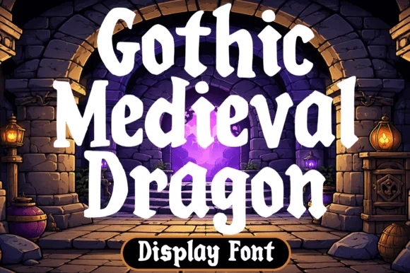
Chunky fantasy serif with rounded wedge serifs and heavy lowercase bowls
Gothic Medieval Dragon is a chunky fantasy serif in which the serifs wedge out round, the lowercase bowls stay heavy and the contrast stays low, so a game-night title reads as friendly storybook lettering rather than as black-metal type.
Ideas for this font
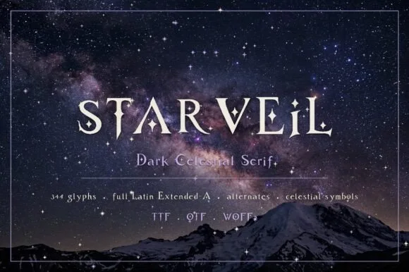
Dark celestial serif with crescent moons & stars (344 glyphs, OTF/TTF/WOFF2)
Starveil is a dark celestial display serif (344 glyphs, Latin Extended-A, TTF/OTF/WOFF2) embedding crescent moons and star sparkles into flared stems.
Ideas for this font
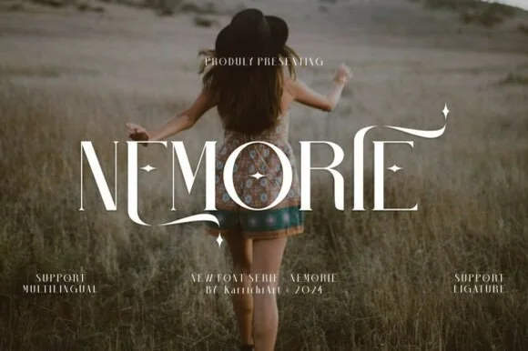
Celestial high-contrast art-nouveau & fantasy ligature serif
Nemorie is a refined high-contrast display serif featuring sweeping scythe-like swash bars, sculpted ligatures, and four-point star accents.
Ideas for this font
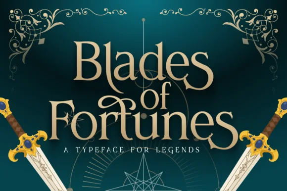
Heroic sword-flared epic fantasy display serif
Blades of Fortunes is a sculpted epic-fantasy display serif featuring sword-hilted crossbars, sweeping swash loops, and sharp triangular terminals.
Ideas for this font
Same independent foundry
Allow optional Google Analytics to measure visits and catalogue actions. Your search words and notes are not included. Privacy & storage