High-Contrast Display Serif

Traditional and Exceptional + Svara
Pairs sculptural editorial warmth with Traditional and Exceptional's clean modern geometry.
Inspect Svara specimenDisclosure: MakerFileHub may earn a commission from qualifying purchases via paid links on this page. How our links work.
Handcrafted serif duo
Traditional and Exceptional is a handcrafted serif duo in black on cream: a roman with sturdy bracketed serifs and a slightly irregular stem, paired with an italic drawn on the same skeleton, set in two lines with a small tracked introduction and a credit beneath, so the plate reads as a bookish specimen.
Paid link
Get this fontProject & layout blueprintsAt-a-glance maker compatibility
Sturdy stroke walls and open counters weed cleanly on adhesive vinyl, HTV apparel film, and cut cardstock.
Visual anatomy & craft review
The pairing is the design: the roman carries the first line and the italic the second, and both are drawn by hand rather than digitised from a classic, which shows in the slightly uneven stems and the small kinks in the curves. The serifs are short and bracketed, the contrast moderate, so the face works at body size as well as in a heading, and the italic keeps the same angle throughout, which makes it usable for long passages rather than only for accents. Spacing is generous and the two lines are centred, with the introduction set in tiny tracked caps above and the credit in an italic beneath, which is the setting a publisher would use on a title page.
Serif, handcrafted, classic, bookish
Two-font hierarchy recipes
Tested contrast partners — pairing Traditional and Exceptional with grounded secondary typography.
Traditional and Exceptional + Svara
Pairs sculptural editorial warmth with Traditional and Exceptional's clean modern geometry.
Inspect Svara specimen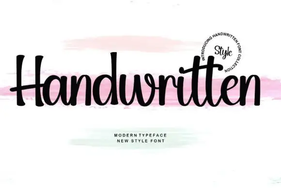
Traditional and Exceptional + Handwritten
Introduces organic movement on pull-quotes, signatures and gift tags.
Inspect Handwritten specimenPractical applications
Concrete hierarchy, scale and production guidance tailored to Traditional and Exceptional’s stroke geometry.
A handcrafted serif with a true italic gives a poetry collection the texture of a letterpress title page, and the moderate contrast survives on the uncoated stock small presses actually use.
Hierarchy & layout recipe
A5 title page: the title at 28 pt, the author in an 11 pt roman, and the imprint in a 8 pt tracked caps. Keep 22 mm margins, centre the block optically, and print one ink on a laid paper so the hand-drawn stems read.
Pre-production check
Check the 28 pt title on laid paper, where the irregularity can look like a printing fault; proof the plate. Confirm the 11 pt author reads at arm's length and that the italic in the contents holds its angle.
A handcrafted serif gives a small press a mark that looks typeset rather than designed, and the italic gives a subtitle voice without a second licence.
Hierarchy & layout recipe
Set the mark at 18 pt on a title page and 10 pt on a colophon, with the italic reserved for taglines. Keep one ink, hold clear space equal to the cap height on every side, and test the mark at 8 pt before committing.
Pre-production check
Check the 10 pt colophon on uncoated stock, where the bracketed serifs can fill; keep the size at or above 8 pt. Confirm the mark reads on a spine at 9 pt and that the italic tagline stays distinct from the roman mark.
A roman and an italic from the same hand keep a service booklet tidy, and the moderate contrast prints cleanly on the lightweight stock booklets are made from.
Hierarchy & layout recipe
A5 booklet: the headings at 14 pt roman, the responses in a 9.5 pt italic, and the page numbers at 8 pt. Keep 18 mm margins, print one ink on an uncoated stock, and keep the italic to the spoken parts.
Pre-production check
Check the 9.5 pt italic on lightweight stock, where show-through can grey the page; use a heavier sheet. Confirm the 8 pt numbers read at arm's length and that the headings hold their weight across a spread.
Technical & licence verification
Confirm included OTF/TTF/WOFF formats, full glyph tables and licence coverage on the live store page before batch production.
Closest visual alternatives
Matched across letterform anatomy, stroke behaviour and craft applications.
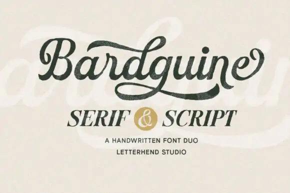
Textured brush script paired with an italic serif in caps
Bardguine pairs a textured brush script in mixed case with an italic serif in caps, so a label can carry a written name and a formal secondary line that share a slightly worn finish.
Ideas for this font
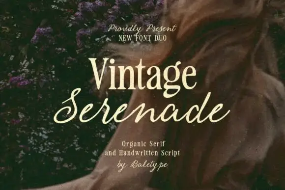
Compact organic serif paired with a long slanted handwritten script
Vintage Serenade pairs a compact organic serif with a long slanted script, so a card carries a firm printed name and a flowing second line that runs well beyond it on both sides.
Ideas for this font
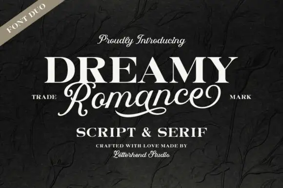
Heavy upright serif heading paired with a flowing script
Dreamy Romance shows bold white serif capitals above a slanted connected script word: the script capital R closes a loop while a long curved underline sweeps beneath the middle of the word, so one card holds a solid statement and a written line.
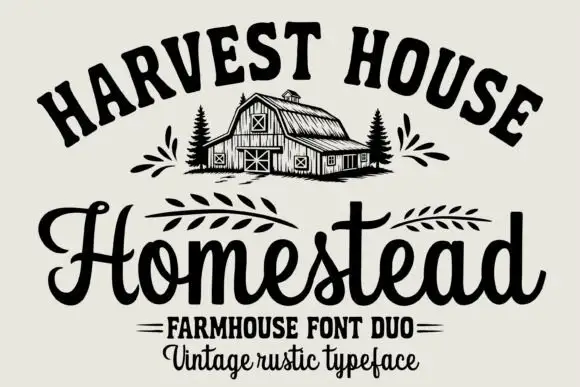
Arched rustic caps paired with a heavy farmhouse script
Homestead is a duo of an arched rustic capital alphabet and a heavy farmhouse script with curled terminals, drawn so a stacked sign reads as a hand-painted barn board.
Ideas for this font
Same independent foundry
Allow optional Google Analytics to measure visits and catalogue actions. Your search words and notes are not included. Privacy & storage