Neutral Sans Workhorse

Black Ink + Bielchon
Lets Black Ink own the focal silhouette while handling secondary copy, sizing and subheads cleanly.
Inspect Bielchon specimenDisclosure: MakerFileHub may earn a commission from qualifying purchases via paid links on this page. How our links work.
Fine-contrast ornamental lettering with looping capitals and long swashes
Black Ink sets a blackletter in silver on black, opens every capital into a swash and lets the flourishes cross the word, so the lettering reads as a tattoo design rather than as a heading.
Paid link
Get this fontProject & layout blueprintsAt-a-glance maker compatibility
Sturdy stroke walls and open counters weed cleanly on adhesive vinyl, HTV apparel film, and cut cardstock.
Visual anatomy & craft review
Black over Ink fills the frame, the B built from a long loop and the k closing in a spike, with the two words linked by a flourish that carries across the middle. Strokes vary between heavy and hairline, and the joins are drawn rather than constructed. A rose and a machine sit in the background at low contrast, and two tracked captions frame the piece. The detail is extremely fine at the ends of the flourishes, so the face is a display object: it needs size and a clean output, and it will not survive a small label or a low-resolution print.
Fine-contrast ornamental lettering with looping capitals and long swashes
Two-font hierarchy recipes
Tested contrast partners — pairing Black Ink with grounded secondary typography.
Black Ink + Bielchon
Lets Black Ink own the focal silhouette while handling secondary copy, sizing and subheads cleanly.
Inspect Bielchon specimen
Black Ink + Aureline
Grounds bold display lettering with classic typographic authority on posters, badges and apparel.
Inspect Aureline specimenPractical applications
Concrete hierarchy, scale and production guidance tailored to Black Ink’s stroke geometry.
The lettering reads as a hand-painted sign, and the swashes give a small studio a window piece that looks commissioned rather than bought.
Hierarchy & layout recipe
Print a 700 by 400 mm window decal: set the name at 80 mm across one row, keep 28 mm of clear ground beneath before the street line at 14 pt, and keep 34 mm of border so the swashes are not cut.
Pre-production check
Hairline flourishes break in cut vinyl; check a weeding test before the decal is produced.
The dark lettering sets the mood for a late event, and the one-line phrase fills a poster without an illustration behind it.
Hierarchy & layout recipe
Print an A2 poster: set the title at 110 pt across one row, keep 30 mm of clear ground beneath before the date at 18 pt, and keep 28 mm of border so the flourishes stay on the sheet.
Pre-production check
Fine ends can drop out at large format; check a printed proof before the order. Have the printer send a physical sample first.
The lettering is the subject of the book, and one phrase on a cover says more than a photograph would for this audience.
Hierarchy & layout recipe
Print a 200 by 250 mm cover: set the title at 78 pt across one row, keep 24 mm of clear ground beneath before the author at 12 pt, and keep 20 mm of margin from the trim on every side.
Pre-production check
Silver on black needs a coated sheet; check a proof on the chosen paper before the run. Request a proof on the actual stock before signing off.
Technical & licence verification
Confirm included OTF/TTF/WOFF formats, full glyph tables and licence coverage on the live store page before batch production.
Closest visual alternatives
Matched across letterform anatomy, stroke behaviour and craft applications.
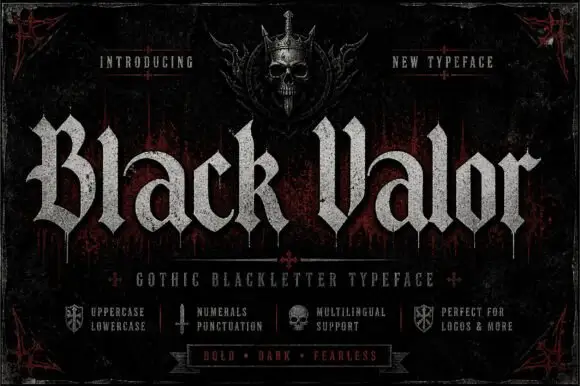
Broad blackletter with curved a shoulders and hooked capitals
Black Valor sets a gothic blackletter in distressed white on a black ground, with broad strokes, curled lowercase shoulders and hooked capitals whose ends finish in fine diamond points.
Ideas for this font
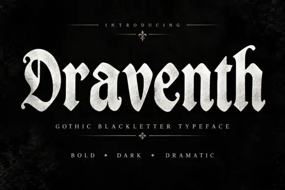
Broad rounded blackletter with curled D and pointed lower joins
Draventh is a wide gothic blackletter display face with heavy stems, sharp hooked shoulders and a weathered silver fill that reads as rubbed metal.
Ideas for this font
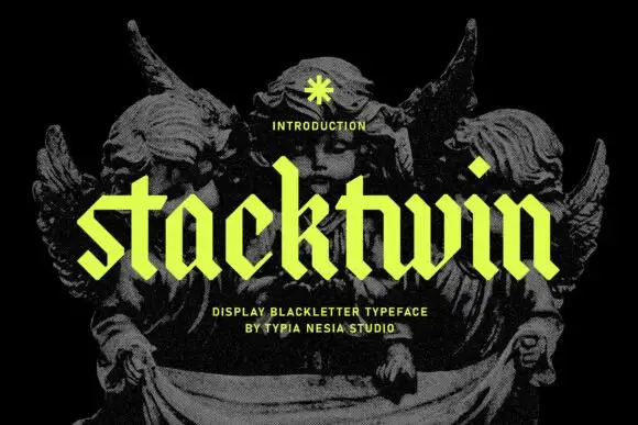
Geometric lowercase blackletter
Stackwin is a geometric lowercase blackletter in acid yellow over a black engraving: straight clipped ends, diamond-shaped dots, uniform stroke widths and angular joins, set as one word with a small note above and two plain lines beneath naming the style and the studio.
Ideas for this font
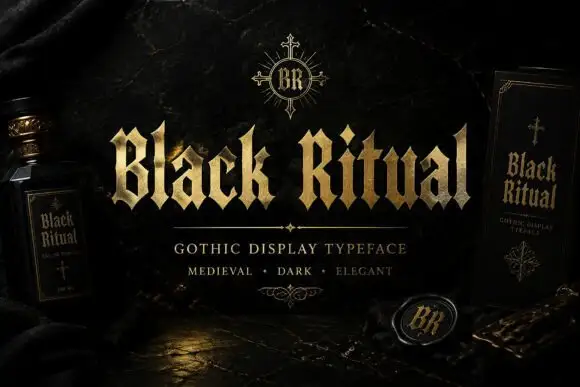
Faceted blackletter with split B and sharp diamond dots
Black Ritual sets heavy gothic capitals with diamond finials in a gold finish on a black ground, and shows the same face printed on a bottle label and a book cover so the range is visible.
Ideas for this font
Allow optional Google Analytics to measure visits and catalogue actions. Your search words and notes are not included. Privacy & storage