Editorial Serif Anchor

Heart Style + Things
Anchors Heart Style's fluid strokes with crisp Roman proportions on wedding suites, headers and packaging.
Inspect Things specimenDisclosure: MakerFileHub may earn a commission from qualifying purchases via paid links on this page. How our links work.
Script with a central heart connection
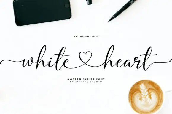
Heart Style joins two words through a small heart, with long outer strokes stretching the heading across the artwork while the h and l rise well above the word body, the y falls below it and two long t crossbars sit near the centre.
Paid link
Get this fontProject & layout blueprintsAt-a-glance maker compatibility
Weld or Unite overlapping script joins into one continuous vector path before sending to the blade.
Visual anatomy & craft review
The connectors run through a heart between the words, the outer strokes extend far past the letters and the ascenders and descender reach beyond the body. The central heart is the character: the join becomes the ornament, which is why the sample spreads the heading wide. Because the outer strokes travel, keep 22 mm at each end from 26 pt, and note the preview does not prove that any pair of typed words receives the heart automatically. The heart join is drawn for one pairing: the preview does not prove that any two typed words receive it, so test your own phrase, and keep 22 mm at each end for the travelling outer strokes.
Script · Heart connection · Long strokes
Two-font hierarchy recipes
Tested contrast partners — pairing Heart Style with grounded secondary typography.
Heart Style + Things
Anchors Heart Style's fluid strokes with crisp Roman proportions on wedding suites, headers and packaging.
Inspect Things specimen
Heart Style + Bielchon
Keeps small-scale dates, URLs, nutrition facts and care instructions crisp and legible below script titles.
Inspect Bielchon specimenPractical applications
Concrete hierarchy, scale and production guidance tailored to Heart Style’s stroke geometry.
The heart join carries the message, and the long strokes stretch a short phrase at 30 pt across an A6 card. The wide stretch also makes a card feel celebratory.
Hierarchy & layout recipe
Print an A6 card: set the phrase at 30 pt, keep 20 mm of clear card at each end for the outer strokes, and leave the lower half blank for a handwritten line. Keep the card flat under the line.
Pre-production check
A heart set closer than 4 mm to the next letter merges into it; check the proof and open the spacing. Open the join spacing deliberately.
The joined heart gives a suite a single ornament, and the fine strokes keep two names readable at 26 pt on heavy card. The joined heart also keeps a formal suite warm.
Hierarchy & layout recipe
Print a 130 by 180 mm card: set the names at 26 pt, keep 20 mm of clear card at each end, and set the venue at 9 pt in a light serif with 16 mm of clear ground below. Keep the venue line short.
Pre-production check
An outer stroke printed into the card margin looks clipped; check the proof and keep 14 mm of edge. Print one card before the set.
The wide heading suits a celebration banner, and the long strokes hold two words at 40 pt on a printed sheet. The long strokes also fill a banner width.
Hierarchy & layout recipe
Print an A3 banner: set the heading at 40 pt, keep 22 mm of clear sheet at each end so the strokes stay inside, and set the year at 18 pt in a plain sans beneath with 12 mm of clear ground.
Pre-production check
The heart join disappears when the heading is squeezed; check the layout and keep the words on one line. Keep the two words on one line only.
Technical & licence verification
Confirm included OTF/TTF/WOFF formats, full glyph tables and licence coverage on the live store page before batch production.
Closest visual alternatives
Matched across letterform anatomy, stroke behaviour and craft applications.
Rounded bold script with a keyline
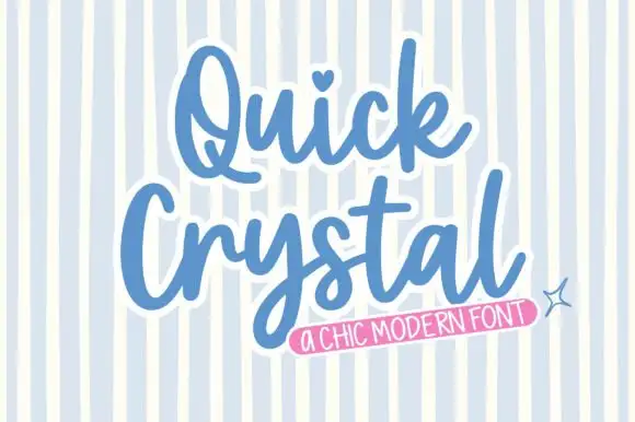
Quick Crystal is a rounded bold script in blue with a white keyline on a pale striped ground: fat even strokes, a capital Q with a curled tail, and a final l that lifts into a short exit as the word ends.
Chic script with cherries and a badge
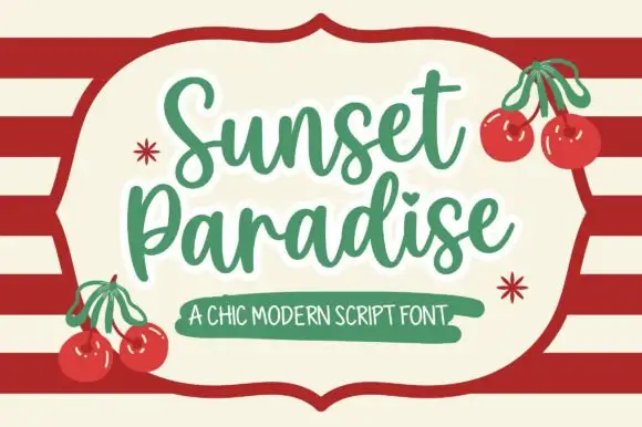
Sunset Paradise is a chic script in green on cream: rounded strokes with a slight taper, tall narrow letters, a bouncy baseline and a heart in place of the dot on the i, set inside a drawn shield panel over red stripes.
Ideas for this font
Elegant script with long entry swashes and drawn connectors
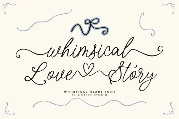
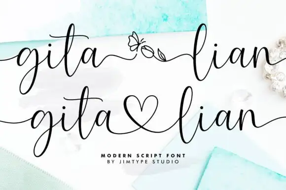
Gita Lian is an elegant script in which long swashes enter and leave the word and a drawn connector ties two names together, so a two-name lockup reads as a single written gesture rather than as two separate words.
Ideas for this font
Broad looped confectionery script
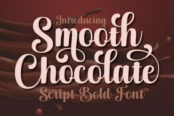
Smooth Chocolate is a broad looped script in pale pink over poured chocolate: wide bowls, tall loops, ball terminals on the ascenders and a light script caption in the same family beneath.
Same independent foundry
Allow optional Google Analytics to measure visits and catalogue actions. Your search words and notes are not included. Privacy & storage