Neutral Sans Workhorse

Daisy Land + Helina
Lets Daisy Land own the focal silhouette while handling secondary copy, sizing and subheads cleanly.
Inspect Helina specimenDisclosure: MakerFileHub may earn a commission from qualifying purchases via paid links on this page. How our links work.
Tall soft capitals carrying small daisy clusters and fine outlined butterflies
Daisy Land is a cute display face in which each capital is a slender pastel letter with drawn daisies, leaves and butterflies attached to its stems, so a word looks like a trellis in flower.
Paid link
Get this fontProject & layout blueprintsAt-a-glance maker compatibility
Sturdy stroke walls and open counters weed cleanly on adhesive vinyl, HTV apparel film, and cut cardstock.
Visual anatomy & craft review
DAISY over LAND fills the card, the first row in a soft turquoise and the second in pink, and each letter is a narrow rounded shape with flowers growing out of it: a daisy on the shoulder of the D, leaves along the stem of the L, a butterfly resting on the Y. The flowers are drawn in the same pastel range with pale yellow centres, and the ground is white with large flat daisies in lilac, yellow and pink along the edges. A line at the foot names the set in a plain sans. The face is decorative in a gentle way: the letters stay narrow and simple so the flowers read as an addition rather than as texture, and the whole set prints in two or three colours without a photographic effect.
Tall soft capitals carrying small daisy clusters and fine outlined butterflies
Two-font hierarchy recipes
Tested contrast partners — pairing Daisy Land with grounded secondary typography.
Daisy Land + Helina
Lets Daisy Land own the focal silhouette while handling secondary copy, sizing and subheads cleanly.
Inspect Helina specimen
Daisy Land + Askinо
Grounds bold display lettering with classic typographic authority on posters, badges and apparel.
Inspect Askinо specimenPractical applications
Concrete hierarchy, scale and production guidance tailored to Daisy Land’s stroke geometry.
The flowers growing out of the letters say what the shop sells, and the pastel palette suits a spring display better than a hard colour.
Hierarchy & layout recipe
Print a 600 by 400 mm board: set the name at 90 pt across two rows, keep 24 mm of clear ground beneath before the opening hours at 14 pt, and hold 26 mm of border so no butterfly is cut.
Pre-production check
Pastels wash out in daylight; print one board and check it outdoors before the set is mounted.
The daisies give a light wedding a floral note without a photograph or a drawn wreath, and the narrow letters keep two names on one line where a wider display face would force a break.
Hierarchy & layout recipe
Print a 130 by 180 mm invitation: set the names at 28 pt on one row, keep 20 mm of clear ground beneath before the venue at 9 pt, and hold 15 mm from the flowers to the card edge.
Pre-production check
The fine leaves break on textured card; print one invitation on the intended board and check a stem first.
The flowers make a plain card feel decorated without a photograph inside it, and the soft colours suit a birthday that happens in a garden rather than in a hall.
Hierarchy & layout recipe
Print a 105 by 148 mm card: set the greeting at 38 pt across two rows, keep 15 mm of clear ground beneath before the message at 9 pt, and hold 12 mm from the widest petal to the card edge.
Pre-production check
Small daisies close below 24 pt; print one card at the finished size and check the centres before the batch.
Technical & licence verification
Confirm included OTF/TTF/WOFF formats, full glyph tables and licence coverage on the live store page before batch production.
Closest visual alternatives
Matched across letterform anatomy, stroke behaviour and craft applications.
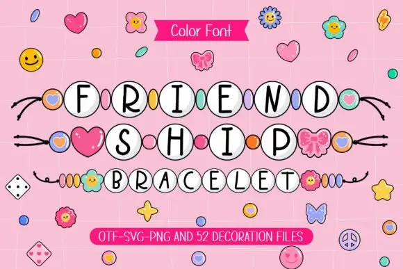
Slim black capitals inside white round beads with coloured spacers
Friendship Bracelet draws each capital inside a round bead threaded on a string, and fills the spaces between the words with charms: hearts, flowers, butterflies and small smiling faces.
Ideas for this font
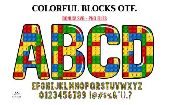
Outlined block capitals filled with colourful studded rectangles
Colorful Blocks builds every letter from a grid of plastic bricks, fills them in primary red, yellow, green and blue, and adds a glossy highlight and a heavy black contour around the whole shape.
Ideas for this font
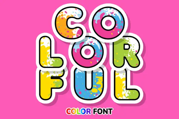
Rounded sticker-like capitals with bright paint splashes and broad white edging
Colorful sets fat rounded caps in a solid colour with a spatter of paint across the letter, a white sticker outline and a soft shadow, so a word looks like a painted cut-out.
Ideas for this font
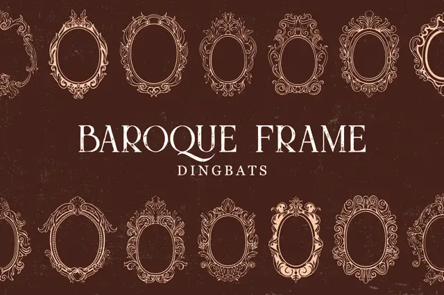
Intricate oval baroque frames with curling crowns and fine inner rings
Baroque Frame Dingbats is a set of oval cartouche frames drawn with acanthus scrolls, shell crests and bead mouldings, each one a typable character that can be dropped around a name.
Ideas for this font
Same independent foundry
Allow optional Google Analytics to measure visits and catalogue actions. Your search words and notes are not included. Privacy & storage