High-Contrast Display Serif

Aveton + Cervelique
Pairs sculptural editorial warmth with Aveton's clean modern geometry.
Inspect Cervelique specimenDisclosure: MakerFileHub may earn a commission from qualifying purchases via paid links on this page. How our links work.
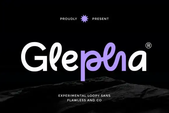
Broad rounded mixed case with an arched A foot and a raised pointed t shoulder
Aveton is a geometric sans built for logotypes: circular bowls, a wide A whose crossbar is cut into the left stroke, and a lowercase t whose foot curls forward instead of sitting flat.
Paid link
Get this fontProject & layout blueprintsAt-a-glance maker compatibility
Sturdy stroke walls and open counters weed cleanly on adhesive vinyl, HTV apparel film, and cut cardstock.
Visual anatomy & craft review
Aveton crosses the middle of the card in white over a dark ground lit by a warm diagonal flare, set in mixed case at a size where the details are plain. The A is wide and its crossbar stops short of the left diagonal, which gives the letter an open look; the v and the e are built on circles, and the t ends in a small foot that turns up rather than a straight bar. The spacing is even and slightly open, so the word reads as a mark rather than as a sentence. Three small tracked credits sit at the corners: the publisher at the top left, the feature set at the top right, and the style claim under the word. The face is a logotype cut first and a heading face second, and it does what a corporate identity needs: it stays legible at fifteen millimetres and looks deliberate at a hundred.
Broad rounded mixed case with an arched A foot and a raised pointed t shoulder
Two-font hierarchy recipes
Tested contrast partners — pairing Aveton with grounded secondary typography.
Aveton + Cervelique
Pairs sculptural editorial warmth with Aveton's clean modern geometry.
Inspect Cervelique specimen
Aveton + Bunglon
Introduces organic movement on pull-quotes, signatures and gift tags.
Inspect Bunglon specimenPractical applications
Concrete hierarchy, scale and production guidance tailored to Aveton’s stroke geometry.
The geometric forms read as steady rather than fashionable, and the open A gives a plain company name a distinctive letter without a drawn symbol.
Hierarchy & layout recipe
Print an A4 letterhead: set the wordmark at 26 pt across the head, keep 14 mm of clear ground beneath before the address block at 8 pt, and hold 20 mm of margin at the top and 18 mm at both sides.
Pre-production check
The cut crossbar fills in at small sizes; print the mark at 15 mm wide on the envelope and check the A before the stationery order.
The circular bowls keep a long standfirst calm at fourteen points, and the same family covers the pull quotes without a second typeface in the spread.
Hierarchy & layout recipe
Print a 210 by 297 mm spread: set the standfirst at 14 pt on 19 pt leading in an 80 mm measure, keep 12 mm of clear ground under the headline before the first line, and hold 8 mm between the standfirst and the body column.
Pre-production check
Light geometric faces thin out on recycled paper; print one spread on the actual stock before the issue closes.
The corporate tone suits a building full of offices, and the plain shapes stay readable at door-plate size from a few steps away.
Hierarchy & layout recipe
Print a 220 by 90 mm door plate: set the room name at 22 pt across one row, keep 7 mm of clear ground beneath before the number at 12 pt, and hold 6 mm of margin at each end of the plate.
Pre-production check
Door plates are engraved as often as printed; cut one sample plate and check the open A before the full set.
Technical & licence verification
Confirm included OTF/TTF/WOFF formats, full glyph tables and licence coverage on the live store page before batch production.
Closest visual alternatives
Matched across letterform anatomy, stroke behaviour and craft applications.

Light rounded mixed case with an open e and slender upright stems
Clyne Sans draws a light geometric sans with even strokes, circular bowls and a short ascender, so a two-word name reads as a quiet line rather than as a mark.
Ideas for this font

Light contrast capital sans
Mansory is a light contrast sans in black on cream, shown small against a sunlit venetian blind: wide capitals with a broad circular O, fine diagonal joins and hairline uprights, with a small serif line beneath and an italic credit under that.
Ideas for this font
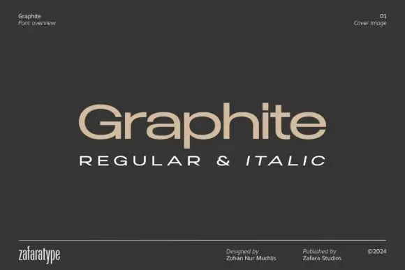
Low wide mixed case with flattened bowls and a long horizontal t bar
Graphite is a wide geometric sans with flattened bowls and a very long horizontal t bar, set here in warm beige on charcoal so the letterforms do the talking and the page stays quiet.
Ideas for this font
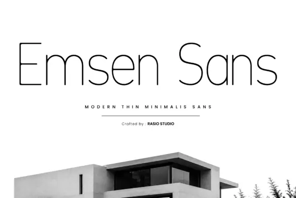
Very thin mixed case with rounded shoulders and a plain narrow capital E
Emsen shows black lettering on white above a cropped modern building photograph. Very thin nearly even strokes build narrow upright stems, rounded m and n shoulders and an open e with a long horizontal bar, while the capital E keeps plain flat arms and the a is a simple round bowl with a straight right side.
Ideas for this font
Same independent foundry
Allow optional Google Analytics to measure visits and catalogue actions. Your search words and notes are not included. Privacy & storage