Editorial Serif Anchor

August + Marquis - Elegant Modern Serif
Anchors August's fluid strokes with crisp Roman proportions on wedding suites, headers and packaging.
Inspect Marquis - Elegant Modern Serif specimenDisclosure: MakerFileHub may earn a commission from qualifying purchases via paid links on this page. How our links work.
Tall narrow looped script
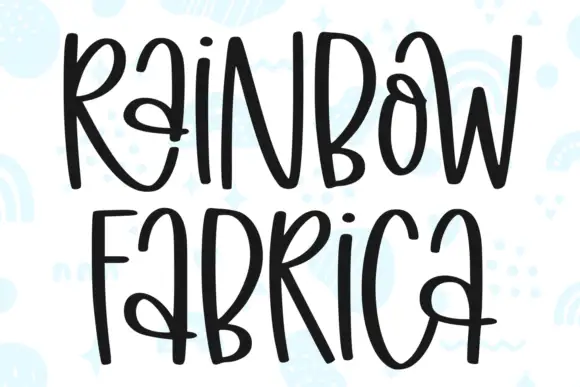
August is drawn tall and narrow with even monoline strokes, so every letter becomes a loop and the word stacks up as a column of verticals rather than a horizontal band.
Paid link
Get this fontProject & layout blueprintsAt-a-glance maker compatibility
Weld or Unite overlapping script joins into one continuous vector path before sending to the blade.
Visual anatomy & craft review
The cover sets the whole word at once and the effect is a picket of narrow loops: the a and u are closed ovals with a short entry, the g drops a large descender that loops back up through the line below, and the t is the only letter with a cross, drawn short and set low. Connections sit close to the baseline, which keeps the loops from crossing each other, and the x-height is nearly as tall as the ascenders, so the word has an even height along its whole length. Weight is monoline and consistent, with no hairline and no swelling, which is why the shape holds when it is scaled down. The faint leaf pattern behind is a ground texture, and the tracked caption beneath belongs to a separate label face.
Tall · Looped · Even
Two-font hierarchy recipes
Tested contrast partners — pairing August with grounded secondary typography.
August + Marquis - Elegant Modern Serif
Anchors August's fluid strokes with crisp Roman proportions on wedding suites, headers and packaging.
Inspect Marquis - Elegant Modern Serif specimen
August + Monure
Keeps small-scale dates, URLs, nutrition facts and care instructions crisp and legible below script titles.
Inspect Monure specimenPractical applications
Concrete hierarchy, scale and production guidance tailored to August’s stroke geometry.
Tall narrow loops fit a long word into the slim column of a folded menu, which is the format where a wide script has to either shrink or break across two lines.
Hierarchy & layout recipe
Set the header at 26 pt at the head of a 90 mm column, keep the courses in a light serif at 9 pt with 3 mm of leading, and let the g descender fall into the gap before the first course.
Pre-production check
Check the descender against the first course line: in a narrow column there is less room to pull the text down than the specimen implies.
Even monoline loops hold up as a small mark on a key tag or a door plaque, and the tall proportions give the name a vertical presence that suits a narrow signage plate.
Hierarchy & layout recipe
Set the mark at 20 mm wide on a 40 by 80 mm plaque, keep the room number in a plain sans beneath it at 8 mm, and leave 6 mm of clear space around the loops so the mark is never confused with the frame.
Pre-production check
Engraving thins the stroke where the cutter turns; check the loops at actual size on the plaque material before the plate is cut.
Tall loops read as something grown rather than drawn, and the even weight survives a hand-painted stall board where a high-contrast script would break into thin and thick lines.
Hierarchy & layout recipe
Paint the stall name at 120 mm cap height across a 900 mm board, keep the prices in a plain hand at 40 mm on a separate lower board, and hold 60 mm clear at each end so the outer loops stay whole.
Pre-production check
Outdoor paint and a brush thicken every stroke, so test the tightest loop on an offcut and also check it at the distance people will actually stand.
Technical & licence verification
Confirm included OTF/TTF/WOFF formats, full glyph tables and licence coverage on the live store page before batch production.
Closest visual alternatives
Matched across letterform anatomy, stroke behaviour and craft applications.

Tall connected script with a long y descender and open round bowls
Hello Honey is a tall connected script in which the ascenders rise high, the bowls stay round and the y drops a descender that runs far below the line before curling away.
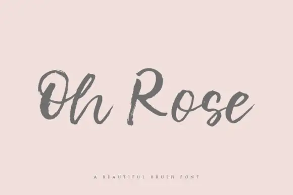
Rough open brush handwriting
Oh Rose is a dry-brush script drawn in carbon grey on blush pink: the letters are unjoined, the strokes break into streaks at the ends and the whole line looks written with a brush that is running out of paint.
Ideas for this font
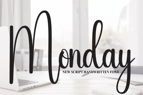
Tall script with an oversized narrow M
Monday is a tall script in black over a photograph of a desk: a very tall narrow capital M drawn as two long strokes with a shallow valley between, a compact connected body and a y whose descender curls below the word.
Ideas for this font
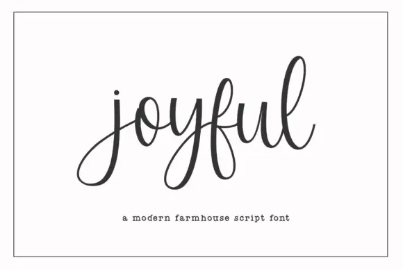
Modern farmhouse script with open descenders and long exit tails
Joyful Script is a modern farmhouse script with light even strokes, wide open descenders and long exit tails, drawn so a single word sits evenly across a wide card.
Ideas for this font
Same independent foundry
Allow optional Google Analytics to measure visits and catalogue actions. Your search words and notes are not included. Privacy & storage