Editorial Serif Anchor

Almenty Carmine + Majestic Letters
Anchors Almenty Carmine's fluid strokes with crisp Roman proportions on wedding suites, headers and packaging.
Inspect Majestic Letters specimenDisclosure: MakerFileHub may earn a commission from qualifying purchases via paid links on this page. How our links work.
Textured antique postal & apothecary calligraphy script (Multilingual + Alternates)
Almenty Carmine is actually a romantic vintage calligraphy script (NOT a serif!) with classic thick-and-thin quill strokes and subtle antique ink grain!
Paid link
Get this fontProject & layout blueprintsAt-a-glance maker compatibility
Weld or Unite overlapping script joins into one continuous vector path before sending to the blade.
Visual anatomy & craft review
Almenty Carmine is a romantic antique calligraphy script with classic thick-and-thin quill strokes, looped capitals and a light ink grain that reads as a letter written with a steel nib on laid paper. Ligatures and alternates let a designer smooth the joins on difficult pairs, and multilingual support keeps a name in another script consistent. Contrast is genuine, so the face needs about 18 mm before the hairlines hold, and it is at its best on cream or buff stock in a single sepia ink. It is a stationery face, not a signage face.
Archival-quill · Ribbon-calligraphy · Nostalgic-script
Two-font hierarchy recipes
Tested contrast partners — pairing Almenty Carmine with grounded secondary typography.
Almenty Carmine + Majestic Letters
Anchors Almenty Carmine's fluid strokes with crisp Roman proportions on wedding suites, headers and packaging.
Inspect Majestic Letters specimen
Almenty Carmine + Sailors
Keeps small-scale dates, URLs, nutrition facts and care instructions crisp and legible below script titles.
Inspect Sailors specimenPractical applications
Concrete hierarchy, scale and production guidance tailored to Almenty Carmine’s stroke geometry.
Quill contrast reads as a label printed a century ago, which is what a heritage apothecary brand is buying. Ligatures let a long product name join smoothly across a narrow label.
Hierarchy & layout recipe
Label 70 x 100 mm, name 16 mm, data 5/7 pt, 5 mm top arc. Carton 60 x 130 x 30 mm, name 18 mm on the front, legal 5.5 pt on the back. Tin 75 x 100 mm, name 14 mm.
Pre-production check
Uncoated label stock fills hairlines under 0.15 mm and the script looks bolder than the specimen. Print a 1:1 proof on the actual stock, and if the contrast collapses, raise the name size rather than the ink.
Antique lettering gives a period venue a suite that belongs to it, and the ligatures keep long names from looking cramped. Sepia ink on cream reads softer than black at the same size.
Hierarchy & layout recipe
Invitation 148 x 210 mm, names 26 mm, details 9/14 pt, 18 mm margins. Service card A5, headings 15 pt, hymns 8.5/12 pt. Place card 90 x 50 mm, name 9 mm, table 4 mm.
Pre-production check
A place card at 9 mm on textured card loses the hairlines entirely and the name becomes unreadable at table distance. Keep the display face for the invitation and set place cards in a companion serif.
A genuine quill script reproduces the look of a period letter without a texture overlay, which is what an ephemera set is selling. Moderate weight holds at 11 pt on a printed letter.
Hierarchy & layout recipe
Insert 120 x 180 mm, letter block 12/17 pt on a 78 mm measure, 15 mm margins. Recipe card 105 x 148 mm, 10.5/15 pt. Ephemera A5, 11/16 pt, printed both sides on 110 gsm buff.
Pre-production check
Double-sided printing on buff stock shows through, and a page of script becomes noisy. Use 110 gsm or heavier, and check one duplex sheet against a lamp before printing the kit.
Technical & licence verification
Confirm included OTF/TTF/WOFF formats, full glyph tables and licence coverage on the live store page before batch production.
Closest visual alternatives
Matched across letterform anatomy, stroke behaviour and craft applications.
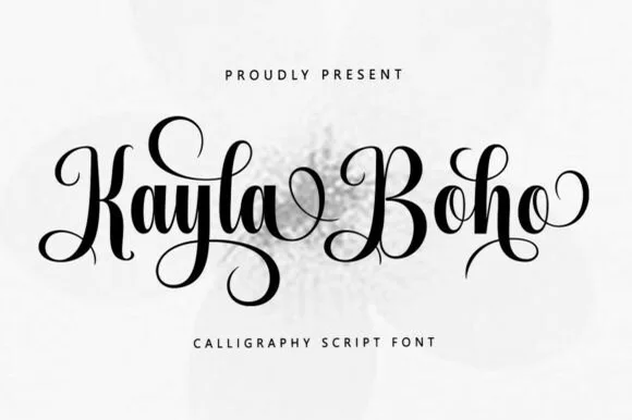
Upright romantic calligraphy script with coiled descenders
Kayla Boho is an upright modern calligraphy script featuring high-contrast brush strokes and graceful spiral-curled capitals and descenders.
Ideas for this font
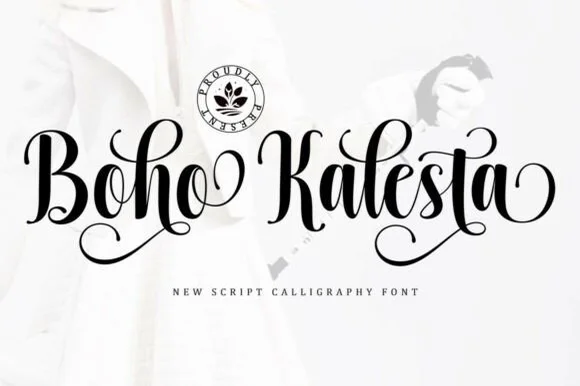
Ornate spiral-looped bohemian calligraphy script
Boho Kalesta is a lush handwritten calligraphy script (not a block display) crowned with dramatic coiled spiral loops on capitals and endings.
Ideas for this font
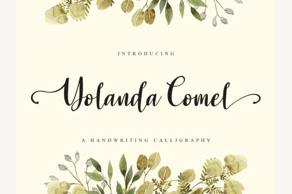
Calligraphic handwriting script with swash capitals
Yolanda Comel is a calligraphic script in near-black on cream: a modulated stroke with a steep angle, tall looping capitals, a long swash entry on the Y and a matching exit on the final l, so the pair reads as an invitation written with a pointed pen and then set in print.
Ideas for this font
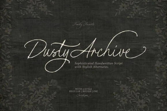
3-style historical quill calligraphy family (Regular, Rough & Ink!)
Dusty Archive is a refined 3-style historical penmanship script ('REGULAR | ROUGH | INK') with sweeping quill flourishes and stylistic alternates!
Ideas for this font
Same independent foundry
Allow optional Google Analytics to measure visits and catalogue actions. Your search words and notes are not included. Privacy & storage