Editorial Serif Anchor

Yolanda Comel + Augler
Anchors Yolanda Comel's fluid strokes with crisp Roman proportions on wedding suites, headers and packaging.
Inspect Augler specimenDisclosure: MakerFileHub may earn a commission from qualifying purchases via paid links on this page. How our links work.
Calligraphic handwriting script with swash capitals
Yolanda Comel is a calligraphic script in near-black on cream: a modulated stroke with a steep angle, tall looping capitals, a long swash entry on the Y and a matching exit on the final l, so the pair reads as an invitation written with a pointed pen and then set in print.
Paid link
Get this fontProject & layout blueprintsAt-a-glance maker compatibility
Weld or Unite overlapping script joins into one continuous vector path before sending to the blade.
Visual anatomy & craft review
The two words sit on one line and the drawing follows pointed-pen logic: the downstrokes swell, the upstrokes thin, and the joins sit on the baseline with visible connections, which is what keeps a fast script legible. The capitals are the decorative part, with the Y opening into a wide loop and the C closing on itself, and the swash entries run well outside the word, so the lockup needs margins rather than a tight frame. Spacing is loose and the angle is consistent, which gives the pair a calm, unhurried tone. The ground is a warm cream with watercolour eucalyptus sprigs at the top and bottom and two tracked captions in a light roman, so the page reads as a stationery sample rather than as a type specimen.
Calligraphic, elegant, swashed, handwritten
Two-font hierarchy recipes
Tested contrast partners — pairing Yolanda Comel with grounded secondary typography.
Yolanda Comel + Augler
Anchors Yolanda Comel's fluid strokes with crisp Roman proportions on wedding suites, headers and packaging.
Inspect Augler specimen
Yolanda Comel + Mansory
Keeps small-scale dates, URLs, nutrition facts and care instructions crisp and legible below script titles.
Inspect Mansory specimenPractical applications
Concrete hierarchy, scale and production guidance tailored to Yolanda Comel’s stroke geometry.
A pointed-pen script gives a garden wedding the right formality, and the loose spacing means two long surnames can share a line without the swashes tangling.
Hierarchy & layout recipe
A5 invitation: the names at 30 pt, the request in a 10 pt roman at 14 pt leading, and the date in 8 pt caps. Keep 22 mm margins, reserve 12 mm around the swash entries, and print one ink on a heavy cream card.
Pre-production check
Check the 30 pt names, where the entry swash can touch the trim; pull the lockup in by 6 mm. Confirm the 10 pt request reads in low light and that the swash entries do not overlap the eucalyptus illustration.
A calligraphic script sells stationery samples at a fair, and the swash capitals read at a glance from across a table where a plain serif would look like a price list.
Hierarchy & layout recipe
A5 card: the studio name at 26 pt, the offer in a 9 pt roman, and the dates at 8 pt caps. Keep 18 mm margins and print on a cream stock with one ink so the swash entries stay thin and clean.
Pre-production check
Check the 26 pt studio name on the card, where a thin entry can break on uncoated stock; proof the run. Confirm the 9 pt offer reads at arm's length and that the card still reads when stacked on a table at an angle.
A calligraphic mark shows the discipline the studio teaches, and the swash gives a small business a signature element that survives at label size where a lighter script would fade.
Hierarchy & layout recipe
Set the mark at 24 pt on a business card and 12 pt on a sticker, and build a version with the entry swash shortened for sizes under 16 pt. Keep the mark one colour and leave clear space equal to the cap height on every side.
Pre-production check
Check the 12 pt sticker, where the thin entry can disappear; test the shortened version. Confirm the mark reads on a kraft sticker and that the shortened swash does not change the character of the word at large sizes.
Technical & licence verification
Confirm included OTF/TTF/WOFF formats, full glyph tables and licence coverage on the live store page before batch production.
Closest visual alternatives
Matched across letterform anatomy, stroke behaviour and craft applications.
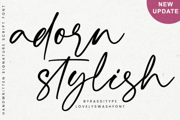
Slanted modern calligraphy script with lowercase end swashes
Adorn Stylish is a fluid, slanted modern handwritten script featuring tall narrow loops and sweeping beginning/ending lowercase swashes.
Ideas for this font
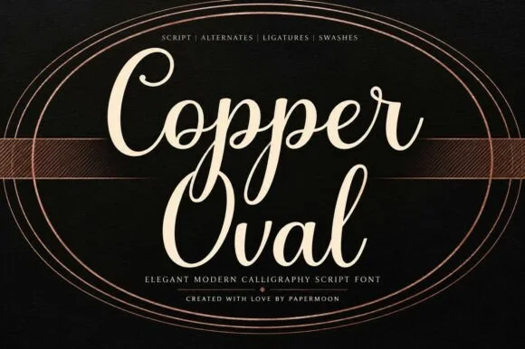
Smooth medium-bold modern copperplate calligraphy script
Copper Oval is a graceful, medium-bold calligraphy script (not a slab serif) blending classic copperplate oval loops with sturdy hand-lettered warmth.
Ideas for this font
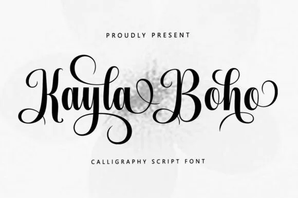
Upright romantic calligraphy script with coiled descenders
Kayla Boho is an upright modern calligraphy script featuring high-contrast brush strokes and graceful spiral-curled capitals and descenders.
Ideas for this font
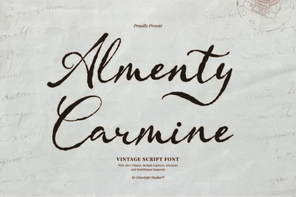
Textured antique postal & apothecary calligraphy script (Multilingual + Alternates)
Almenty Carmine is actually a romantic vintage calligraphy script (NOT a serif!) with classic thick-and-thin quill strokes and subtle antique ink grain!
Ideas for this font
Same independent foundry
Allow optional Google Analytics to measure visits and catalogue actions. Your search words and notes are not included. Privacy & storage