Neutral Sans Workhorse

Break Roman + Montreal
Lets Break Roman own the focal silhouette while handling secondary copy, sizing and subheads cleanly.
Inspect Montreal specimenDisclosure: MakerFileHub may earn a commission from qualifying purchases via paid links on this page. How our links work.
Angular blackletter forms with broad strokes and sweeping alternate-like curls
Break Roman is a bold blackletter display face with wide letters, thick stems, and flourishes that sweep out of the capitals across the whole line, framed by drawn starbursts.
Paid link
Get this fontProject & layout blueprintsAt-a-glance maker compatibility
Cut solid base, outline, and shadow layers in separate vinyl colors and align on registration marks.
Visual anatomy & craft review
Break Roman fills the card in a warm yellow on a dark photographic ground, the B and the R opening with long curved tails that run under the two words and meet in the middle. The letters are broader than a classic textura, with rounded shoulders and short spurs, so the word stays friendly as well as gothic, and the strokes are heavy enough to hold a metallic or textured fill. Starburst ornaments with fine rays sit at the left and right of the composition, and small panels in the corners carry credits and a glyph count in a condensed caps face. The contrast between the busy central flourish and the quiet corner information is what makes the card readable. It is a display face for posters, album art and streetwear graphics, and it needs space: the flourishes take up as much room as the letters themselves.
Angular blackletter forms with broad strokes and sweeping alternate-like curls
Two-font hierarchy recipes
Tested contrast partners — pairing Break Roman with grounded secondary typography.
Break Roman + Montreal
Lets Break Roman own the focal silhouette while handling secondary copy, sizing and subheads cleanly.
Inspect Montreal specimen
Break Roman + The Simple Editorial
Grounds bold display lettering with classic typographic authority on posters, badges and apparel.
Inspect The Simple Editorial specimenPractical applications
Concrete hierarchy, scale and production guidance tailored to Break Roman’s stroke geometry.
The flourishes give a dark poster movement without a photograph, and the heavy yellow letters read across a dim venue where thin gothic type disappears.
Hierarchy & layout recipe
Print an A2 poster: set the event title at 120 pt across two rows, keep 34 mm of clear ground beneath before the line-up at 14 pt, and hold 30 mm of margin so the sweeping tails stay inside the sheet.
Pre-production check
Long tails are thin at the ends and break on textured stock; print one poster on the actual paper and check the tips first.
The lettering signals the strength of the beer before the label is read, and the flourishes fill a wrap label that has no illustration on it.
Hierarchy & layout recipe
Print a 70 by 105 mm label: set the brewery name at 24 pt on one row, keep 8 mm of clear ground beneath before the strength at 5 pt, and hold 6 mm from the lowest tail to the die line.
Pre-production check
Metallic inks close the fine ornaments; print one label in the intended finish and check the flourishes before the batch.
The cut suits a story about a loud band, and the sweep of the flourishes lets a short title fill a cover that has only a dark photograph behind it.
Hierarchy & layout recipe
Print a 140 by 216 mm cover: set the title at 66 pt across two rows, keep 24 mm of clear ground beneath before the author at 11 pt, and hold 18 mm from the widest flourish to the trim.
Pre-production check
Dark covers scuff along the fold; print one cover, fold it and check the flourish where the crease falls.
Technical & licence verification
Confirm included OTF/TTF/WOFF formats, full glyph tables and licence coverage on the live store page before batch production.
Closest visual alternatives
Matched across letterform anatomy, stroke behaviour and craft applications.
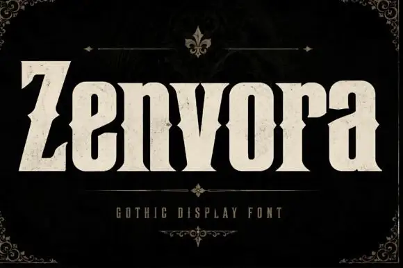
Heavy gothic display with waist notches
Zenvora is a heavy gothic display in bone cream on a dark mottled ground: narrow letter bodies with waist notches cut into the sides, a slanted Z that starts the word, sharp spurs and a stone texture, framed by a thin ruled border with fleur-de-lis corners, a small line beneath and a plain caption.
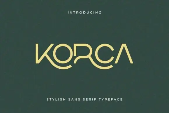
Light geometric capitals with sweeping lower K and R extensions
Korca shows a yellow-green capital name on dark green, where the O and C close as broad round forms, the A carries no crossbar and the K and R extend into long curved lower strokes that sweep beneath the neighbouring letters.
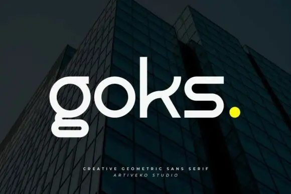
Geometric lowercase with circular o, rectangular lower g loop and curved k arm
Goks is a geometric sans with lowercase forms drawn from circles and straight lines, flat-cut terminals, and a g whose descender drops as a straight stem and stops on a horizontal bar.
Ideas for this font
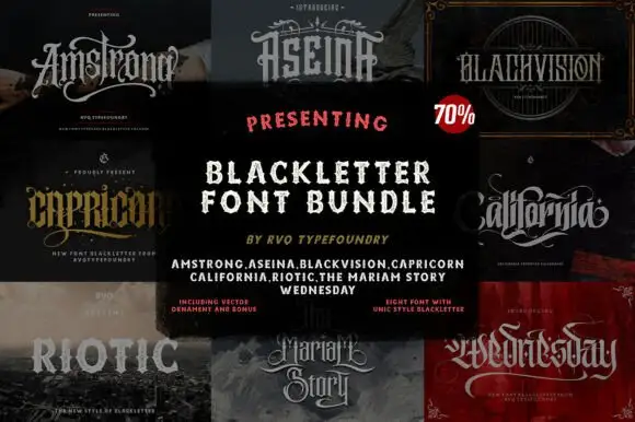
Eight-face blackletter collection
Blackletter Bundle is a collage sheet on black: eight blackletter faces shown in their own tiles, ranging from an ornate swash script through a wide carved gothic to a blunt block cut, with a centred panel listing all eight names and a note about the included extras.
Ideas for this font
Same independent foundry
Allow optional Google Analytics to measure visits and catalogue actions. Your search words and notes are not included. Privacy & storage