Editorial Serif Anchor

Dream Candy + Augler
Anchors Dream Candy's fluid strokes with crisp Roman proportions on wedding suites, headers and packaging.
Inspect Augler specimenDisclosure: MakerFileHub may earn a commission from qualifying purchases via paid links on this page. How our links work.
Soft irregular separate capitals with rounded uneven strokes
Dream Candy is a soft handwritten capital alphabet, drawn separate, with slightly uneven strokes and rounded ends, so a two-line phrase reads as a hand painted on paper rather than set in type.
Paid link
Get this fontProject & layout blueprintsAt-a-glance maker compatibility
Weld or Unite overlapping script joins into one continuous vector path before sending to the blade.
Visual anatomy & craft review
Each letter is a rounded monoline drawn by hand: the D closes a slightly lopsided bowl, the R keeps a short bent leg, the E bars vary in length, the A closes a triangle that is not quite symmetrical and the M and the Y keep uneven stems. The irregularity is gentle rather than dramatic, which is what keeps a phrase readable at a distance while still looking made. Weight is medium and consistent, and the counters are open and rounded so the letters stay clear at small sizes. Letters are set with generous spacing and the two lines are stacked flush left with a slight offset, giving the block a hand-made alignment. The pastel moon, clouds and candy, plus the small caption line, are presentation; the lettering is the two words.
Soft · Irregular · Casual
Two-font hierarchy recipes
Tested contrast partners — pairing Dream Candy with grounded secondary typography.
Dream Candy + Augler
Anchors Dream Candy's fluid strokes with crisp Roman proportions on wedding suites, headers and packaging.
Inspect Augler specimen
Dream Candy + Memoir Slang
Keeps small-scale dates, URLs, nutrition facts and care instructions crisp and legible below script titles.
Inspect Memoir Slang specimenPractical applications
Concrete hierarchy, scale and production guidance tailored to Dream Candy’s stroke geometry.
The irregular caps read as hand-painted signage on a paper bag, and the open counters stay legible when the label is small and folded.
Hierarchy & layout recipe
Set the shop name at 18 pt on a 60 by 40 mm bag label, keep the price in a bold grotesque at 10 pt, and leave 5 mm of margin so the uneven stems do not touch the edge.
Pre-production check
Paper bags crease at the base and the sides; check the artwork against the folds and keep the lettering on the flat face.
The soft irregular caps feel made by hand rather than downloaded, and the open counters read from across a table where a script would clot.
Hierarchy & layout recipe
Set the greeting at 70 mm tall on a 1 m banner, set the name at 45 mm beneath it, and leave 30 mm at each end so the outer letters stay clear of the hem.
Pre-production check
Fabric printing rounds off the uneven edges of a hand-drawn face; check the proof at final size and confirm the letters still look drawn rather than wobbly.
The casual hand gives a food feature warmth without the sweetness of a script, and the flat baseline keeps the header aligned to the column grid.
Hierarchy & layout recipe
Set the header at 40 pt on the opening page, keep the recipes in a 9 pt serif at 13 pt leading, and hold 14 mm between the header and the first recipe line.
Pre-production check
A hand-drawn face on newsprint can look like a print fault; check the page proof and keep the header off the folded edge.
Technical & licence verification
Confirm included OTF/TTF/WOFF formats, full glyph tables and licence coverage on the live store page before batch production.
Closest visual alternatives
Matched across letterform anatomy, stroke behaviour and craft applications.
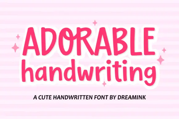
Uneven soft mixed case with tall ascenders and a looping capital join
Adorable Handwriting is a soft drawn hand in which the cap heights shift slightly, the ascenders run tall, the strokes stay rounded and the capital O curls inward at its top, so a line reads as lettered rather than typed.
Ideas for this font
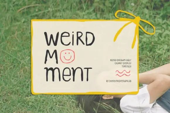
Display
Weird Moment is a hand-drawn display face with tall thin letters, a bouncing baseline and drawn-in jokes: the O is a smiley face, some letters lean, and the whole word looks written on a card with a marker.
Ideas for this font
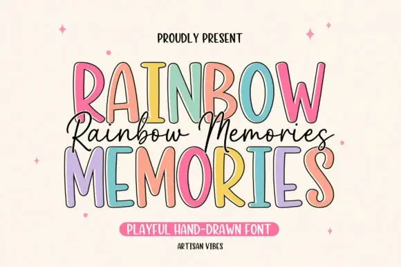
Tall irregular display capitals
Rainbow Memories is a tall irregular display capital hand in mixed pastels with a dark outline: letters of different widths and heights, a light monoline stroke and a small connected script that runs between the two capital lines.
Ideas for this font
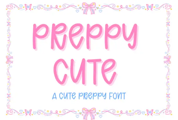
Tall rounded playful capitals
Preppy Cute is a tall rounded capital hand in candy pink with a soft glow: fat even strokes, open counters and a light bounce, framed by a drawn border of bows, hearts and tiny flowers.
Ideas for this font
Same independent foundry
Allow optional Google Analytics to measure visits and catalogue actions. Your search words and notes are not included. Privacy & storage