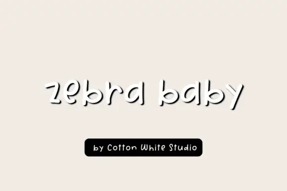
High-Contrast Display Serif

Lavender Magic + Svara
Pairs sculptural editorial warmth with Lavender Magic's clean modern geometry.
Inspect Svara specimenDisclosure: MakerFileHub may earn a commission from qualifying purchases via paid links on this page. How our links work.
Heavy irregular rounded sans
Lavender Magic is a heavy sans in charcoal on a pale lilac ground: mixed case with broad bowls, slightly uneven strokes, a short curved g descender and soft terminals, set in two lines with a lavender sprig above and a plain credit beneath.
Paid link
Get this fontProject & layout blueprintsAt-a-glance maker compatibility
Sturdy stroke walls and open counters weed cleanly on adhesive vinyl, HTV apparel film, and cut cardstock.
Visual anatomy & craft review
The plate is quiet apart from the weight of the type: two words stacked, a sprig of lavender floating above and a small credit below. The drawing is a heavy sans with deliberately uneven strokes and soft terminals, so the face reads as friendly rather than as a corporate grotesque, and the short curved g is the detail that gives it a hand-made quality. That construction sets a moderate size floor, because the broad bowls close first. The lilac ground and the sprig are staging that name the register, and the credit beneath is product copy. Because the letters are heavy and warm, the face suits a label, a card and a sign for a small business, and it is comfortable at a moderate size rather than only at display scale.
Sans serif, heavy, rounded, friendly
Two-font hierarchy recipes
Tested contrast partners — pairing Lavender Magic with grounded secondary typography.
Lavender Magic + Svara
Pairs sculptural editorial warmth with Lavender Magic's clean modern geometry.
Inspect Svara specimen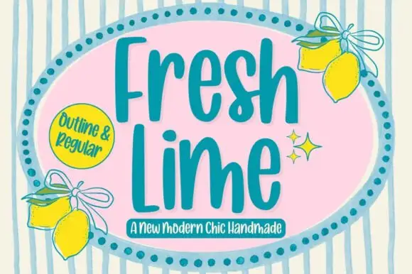
Lavender Magic + Fresh Lime
Introduces organic movement on pull-quotes, signatures and gift tags.
Inspect Fresh Lime specimenPractical applications
Concrete hierarchy, scale and production guidance tailored to Lavender Magic’s stroke geometry.
A heavy rounded sans reads as handmade, and the broad bowls hold a long brand name on a small die. It reads as handmade stock.
Hierarchy & layout recipe
Print a 55 by 80 mm label: the brand at 13 pt, the scent at 8 pt, and the weight at 7 pt. Keep 5 mm inside the die and keep the smallest counter above 1.2 mm.
Pre-production check
Check the 13 pt brand on a small die, where a bowl can close; keep it open. Confirm the 7 pt weight reads at arm's length and that the label survives a damp shelf.
A warm heavy face sets a friendly card, and the two colours print cleanly at home without a third pass. It reads as friendly rather than corporate.
Hierarchy & layout recipe
A6 card: the greeting at 24 pt, the details in a 9.5 pt sans, and the date at 8.5 pt. Keep 15 mm margins and print two colours on a cream card. Print on a cream card so the lilac does not cool the paper.
Pre-production check
Check the 24 pt greeting at home-print resolution, where a bowl can fill; keep the counters open. Confirm the 9.5 pt details keep a 4.5:1 contrast and that the card folds flat.
A heavy rounded face signals making rather than theory, and the even weight reads at a corridor distance. It signals handwork.
Hierarchy & layout recipe
A3 poster: the workshop at 70 mm cap height, the times in a 20 mm sans, and the room at 12 mm. Keep 25 mm margins and print two colours on a light stock.
Pre-production check
Check the A3 at three metres, where a heavy bowl can look blobby; keep the counters open. Confirm the 12 mm room reads at two metres and that the poster sits at eye height.
Technical & licence verification
Confirm included OTF/TTF/WOFF formats, full glyph tables and licence coverage on the live store page before batch production.
Closest visual alternatives
Matched across letterform anatomy, stroke behaviour and craft applications.

Very heavy condensed capitals with squared stems and narrow oval counters
Edition shows white capital lettering spanning most of a dark portrait cover: thick vertical strokes and broad flat arms build a rectangular title, the O keeps rounded outer sides around a small vertically elongated counter and the I stands as a plain bar.

Heavy soft capitals with compact counters and slightly uneven edges
District Supply shows mustard uppercase words across a pale concrete-like field. Broad nearly even strokes form compact round counters, the T arms run flat, the Y angles sharply, and small irregularities soften the outer edges of a dense rectangular heading.
Ideas for this font
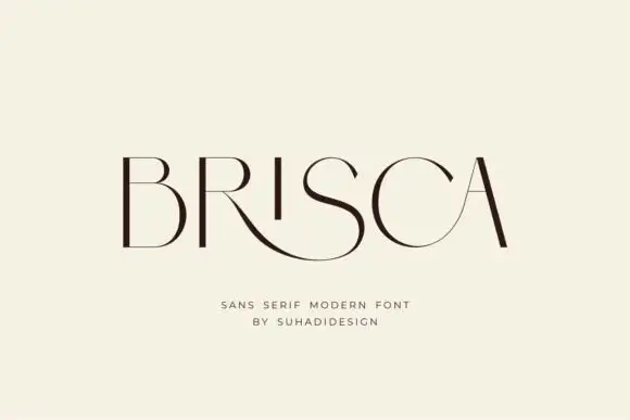
Thin contrasting capitals with a low sweeping R leg and rounded C
Brisca draws very thin extended capitals with an almost hairline weight, then lets the S break out into a long curving tail that runs under the letters beside it.
Ideas for this font
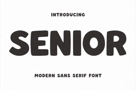
Fat rounded sans with tight spacing
Senior is a fat rounded sans in tight black caps on an off-white ground: nearly uniform stroke weight, closed counters, letterspacing pulled in until the forms almost touch, and a grainy fill that reads as a printed rubber stamp.
Ideas for this font
Same independent foundry
Allow optional Google Analytics to measure visits and catalogue actions. Your search words and notes are not included. Privacy & storage