Editorial Serif Anchor

Youth Brain + Stanza
Anchors Youth Brain's fluid strokes with crisp Roman proportions on wedding suites, headers and packaging.
Inspect Stanza specimenDisclosure: MakerFileHub may earn a commission from qualifying purchases via paid links on this page. How our links work.
Heavy groovy mixed-case lettering
Youth Brain is a heavy groovy hand-lettering in butter yellow over a photograph: fat rounded letters with a marked bounce, drawn flowers in blue and pink at either side, and a mixed case that wanders between heights.
Paid link
Get this fontProject & layout blueprintsAt-a-glance maker compatibility
Weld or Unite overlapping script joins into one continuous vector path before sending to the blade.
Visual anatomy & craft review
Youth sits above BRAIN, and the pair mixes cases deliberately: the first word is written in a fat rounded lowercase with tall loops on the Y and the h, while the second is set in heavy capitals that are just as soft, and the two rows bounce between three heights so the block reads as a hand-painted poster. The strokes are wide with rounded ends, the counters are small and the letterforms swell at the joins, which is what gives the pair its seventies feel. Two drawn flowers, one blue and one pink, sit at the left and right edges, and two tracked captions name the mood and the style. The ground is a photograph of people sitting on a tiled floor, so the yellow lettering has to hold against a busy image, and it does so by being the only warm colour on the card.
A groovy hand in butter yellow
Two-font hierarchy recipes
Tested contrast partners — pairing Youth Brain with grounded secondary typography.
Youth Brain + Stanza
Anchors Youth Brain's fluid strokes with crisp Roman proportions on wedding suites, headers and packaging.
Inspect Stanza specimen
Youth Brain + Monure
Keeps small-scale dates, URLs, nutrition facts and care instructions crisp and legible below script titles.
Inspect Monure specimenPractical applications
Concrete hierarchy, scale and production guidance tailored to Youth Brain’s stroke geometry.
A groovy hand in a single warm colour reads across a room, and the bounce gives a plain board the look of a painted poster.
Hierarchy & layout recipe
Print a 500 by 350 mm board: set the greeting at 90 pt across two rows, keep 24 mm of clear ground beneath before the times at 20 pt, and hold 22 mm of border on all four sides.
Pre-production check
A butter yellow can look washed out on a pale board; print one at the final size and check the contrast before the set.
The lettering matches the stock a vintage shop sells, and a bright sticker on a paper bag travels further than any printed flyer.
Hierarchy & layout recipe
Print a 90 mm round sticker: set the shop name at 22 pt across two rows, keep 6 mm of clear ground between the letters and the rim, and leave 8 mm beneath for the street at 5.5 pt.
Pre-production check
Small counters fill in on a small die; print one on the real vinyl and check the a and the e before the roll.
A groovy hand signals a feature about a scene rather than an institution, and the heavy weight holds against a photograph on an opener.
Hierarchy & layout recipe
Print a 230 by 300 mm opener: set the title at 70 pt across two rows, keep 22 mm of clear ground beneath before the standfirst at 10.5 pt, and hold 20 mm of margin on both sides.
Pre-production check
Warm yellow on newsprint can look dirty; print one opener on the actual stock and judge the colour before the issue.
Technical & licence verification
Confirm included OTF/TTF/WOFF formats, full glyph tables and licence coverage on the live store page before batch production.
Closest visual alternatives
Matched across letterform anatomy, stroke behaviour and craft applications.
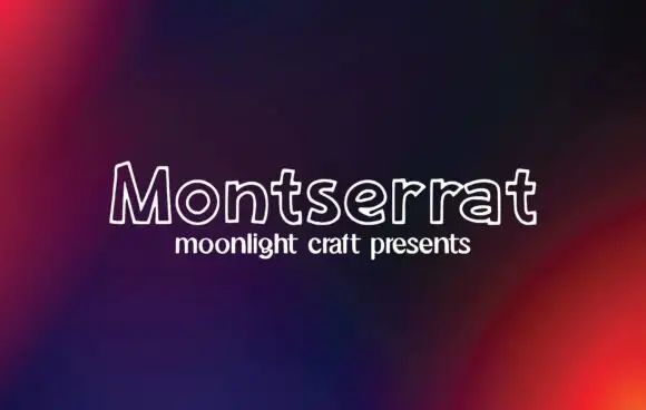
Outline handwritten sans
Montserrat is an outline handwritten sans in white on a dark gradient: unfilled letters drawn with a single rounded line, a small x-height and wide open counters that let the background read through the word.
Ideas for this font
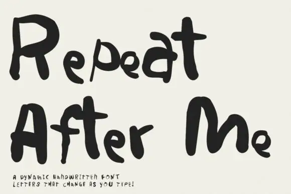
Irregular hand-lettered display
Repeat After Me is a dynamic handwritten display in black on cream: very irregular hand-drawn letters with different strokes for each character, uneven heights and a wobble that changes across a word, sold as a set whose letters vary as they are typed.
Ideas for this font
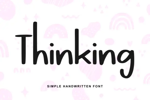
Heavy irregular mixed-case print
Thinking is a heavy hand-drawn print in near-black on pale pink: tall narrow letters, a very tall T with a wide arm, and a light irregular rhythm, over a scatter of drawn pastel doodles.
Ideas for this font
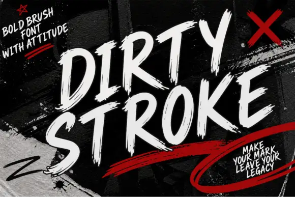
Ragged slanted brush capitals with dry ends and a strong forward lean
Dirty Stroke is ragged brush capitals in which every stroke ends in a dry split tip, the lean is strong and the fit is tight so two words read as one painted block.
Ideas for this font
Same independent foundry
Allow optional Google Analytics to measure visits and catalogue actions. Your search words and notes are not included. Privacy & storage