Editorial Serif Anchor

Dirty Stroke + The Simple Editorial
Anchors Dirty Stroke's fluid strokes with crisp Roman proportions on wedding suites, headers and packaging.
Inspect The Simple Editorial specimenDisclosure: MakerFileHub may earn a commission from qualifying purchases via paid links on this page. How our links work.
Ragged slanted brush capitals with dry ends and a strong forward lean
Dirty Stroke is ragged brush capitals in which every stroke ends in a dry split tip, the lean is strong and the fit is tight so two words read as one painted block.
Paid link
Get this fontProject & layout blueprintsAt-a-glance maker compatibility
Fine grain and micro-texture excel in 300 DPI print, sublimation, and screen print rather than small vinyl weeding.
Visual anatomy & craft review
The D is drawn as a heavy vertical with a blunt bowl, and every stroke in the phrase finishes in a split, frayed end rather than a clean cut, which is what gives the lettering its used, street-painted quality. The lean is constant at roughly fifteen degrees, the letters are packed close enough that the two stacked words almost touch, and the weight stays heavy across both lines. Several strokes carry internal gaps where the brush ran dry, and those gaps are as much part of the texture as the letters themselves. Counters are narrow and the outlines are uneven. The dark ground, the red accents and the small corner captions are presentation; the lettering is the two words.
Ragged · Slanted · Brushed
Two-font hierarchy recipes
Tested contrast partners — pairing Dirty Stroke with grounded secondary typography.
Dirty Stroke + The Simple Editorial
Anchors Dirty Stroke's fluid strokes with crisp Roman proportions on wedding suites, headers and packaging.
Inspect The Simple Editorial specimen
Dirty Stroke + Nyxar
Keeps small-scale dates, URLs, nutrition facts and care instructions crisp and legible below script titles.
Inspect Nyxar specimenPractical applications
Concrete hierarchy, scale and production guidance tailored to Dirty Stroke’s stroke geometry.
The ragged brush reads as painted on a shutter and carries the street register a skate shop wants, while the heavy weight survives being cut in vinyl.
Hierarchy & layout recipe
Set the shop name at 140 mm on the shutter, keep the opening hours in a condensed bold at 30 mm, and hold 40 mm of clearance so the dry ends are not cut by the frame.
Pre-production check
Vinyl loses the dry split tips; check a cut at full size and keep the longest tip 3 mm thick or accept a simplified edge.
The ragged brush suits a garment print, and the tight fit lets two words fill a chest without needing a second line or an illustration.
Hierarchy & layout recipe
Set the first word at 80 mm across a 260 mm chest width, set the second at 60 mm directly beneath with 8 mm of gap, and keep 20 mm from the collar seam.
Pre-production check
A dry tip under 1 mm disappears in screen print; check a pull on the actual shirt and thicken the smallest tips before the run.
The heavy ragged lettering carries the seasonal tone without illustration, and the strong lean gives a poster energy at a distance.
Hierarchy & layout recipe
Set the header at 110 pt on an A3 poster, set the date and venue in a plain 20 pt sans beneath, and hold 35 mm below the drips so the details stay clear.
Pre-production check
Home printers lose the frayed ends; check a print at final size and keep the smallest gap open by at least 1 mm.
Technical & licence verification
Confirm included OTF/TTF/WOFF formats, full glyph tables and licence coverage on the live store page before batch production.
Closest visual alternatives
Matched across letterform anatomy, stroke behaviour and craft applications.
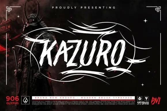
Sharp slanted brush capitals with cut terminals and a wide flourish frame
Kazuro is a sharp slanted brush alphabet in capitals, with strokes that end in hard cut angles and a flourish frame of thin sweeping lines drawn around the word.
Ideas for this font
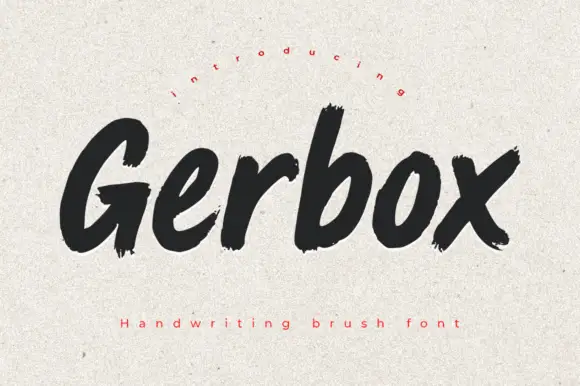
Heavy rough brush print with dry edges and uneven stroke ends
Gerbox is a heavy brush print in which letters stand separately, strokes end in dry ragged tips and the weight varies with the speed of the brush, so a word reads as painted rather than typeset.
Ideas for this font
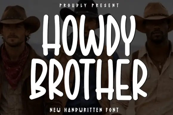
Tall condensed rounded capitals, all caps
Howdy Brother is an all-caps handwriting drawn tall and narrow with thick even strokes and rounded corners, so two stacked words fill a square frame without losing the space between them.
Ideas for this font
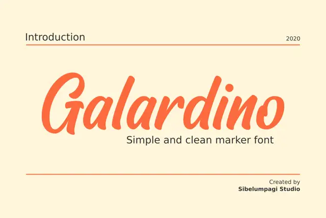
Broad slanted marker with a clean geometry
Galardino is a broad slanted marker alphabet with even strokes, short rounded terminals and a clean, unfussy rhythm that sits close to a slanted grotesque.
Same independent foundry
Allow optional Google Analytics to measure visits and catalogue actions. Your search words and notes are not included. Privacy & storage