Neutral Sans Workhorse

Wildflower School + Miniplate
Lets Wildflower School own the focal silhouette while handling secondary copy, sizing and subheads cleanly.
Inspect Miniplate specimenDisclosure: MakerFileHub may earn a commission from qualifying purchases via paid links on this page. How our links work.
Playful rounded letters with flower and heart forms
Wildflower School is a cheerful hand-drawn display in which the round letters become shapes: the o of flower is a flower head, both o's of school are hearts, and the pastel caps sit inside a white sticker outline.
Paid link
Get this fontProject & layout blueprintsAt-a-glance maker compatibility
Fine grain and micro-texture excel in 300 DPI print, sublimation, and screen print rather than small vinyl weeding.
Visual anatomy & craft review
Wild and flower run on one line, flower beginning in a fat pink script-like italic that sits heavily against the upright gold Wild, and school follows beneath in solid green capitals. The substitutions are the point: the o in flower is drawn as a five-petal bloom, both o's in school are hearts, and the i and the dots on the counters carry small hearts and flowers of their own. Every letter has a thick white cut-out and a soft shadow, a small drawing of a schoolhouse sits above the words, and a two-line caption at the foot names the style and the designer. The face is a children's display for school and party material: it needs a large size for the flower shapes to read as letters, and it should be used for short phrases where the substitutions fall on the right letters.
A playful display with flowers for letters
Two-font hierarchy recipes
Tested contrast partners — pairing Wildflower School with grounded secondary typography.
Wildflower School + Miniplate
Lets Wildflower School own the focal silhouette while handling secondary copy, sizing and subheads cleanly.
Inspect Miniplate specimen
Wildflower School + Askinо
Grounds bold display lettering with classic typographic authority on posters, badges and apparel.
Inspect Askinо specimenPractical applications
Concrete hierarchy, scale and production guidance tailored to Wildflower School’s stroke geometry.
The flower and heart letters say instantly that the room belongs to young children, and the thick shapes hold at door-sign distance.
Hierarchy & layout recipe
Print a 300 by 200 mm sign: set the room name at 60 pt across two rows, keep 18 mm of clear ground beneath before the teacher name at 14 pt, and hold 16 mm of border on all sides.
Pre-production check
The substituted letters can be misread as decoration; print one sign and check a child recognises the word before the set.
The pastel palette and the drawn schoolhouse do the work of an illustration, and a fair card does not need a second element.
Hierarchy & layout recipe
Print a 105 by 148 mm card: set the fair name at 30 pt across two rows, keep 14 mm of clear ground beneath before the date at 9 pt, and hold 12 mm of margin at the card edge.
Pre-production check
Pastel colours print darker than they look on screen; print one card on the actual machine and check the palette before the batch.
A cheerful label makes a child want to keep the book tidy, and the thick letters survive a felt-tip name written beneath.
Hierarchy & layout recipe
Print a 60 by 40 mm label: set the subject at 12 pt on one row, keep 4 mm of clear ground beneath before the name line at 3 mm tall, and hold 3 mm from the outline to the label edge.
Pre-production check
Small labels lose the flower shapes; print one sheet at the real size and check the o before the run.
Technical & licence verification
Confirm included OTF/TTF/WOFF formats, full glyph tables and licence coverage on the live store page before batch production.
Closest visual alternatives
Matched across letterform anatomy, stroke behaviour and craft applications.

Very heavy rounded mixed-case lettering with a soft sticker outline
Cute Simple is very heavy rounded mixed-case lettering in which the bowls press against the stems and a thick soft outline wraps the whole lockup, so a word reads as one cut sticker rather than as separate letters.
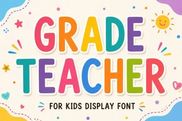
Tall rounded classroom capitals with simple counters and per-letter colour
Grade Teacher is a tall rounded capital alphabet with simple counters, drawn so a heading reads as classroom lettering that a teacher could have cut out of coloured card.
Ideas for this font
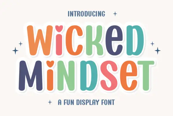
Playful multicolour caps with heart counters
Wicked Mindset is a playful rounded caps display in multicolour with a white contour and offset shadow: fat letters with soft corners, hearts cut into three counters, a bounce across both lines, and four-point sparkles at the sides of a plain cream ground.
Ideas for this font
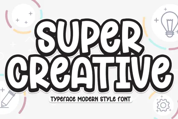
Super chunky playful caps
Super Creative is a super chunky display in near-black with a white inline and a heavy offset outline: fat caps with soft corners, a bounce across both lines, and a caption on a tape strip beneath, on a pale ground with line-drawn lightbulbs, pencils and gears.
Ideas for this font
Same independent foundry
Allow optional Google Analytics to measure visits and catalogue actions. Your search words and notes are not included. Privacy & storage



