Neutral Sans Workhorse

Cute Simple + Bareum
Lets Cute Simple own the focal silhouette while handling secondary copy, sizing and subheads cleanly.
Inspect Bareum specimenDisclosure: MakerFileHub may earn a commission from qualifying purchases via paid links on this page. How our links work.
Very heavy rounded mixed-case lettering with a soft sticker outline
Cute Simple is very heavy rounded mixed-case lettering in which the bowls press against the stems and a thick soft outline wraps the whole lockup, so a word reads as one cut sticker rather than as separate letters.
Paid link
Get this fontProject & layout blueprintsAt-a-glance maker compatibility
Sturdy stroke walls and open counters weed cleanly on adhesive vinyl, HTV apparel film, and cut cardstock.
Visual anatomy & craft review
The C closes a wide crescent, the u holds a deep bowl, the t crosses with a fat bar and the S reverses through two plump curves, all at a maximal even weight with fully rounded ends. The counters are tiny, which is what gives the face its sticker proportion rather than the look of a rounded sans, and the outline surrounds the whole word rather than each letter, so the lockup reads as a single cut shape. That is the practical detail: a designer can print the outline as a die line for a vinyl cut. Below 20 pt the counters close and the face turns into a blob. The pastel ground, the smiling shapes, the stars and the small caption are presentation; the lettering is the two words.
Heavy · Rounded · Sticker
Two-font hierarchy recipes
Tested contrast partners — pairing Cute Simple with grounded secondary typography.
Cute Simple + Bareum
Lets Cute Simple own the focal silhouette while handling secondary copy, sizing and subheads cleanly.
Inspect Bareum specimen
Cute Simple + Glofi
Grounds bold display lettering with classic typographic authority on posters, badges and apparel.
Inspect Glofi specimenPractical applications
Concrete hierarchy, scale and production guidance tailored to Cute Simple’s stroke geometry.
The whole-lockup outline can be cut as one sticker, and the heavy weight reads at 14 pt on a small die where a lighter face would lose its shape.
Hierarchy & layout recipe
Print a 55 mm round sticker: set the phrase at 14 pt with the outline at 2 mm, keep 5 mm inside the die so the outline has a clean margin, and check that the counters of the e and a still open at that size.
Pre-production check
Counters under 1 mm close on a digital press; check the printed sticker and raise the size rather than the weight.
The heavy rounded shapes cut cleanly in card and read against frosting, and the single outline gives the topper a finished edge at 45 mm.
Hierarchy & layout recipe
Cut a 140 mm wide topper: set the word at 45 mm tall, keep 6 mm of material around the outline, and leave a 20 mm stem at the centre so the topper stands in the cake without a support.
Pre-production check
A cut outline under 3 mm tears at the corner; check the vector at full size and widen the outline rather than the letters.
The sticker weight reads from the back of a classroom at 60 mm, and the rounded forms keep the heading friendly rather than institutional.
Hierarchy & layout recipe
Print a 900 by 500 mm board: set the heading at 60 mm across the upper half, set the class list in a 14 mm sans beneath, and leave 25 mm of border so the outline sits clear of the board frame.
Pre-production check
A thick outline printed at 60 mm looks like a halo on a plain board; check the proof and use the outline only where the heading sits over colour.
Technical & licence verification
Confirm included OTF/TTF/WOFF formats, full glyph tables and licence coverage on the live store page before batch production.
Closest visual alternatives
Matched across letterform anatomy, stroke behaviour and craft applications.
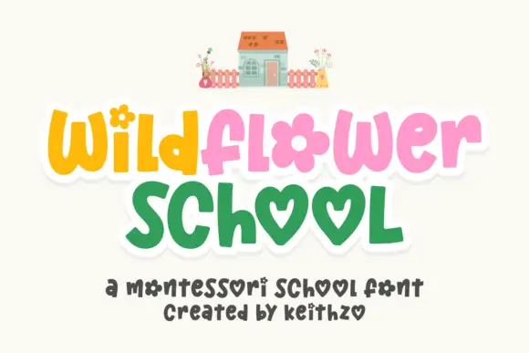
Playful rounded letters with flower and heart forms
Wildflower School is a cheerful hand-drawn display in which the round letters become shapes: the o of flower is a flower head, both o's of school are hearts, and the pastel caps sit inside a white sticker outline.
Ideas for this font
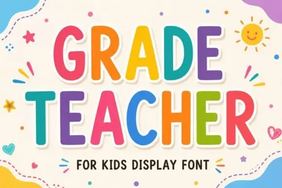
Tall rounded classroom capitals with simple counters and per-letter colour
Grade Teacher is a tall rounded capital alphabet with simple counters, drawn so a heading reads as classroom lettering that a teacher could have cut out of coloured card.
Ideas for this font
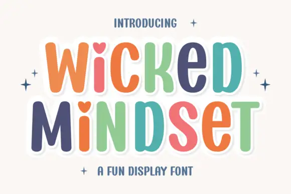
Playful multicolour caps with heart counters
Wicked Mindset is a playful rounded caps display in multicolour with a white contour and offset shadow: fat letters with soft corners, hearts cut into three counters, a bounce across both lines, and four-point sparkles at the sides of a plain cream ground.
Ideas for this font
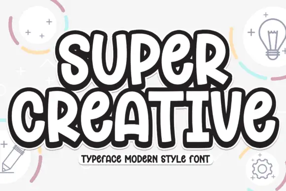
Super chunky playful caps
Super Creative is a super chunky display in near-black with a white inline and a heavy offset outline: fat caps with soft corners, a bounce across both lines, and a caption on a tape strip beneath, on a pale ground with line-drawn lightbulbs, pencils and gears.
Ideas for this font
Same independent foundry
Allow optional Google Analytics to measure visits and catalogue actions. Your search words and notes are not included. Privacy & storage



