Editorial Serif Anchor

Murisa Agneli + Things
Anchors Murisa Agneli's fluid strokes with crisp Roman proportions on wedding suites, headers and packaging.
Inspect Things specimenDisclosure: MakerFileHub may earn a commission from qualifying purchases via paid links on this page. How our links work.
Decorative ornamented capitals
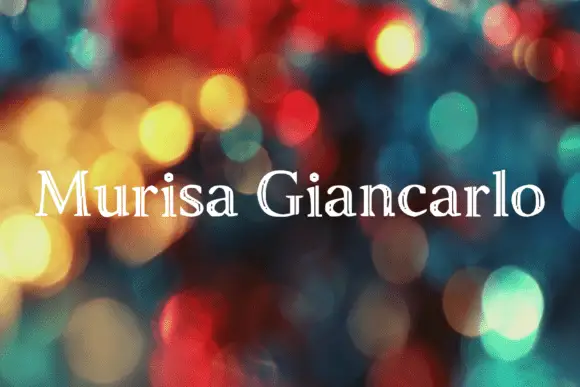
Murisa Agneli is a set of decorative serif capitals in white on a bokeh ground: high-contrast strokes, curled serifs, and small drawn ornaments set inside the counters of several letters.
Paid link
Get this fontProject & layout blueprintsAt-a-glance maker compatibility
Weld or Unite overlapping script joins into one continuous vector path before sending to the blade.
Visual anatomy & craft review
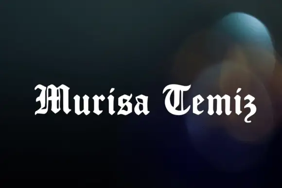
Murisa sits beside Agneli on one line, and the lettering is a decorative serif rather than a script: the M carries a curved outer leg, the r and the i are joined by a swash, the A is drawn with a high crossbar and the g and the l carry curled terminals. The decoration is internal: small drawn flourishes and a crown sit inside the counters of the M, the A and the i, so the mark reads as a monogram rather than a word. The ground is a soft bokeh of green and teal lights, and there is no caption at all, which lets the ornament carry the card. The face is an ornamental display for brand marks, packaging and certificates: the internal ornaments need a large size to be seen, and the face works best as a short name or a pair of words rather than a sentence.
A serif with drawn ornaments inside
Two-font hierarchy recipes
Tested contrast partners — pairing Murisa Agneli with grounded secondary typography.
Murisa Agneli + Things
Anchors Murisa Agneli's fluid strokes with crisp Roman proportions on wedding suites, headers and packaging.
Inspect Things specimen
Murisa Agneli + Taught
Keeps small-scale dates, URLs, nutrition facts and care instructions crisp and legible below script titles.
Inspect Taught specimenPractical applications
Concrete hierarchy, scale and production guidance tailored to Murisa Agneli’s stroke geometry.
Ornaments inside the letters give a couple's names the look of an engraved monogram, which is the most formal thing a card can carry without a crest.
Hierarchy & layout recipe
Print a 130 by 180 mm invitation: set the names at 30 pt on one row, keep 20 mm of clear ground beneath before the venue at 9 pt, and hold 16 mm of margin on all sides.
Pre-production check
The internal ornaments close up below about twenty-four points; print one invitation at the finished size and check the counters before the suite.
An ornamented serif reads as an established house rather than a new brand, and a small label inherits that history from one purchase.
Hierarchy & layout recipe
Print a 55 by 40 mm label: set the house name at 14 pt on one row, keep 5 mm of clear ground beneath before the city at 4.5 pt, and hold 4 mm of margin on all sides.
Pre-production check
Fine ornaments fill in on a coated label; print one on the real stock and check the crown before the order.
The face already looks engraved, which is exactly the material a jeweller sells, and one ink on a heavy card is all the mark needs.
Hierarchy & layout recipe
Print an 85 by 55 mm card: set the name at 18 pt on one row, keep 6 mm of clear ground beneath before the contact block at 6.5 pt, and hold 5 mm of margin on all sides.
Pre-production check
High-contrast hairlines break on textured card stock; print one card on the intended board and check a serif before the order.
Technical & licence verification
Confirm included OTF/TTF/WOFF formats, full glyph tables and licence coverage on the live store page before batch production.
Closest visual alternatives
Matched across letterform anatomy, stroke behaviour and craft applications.
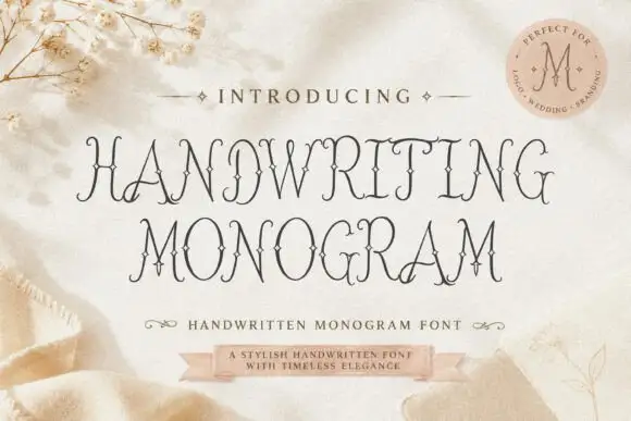
Fine ornamental monogram capitals with hairline flourishes
Handwriting Monogram is a fine ornamental alphabet in capitals only, built from hairline stems and small flourishes, with letters designed to interlock when two or three of them are set together.
Ideas for this font
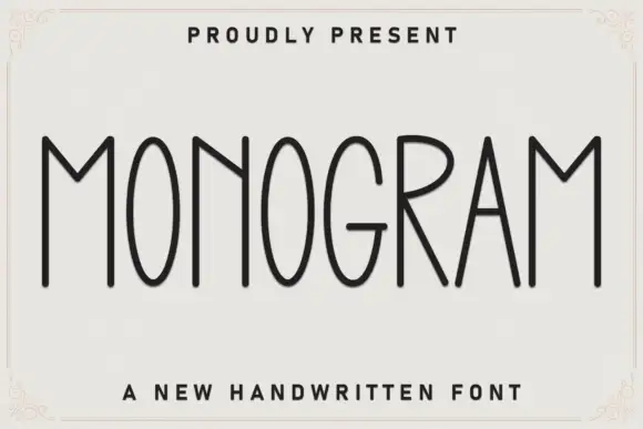
Very tall thin capital face
Monogram is a very tall thin capital face in charcoal on off-white: narrow letters with oval bowls, a deep pointed M, fine even strokes and slightly varied heights, set as one word inside a drawn corner frame with a tracked line above and a plain caption beneath.
Ideas for this font
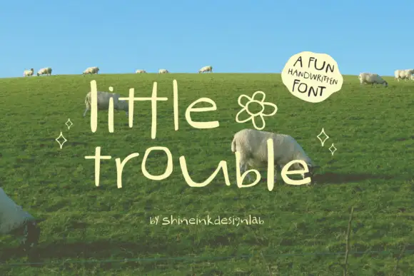
Thin quirky handwriting
Little Trouble is a thin handwritten face in cream over a green hillside: tall narrow lowercase letters with uneven heights, an open e and a hooked t, a drifting baseline, and a small drawn flower between the words, with a curved note in a soft shape at the upper right.
Ideas for this font
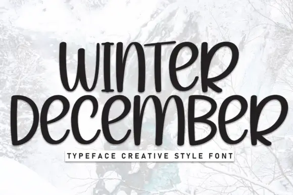
Tall rounded winter lettering
Winter December is a tall rounded hand-lettering in near-black on a pale winter photograph: narrow letters, small counters and a slight warm wobble, with a letter-spaced caption in a boxed strip below.
Ideas for this font
Same independent foundry
Allow optional Google Analytics to measure visits and catalogue actions. Your search words and notes are not included. Privacy & storage