Editorial Serif Anchor

Warm Bakery + Svara
Anchors Warm Bakery's fluid strokes with crisp Roman proportions on wedding suites, headers and packaging.
Inspect Svara specimenDisclosure: MakerFileHub may earn a commission from qualifying purchases via paid links on this page. How our links work.
Tall thin quirky handwriting display
Warm Bakery is a tall thin handwriting display in warm brown on a flour-dusted surface: narrow letters with uneven heights, a curled uppercase W, round lowercase bowls and generous spacing, so the pair reads as pen lettering written slowly on a bakery order pad.
Paid link
Get this fontProject & layout blueprintsAt-a-glance maker compatibility
Weld or Unite overlapping script joins into one continuous vector path before sending to the blade.
Visual anatomy & craft review
The two words are stacked and the drawing is handwriting rather than a script: the letters do not connect, the stroke is even and thin, and the shapes are simplified, with a W drawn as a single curled line and an e that closes into a small loop. The heights drift from letter to letter and the spacing opens and closes, which gives the pair its handmade rhythm, and the thin stroke means the face needs a large size and a clean ground. The specimen supplies both: a photograph of flour, wheat, eggs and a rolling pin, with the type placed in the empty centre where nothing competes. Because the letters are narrow and light, the phrase holds together at poster size and reads as a label rather than as a headline, which is exactly what a small bakery would want on a chalkboard.
Quirky, thin, tall, handmade
Two-font hierarchy recipes
Tested contrast partners — pairing Warm Bakery with grounded secondary typography.
Warm Bakery + Svara
Anchors Warm Bakery's fluid strokes with crisp Roman proportions on wedding suites, headers and packaging.
Inspect Svara specimen
Warm Bakery + Modern Heritage
Keeps small-scale dates, URLs, nutrition facts and care instructions crisp and legible below script titles.
Inspect Modern Heritage specimenPractical applications
Concrete hierarchy, scale and production guidance tailored to Warm Bakery’s stroke geometry.
A thin handwriting display looks like a hand-written chalkboard, and the even stroke survives being traced onto a board where a heavy display would have to be re-drawn at every change.
Hierarchy & layout recipe
A2 board: the daily bread at 90 mm cap height, the prices in a 22 mm casual sans, and a 6 mm rule. Keep the letters at least 8 mm apart so the thin strokes read from the counter, and use a chalk marker rather than a liquid pen.
Pre-production check
Check the board at three metres, where a thin stroke can vanish on a mid-tone board; use white rather than brown. Confirm the 22 mm prices read from the queue and that the letter heights stay even across the row.
A thin handmade face gives a cookbook cover the look of a recipe card, and the open spacing keeps a long title readable without a heavier weight that would fight the photography.
Hierarchy & layout recipe
Set the title at 80 mm cap height across 200 mm, the subtitle in a 10 pt roman, and the author in 9 pt caps. Keep the title in the upper third and let a single photograph of bread occupy the lower half.
Pre-production check
Check the title at thumbnail size, where the thin stroke can disappear against a light photograph; give it a solid ground or heavy print. Confirm the 9 pt author survives lamination and that the title holds on a white background online.
A handwriting display reads as a daily menu written by hand, which is the tone a small bakery wants, and the thin letters keep the sheet from looking like a printed chain board.
Hierarchy & layout recipe
A4 sheet: the items at 8 mm cap height, the prices aligned right at the same size, and the date at 12 mm. Keep 15 mm margins and print one ink on a kraft sheet that clips into a wooden frame.
Pre-production check
Check the 8 mm items on kraft, where a thin stroke can break; keep the ink dark and the size above 6 mm. Confirm the prices align on a common right edge and that the sheet reads under counter lighting.
Technical & licence verification
Confirm included OTF/TTF/WOFF formats, full glyph tables and licence coverage on the live store page before batch production.
Closest visual alternatives
Matched across letterform anatomy, stroke behaviour and craft applications.
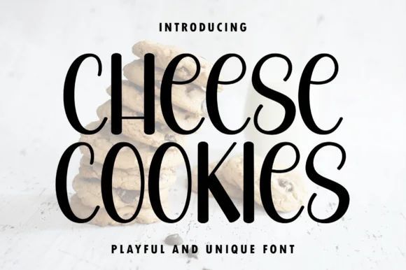
Tall quirky curled-terminal bakery & farmhouse display sans
Cheese Cookies is actually a tall, playful handwritten display sans with curled 'S/K' terminals—NOT a formal wedding script despite mismatched seller copy!
Ideas for this font
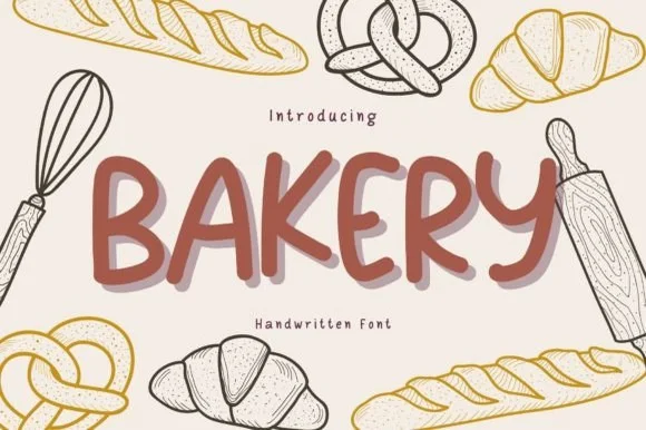
Playful chunky rounded marker all-caps display
Bakery (by Brown Cupple Fonts) is a plump, cheerful rounded marker print font (disconnected, NOT cursive!) built for cozy hand-drawn packaging & signs.
Ideas for this font
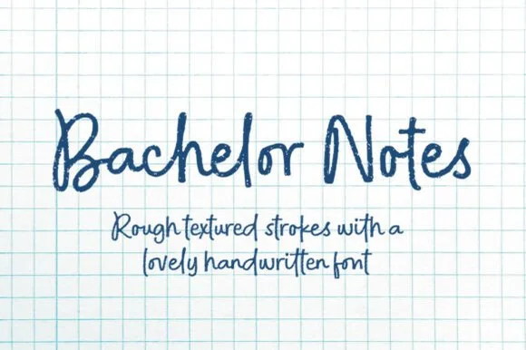
Rough felt-pen notebook & graph-paper handwritten font
Bachelor Notes is an organic, lightly-textured felt-pen handwriting font capturing real ballpoint/marker lecture notes on quad graph paper!
Ideas for this font
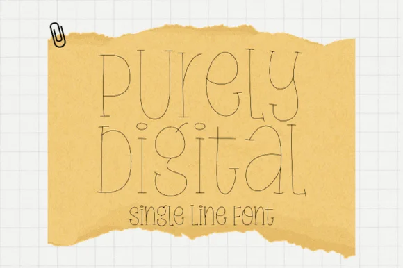
Single-line hairline display with doubled strokes
Purely Digital is a single-line display in ink on tan torn paper: letters drawn as a hairline contour with a second line inside them, very tall and narrow, with open counters and no fill anywhere.
Ideas for this font
Allow optional Google Analytics to measure visits and catalogue actions. Your search words and notes are not included. Privacy & storage