High-Contrast Display Serif

Locked Whisper + Lumera Editorial
Pairs sculptural editorial warmth with Locked Whisper's clean modern geometry.
Inspect Lumera Editorial specimenDisclosure: MakerFileHub may earn a commission from qualifying purchases via paid links on this page. How our links work.
Ornate serif capitals with a whiskered script
Locked Whisper is a duo on speckled cream: ornate display capitals with thin strokes, curled serifs and long whiskers, and a fine script beneath whose letters carry the same curls at a smaller scale.
Paid link
Get this fontProject & layout blueprintsAt-a-glance maker compatibility
Sturdy stroke walls and open counters weed cleanly on adhesive vinyl, HTV apparel film, and cut cardstock.
Visual anatomy & craft review
The pair works because both halves share a drawn quality: LOCKED and WHISPER are set in capitals with hairline stems, flared serifs and whiskers that trail from the R and the K, so a plain word looks like a Victorian engraved plate, while the script beneath is a light connected hand with the same curly terminals used at caption size. A third line in a small script explains the pair, which shows how the two cuts behave at their intended sizes rather than only at display. The ground is a flecked cream paper with a small circular monogram at the foot. Locked Whisper is a duo for editorial, wedding stationery and packaging with a period feel, and it needs a large size for the whiskers and a generous measure for the script.
A display serif paired with a fine script
Two-font hierarchy recipes
Tested contrast partners — pairing Locked Whisper with grounded secondary typography.
Locked Whisper + Lumera Editorial
Pairs sculptural editorial warmth with Locked Whisper's clean modern geometry.
Inspect Lumera Editorial specimen
Locked Whisper + Easy Handwriting
Introduces organic movement on pull-quotes, signatures and gift tags.
Inspect Easy Handwriting specimenPractical applications
Concrete hierarchy, scale and production guidance tailored to Locked Whisper’s stroke geometry.
An ornate capital over a fine script gives a cover a hierarchy that suits a period novel, and the whiskers supply the ornament without an illustration.
Hierarchy & layout recipe
Print a 130 by 198 mm cover: set the title at 48 pt in the capitals, set the author line at 12 pt in the script with 18 mm of clear ground, and hold 14 mm of margin on all four sides.
Pre-production check
Hairline whiskers break on uncoated cover stock; print one cover on the real paper and check the thinnest stroke before the run.
A display serif gives an invitation the look of an engraved card, and the fine script carries the details without adding a third face.
Hierarchy & layout recipe
Print a 130 by 180 mm invitation: set the family name at 30 pt in the capitals, set the names at 22 pt in the script with 16 mm of clear ground, and hold 18 mm of margin on all four sides.
Pre-production check
Whiskered capitals need air; print one invitation at the finished size and check the margins before the suite.
The pair suits a bottle with a heritage story, and the capitals carry the product while the script carries the age on one narrow label.
Hierarchy & layout recipe
Print a 55 by 90 mm label: set the product at 14 pt in the capitals, set the age at 8 pt in the script with 5 mm of clear ground, and hold 4 mm of margin on all four sides.
Pre-production check
A whisker can run past a narrow die; print one on the real stock and check both ends before the order.
Technical & licence verification
Confirm included OTF/TTF/WOFF formats, full glyph tables and licence coverage on the live store page before batch production.
Closest visual alternatives
Matched across letterform anatomy, stroke behaviour and craft applications.
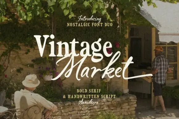
Bold serif paired with a hand-brushed script
Vintage Market is a nostalgic duo in cream over a market photograph: a bold serif for the first word and a hand-brushed script with long tails for the second, sold together as a pair with a small credit line beneath.
Ideas for this font
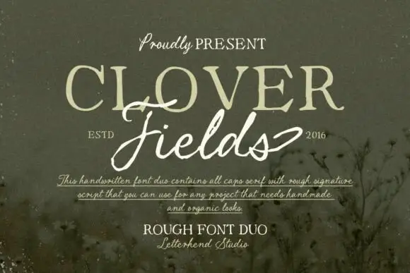
Rough caps serif paired with a ragged signature script
Clover Fields is a duo pairing a rough all-caps serif with a ragged signature script, so one block carries the noun in uneven capitals and the other carries it in a loose, broken hand.
Ideas for this font
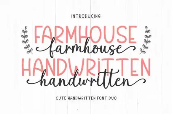
Irregular narrow hand-drawn capitals paired with a looped lowercase script
Farmhouse Handwritten is a two-cut pair in which narrow capitals lean unevenly with rounded A and R bowls, while a looped lowercase script sends a deep f and high h and d loops that curl away at both ends of the word.
Ideas for this font
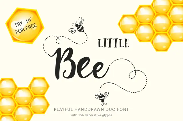
Serif label capitals paired with a rounded connected script
Little Bee Duo pairs a compact serif in wide capitals with a rounded connected script, so a jar label can carry a printed heading and a friendly written line in the same ink.
Ideas for this font
Same independent foundry
Allow optional Google Analytics to measure visits and catalogue actions. Your search words and notes are not included. Privacy & storage



