High-Contrast Display Serif

Farmhouse Handwritten + Askinо
Pairs sculptural editorial warmth with Farmhouse Handwritten's clean modern geometry.
Inspect Askinо specimenDisclosure: MakerFileHub may earn a commission from qualifying purchases via paid links on this page. How our links work.
Irregular narrow hand-drawn capitals paired with a looped lowercase script
Farmhouse Handwritten is a two-cut pair in which narrow capitals lean unevenly with rounded A and R bowls, while a looped lowercase script sends a deep f and high h and d loops that curl away at both ends of the word.
Paid link
Get this fontProject & layout blueprintsAt-a-glance maker compatibility
Fine grain and micro-texture excel in 300 DPI print, sublimation, and screen print rather than small vinyl weeding.
Visual anatomy & craft review
The capital cut keeps its stems close and its widths uneven, with the A arching over a narrow counter and the R closing a soft bowl; the script cut descends a deep f below the baseline, lifts h and d into tall loops and finishes both outer strokes in curls that leave the word. The pairing is the character: a hand-drawn cap row over a looped script gives a quote two registers, which is why the sample layers them. Because the loops extend, a stacked layout needs 18 mm between rows from 28 pt, and the script welds before cutting from 1.1 inches of x-height. The pale ground, the sprigs and the small caption are presentation; the two lettered rows are the duo.
Farmhouse · Hand-drawn · Paired
Two-font hierarchy recipes
Tested contrast partners — pairing Farmhouse Handwritten with grounded secondary typography.
Farmhouse Handwritten + Askinо
Pairs sculptural editorial warmth with Farmhouse Handwritten's clean modern geometry.
Inspect Askinо specimen
Farmhouse Handwritten + Hailey
Introduces organic movement on pull-quotes, signatures and gift tags.
Inspect Hailey specimenPractical applications
Concrete hierarchy, scale and production guidance tailored to Farmhouse Handwritten’s stroke geometry.
The narrow caps carry a plain line while the script carries warmth, and the pair holds at 50 mm on a printed board above a counter in one ink.
Hierarchy & layout recipe
Print a 500 by 250 mm board: set the caps at 50 mm across the top, set the script at 44 mm beneath with 24 mm of clear ground between the rows, and keep 30 mm of border all round.
Pre-production check
A script loop printed into the capital row tangles with the descenders; check the board at final size and open the gap by 6 mm.
The duo makes a two-line note without a second family, and the script stays readable at 26 pt on an A5 folded card in one ink.
Hierarchy & layout recipe
Print an A5 folded card: set the caps at 30 pt at the head, set the script at 26 pt beneath with 16 mm of clear card between them, and leave the lower half blank for a written line.
Pre-production check
A fold scored through a script loop cracks the ink; check the imposed card and keep 10 mm between the score and any stroke.
The hand-drawn caps suit a jam label, and the even strokes keep a fruit name clear at 20 pt on a 50 mm round sticker on a glass jar.
Hierarchy & layout recipe
Print a 50 mm round sticker: set the fruit at 20 pt in the caps, set the month at 18 pt in the script beneath, and keep 6 mm inside the die so the exit curl stays whole.
Pre-production check
A curl printed across a round edge distorts on the sticker; check the wrap and keep the script on the flat centre.
Technical & licence verification
Confirm included OTF/TTF/WOFF formats, full glyph tables and licence coverage on the live store page before batch production.
Closest visual alternatives
Matched across letterform anatomy, stroke behaviour and craft applications.
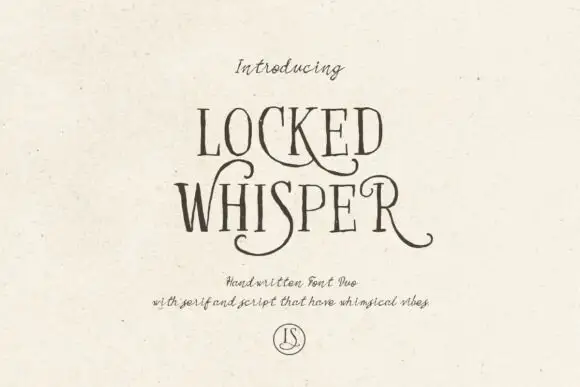
Ornate serif capitals with a whiskered script
Locked Whisper is a duo on speckled cream: ornate display capitals with thin strokes, curled serifs and long whiskers, and a fine script beneath whose letters carry the same curls at a smaller scale.
Ideas for this font
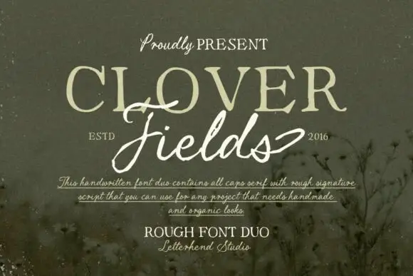
Rough caps serif paired with a ragged signature script
Clover Fields is a duo pairing a rough all-caps serif with a ragged signature script, so one block carries the noun in uneven capitals and the other carries it in a loose, broken hand.
Ideas for this font
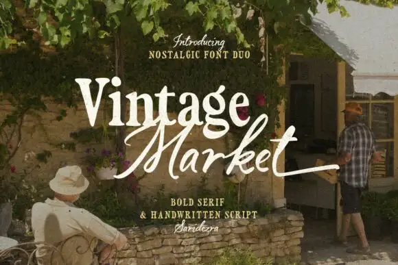
Bold serif paired with a hand-brushed script
Vintage Market is a nostalgic duo in cream over a market photograph: a bold serif for the first word and a hand-brushed script with long tails for the second, sold together as a pair with a small credit line beneath.
Ideas for this font
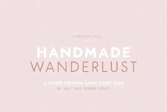
Spaced sans capitals shown in thick white and thin muted-pink lines
Handmade Wanderlust Duo shows two centred uppercase words on a soft pink background, where Handmade is white and noticeably heavier while Wanderlust beneath is thin, muted pink and more widely spaced, with slightly uneven edges and broad A and M diagonals.
Ideas for this font
Same independent foundry
Allow optional Google Analytics to measure visits and catalogue actions. Your search words and notes are not included. Privacy & storage