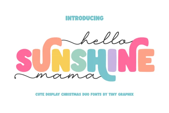
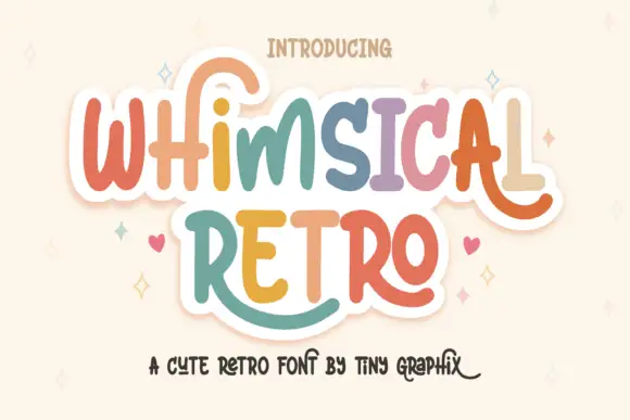
Modern Grotesque Body

Vesper Varsity + Inkora
Creates crisp high-hierarchy contrast beneath Vesper Varsity headlines across menus, websites and labels.
Inspect Inkora specimenDisclosure: MakerFileHub may earn a commission from qualifying purchases via paid links on this page. How our links work.
Layered varsity display
Vesper Varsity is a display varsity in black with a white inline and a grey outer shadow on white: heavy caps with block serifs, a high waist and closed counters, set on two lines with a small tracked note above and a smaller line beneath.
Paid link
Get this fontProject & layout blueprintsAt-a-glance maker compatibility
Sturdy stroke walls and open counters weed cleanly on adhesive vinyl, HTV apparel film, and cut cardstock.
Visual anatomy & craft review
The two words are stacked and the drawing is a college slab: the serifs are blocks, the strokes are heavy, and the counters are narrow, which keeps the letters readable at a distance. The inline and the outer contour make the face a layered system rather than a single cut, and the specimen shows all three layers aligned — the inline sits inside, the shadow steps out — which is the registration a buyer has to hold across a set. Because the letters are heavy and the layers separate them, the face works on apparel and at sign scale, and the plate keeps the ground white so the layering reads. The small tracked notes above and beneath name the style and the foundry.
Varsity, layered, slab, athletic
Two-font hierarchy recipes
Tested contrast partners — pairing Vesper Varsity with grounded secondary typography.
Vesper Varsity + Inkora
Creates crisp high-hierarchy contrast beneath Vesper Varsity headlines across menus, websites and labels.
Inspect Inkora specimen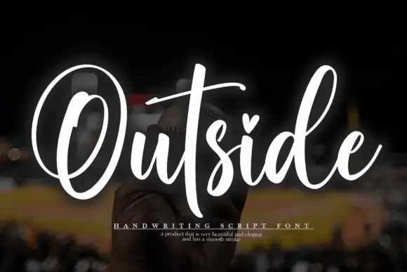
Vesper Varsity + Outside
Adds a warm human signature touch for 1-to-3-word callouts without competing against structured serif capitals.
Inspect Outside specimenPractical applications
Concrete hierarchy, scale and production guidance tailored to Vesper Varsity’s stroke geometry.
A layered varsity face reads as a stitched banner, and the separate inline and shadow let a school produce the same mark in one colour or three.
Hierarchy & layout recipe
Print 1,400 by 500 mm: the team at 170 mm cap height with a 6 mm inline and a 10 mm shadow, the year at 90 mm, and a 34 mm line between rules. Keep 30 mm margins.
Pre-production check
Check the banner at eight metres, where the inline can vanish; keep it above 8 mm at that scale. Confirm the 34 mm line reads at four metres and that the three layers stay registered.
A layered varsity mark prints as two or three screens and reads as official kit, which is what a club wants on a sponsored shirt.
Hierarchy & layout recipe
Print a 260 mm chest graphic: the club at 55 mm cap height, a 3 mm inline, and two inks on a light shirt. Keep the thinnest serif at 4 mm and place the graphic 80 mm below the collar.
Pre-production check
Check the screen at actual mesh, where a 3 mm inline fills; widen it. Wash-test one shirt and confirm the shadow layer stays aligned after five cycles.
A varsity face marks an occasion as a class year, and the layered version lets a family print a single shirt with the school colours.
Hierarchy & layout recipe
Print a 240 mm chest graphic: the class year at 70 mm, the name at 30 mm, and two inks on a light shirt. Keep the inline only above 50 mm and place the graphic 80 mm below the collar.
Pre-production check
Check the 30 mm name, where a narrow counter can close in the screen; keep it above 28 mm. Confirm the year reads at three metres and that the shirt survives a full wash cycle.
Technical & licence verification
Confirm included OTF/TTF/WOFF formats, full glyph tables and licence coverage on the live store page before batch production.
Closest visual alternatives
Matched across letterform anatomy, stroke behaviour and craft applications.
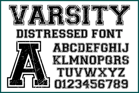
Varsity slab with double outline and wear
Varsity Distressed is a varsity slab in black on white: heavy capitals with flat serifs, a double outline that follows the silhouette, and a worn texture across the fill, shown with a full alphabet and a digit set.

Collegiate slab with inline border
Varsity Legacy is a collegiate slab in black with a thin light inline border on a pale wood ground: wide caps with heavy slab serifs, a low waist and closed counters, edged by a light contour that follows every stroke, with tracked lines above and below.
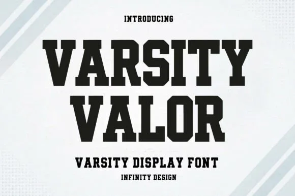
Solid varsity slab with flat serifs
Varsity Valor is a varsity display face in solid black on a pale ground: heavy capitals with thick flat serifs, flat apexes and a tight fit, with a small hatched pattern behind the words and tracked capital lines above and below.
Ideas for this font
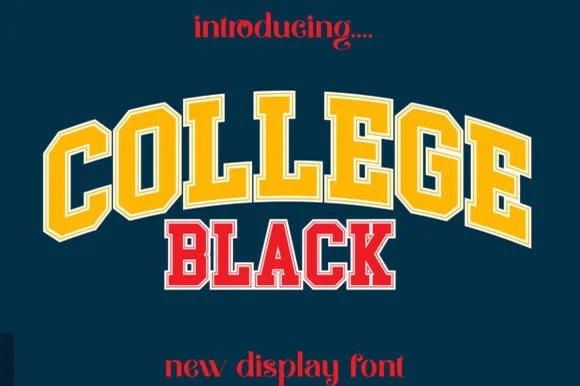
Double-outlined varsity jersey display
College Black pairs heavy collegiate slab capitals with a built-in athletic border framing, where wide stable letterforms and generous counter openings keep arched headlines crisp on jerseys, pennants and party backdrops.
Ideas for this font
Same independent foundry
Allow optional Google Analytics to measure visits and catalogue actions. Your search words and notes are not included. Privacy & storage