Editorial Serif Anchor

Valdre + Augler
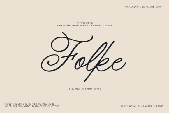
Anchors Valdre's fluid strokes with crisp Roman proportions on wedding suites, headers and packaging.
Inspect Augler specimenDisclosure: MakerFileHub may earn a commission from qualifying purchases via paid links on this page. How our links work.
Chunky organic serif with tactile details
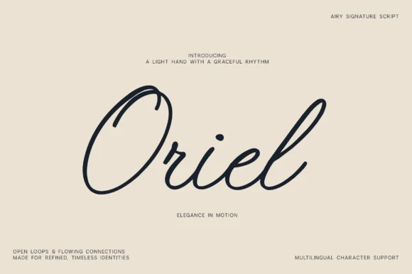
Valdre is an organic display serif in near-black on cream: chunky stems, soft irregular serifs and a handmade wobble, drawn as a lowercase word with wide spacing.
Paid link
Get this fontProject & layout blueprintsAt-a-glance maker compatibility
Weld or Unite overlapping script joins into one continuous vector path before sending to the blade.
Visual anatomy & craft review
Valdre appears as a single lowercase word across the middle of the card, and every letter is soft rather than sharp: the stems swell slightly in the middle, the serifs are rounded blobs rather than cut wedges, the bowl of the a is slightly squared and the r finishes with a short curved arm. The letterforms are wide and generously spaced, so the word reads as a considered mark rather than as a set word, and the irregularities are consistent enough to look drawn by one hand. The ground is plain cream, and five small captions in a plain sans are distributed around the edges, one of them naming the style. The face is an organic serif for warm identities, packaging and labels: it needs size for the soft serifs to read, it works in one ink, and it is deliberately not a text face.
A soft organic serif with drawn irregularities
Two-font hierarchy recipes
Tested contrast partners — pairing Valdre with grounded secondary typography.
Valdre + Augler
Anchors Valdre's fluid strokes with crisp Roman proportions on wedding suites, headers and packaging.
Inspect Augler specimen
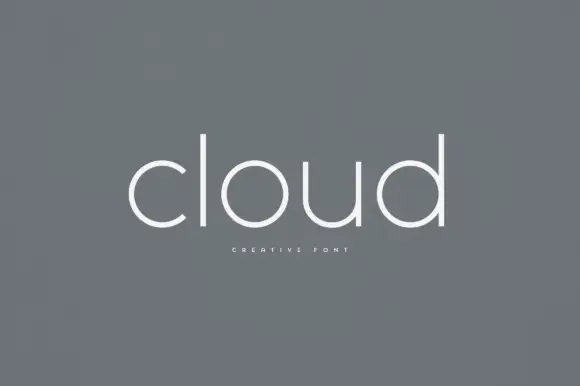
Valdre + Bielchon
Keeps small-scale dates, URLs, nutrition facts and care instructions crisp and legible below script titles.
Inspect Bielchon specimenPractical applications
Concrete hierarchy, scale and production guidance tailored to Valdre’s stroke geometry.
The organic serif sets a warm, made tone that suits a rural venue, and one ink on timber or card keeps the whole suite affordable.
Hierarchy & layout recipe
Print a 500 by 350 mm board: set the greeting at 90 pt on one row, keep 24 mm of clear ground beneath before the names at 22 pt, and hold 22 mm of border on all sides.
Pre-production check
Soft serifs blur when a board is printed at low resolution; print one at the final size and check the r before the set.
A soft organic serif reads as a small producer rather than a laboratory, and the wide spacing gives a short product name presence on a small label.
Hierarchy & layout recipe
Print a 50 by 70 mm label: set the product at 15 pt on one row, keep 6 mm of clear ground beneath before the volume at 4.5 pt, and hold 4 mm from the lowest serif to the die line.
Pre-production check
Rounded serifs can merge on a small label; print one at the real size and check the a before the order.
An organic serif gives a design feature a subject-appropriate heading, and the wide spacing holds a short word across a column without a rule.
Hierarchy & layout recipe
Print a 230 by 300 mm opener: set the heading at 64 pt on one row, keep 20 mm of clear ground beneath before the standfirst at 10.5 pt, and hold 18 mm of margin on both sides.
Pre-production check
A soft serif on newsprint can look woolly; print one opener on the actual stock and check the stems before the issue.
Technical & licence verification
Confirm included OTF/TTF/WOFF formats, full glyph tables and licence coverage on the live store page before batch production.
Closest visual alternatives
Matched across letterform anatomy, stroke behaviour and craft applications.
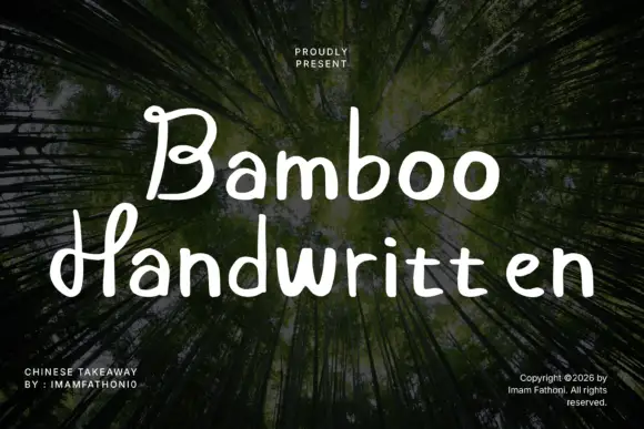
Rounded separate letters with curled capitals and a level baseline
Bamboo is rounded handwritten lettering in which the letters stand separately, the capitals curl at their ends and the baseline holds level across a phrase.
Ideas for this font
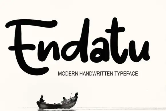
Heavy rounded connected lettering with tall stems and a wide E
Endatu is heavy rounded connected lettering whose capital E opens into a wide three-bar form while the lowercase stays tall, tight and joined, so a word reads as a dense soft block.
Ideas for this font
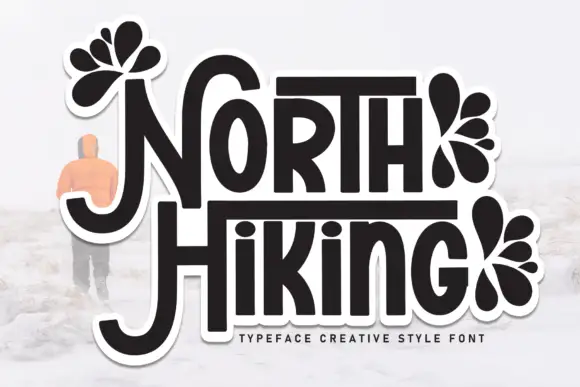
Display
North Hiking is a bold display face drawn as a sticker: rounded capitals with a heavy dark fill and a thick white contour, decorated with black leaf and petal fans, with a soft drop shadow behind the whole word.
Ideas for this font
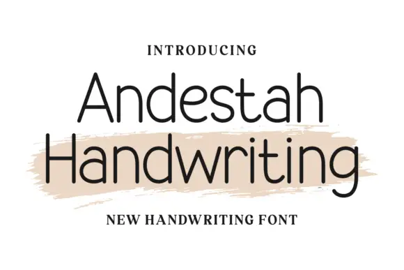
Fine open separate handwriting with even strokes and a narrow skeleton
Andestah Handwriting is fine open handwriting in which the letters stand apart, the stroke stays light and even and the skeleton is narrow, so a word reads as something written neatly with a fineliner.
Ideas for this font
Same independent foundry
Allow optional Google Analytics to measure visits and catalogue actions. Your search words and notes are not included. Privacy & storage