Editorial Serif Anchor

Andestah Handwriting + The Avenue Editorial
Anchors Andestah Handwriting's fluid strokes with crisp Roman proportions on wedding suites, headers and packaging.
Inspect The Avenue Editorial specimenDisclosure: MakerFileHub may earn a commission from qualifying purchases via paid links on this page. How our links work.
Fine open separate handwriting with even strokes and a narrow skeleton
Andestah Handwriting is fine open handwriting in which the letters stand apart, the stroke stays light and even and the skeleton is narrow, so a word reads as something written neatly with a fineliner.
Paid link
Get this fontProject & layout blueprintsAt-a-glance maker compatibility
Weld or Unite overlapping script joins into one continuous vector path before sending to the blade.
Visual anatomy & craft review
The A carries a low bar and a rounded apex, the n keeps a tall shoulder, the d rises into a plain stem, the e closes a small loop and the s reverses through two tight curves, all at one even light weight with rounded ends and no connection anywhere. The narrow skeleton is the character: at 20 pt the face reads almost like a fine sans, which makes it usable for captions and long labels rather than only for headings. Because nothing touches, the letters stay distinct at small sizes, and the light weight keeps a card from looking heavy. The white ground, the beige brush swatch behind, the black ink and the two caps lines are presentation; the handwriting is the two words.
Fine · Open · Separate
Two-font hierarchy recipes
Tested contrast partners — pairing Andestah Handwriting with grounded secondary typography.
Andestah Handwriting + The Avenue Editorial
Anchors Andestah Handwriting's fluid strokes with crisp Roman proportions on wedding suites, headers and packaging.
Inspect The Avenue Editorial specimen
Andestah Handwriting + Homies
Keeps small-scale dates, URLs, nutrition facts and care instructions crisp and legible below script titles.
Inspect Homies specimenPractical applications
Concrete hierarchy, scale and production guidance tailored to Andestah Handwriting’s stroke geometry.
The fine open hand reads at 10 pt on a slim label and keeps a long product name on one line where a connected script would clot.
Hierarchy & layout recipe
Print a 40 by 80 mm label: set the product at 10 pt, set the scent in a 5 pt caps sans beneath, and keep 4 mm of margin so the tall ascenders clear the die on both sides of the slim label.
Pre-production check
A light stroke under 0.2 mm thins on a kraft label; check a printed label on the actual stock and choose a lighter paper if the line greys out.
The narrow open hand keeps captions personal at 9 pt, and the separate letters stay legible across a long run of small print beneath photographs.
Hierarchy & layout recipe
Print an A4 catalogue page: set the captions at 9 pt across a 55 mm measure, set the item numbers in the same weight at 7 pt, and keep 4 mm between the caption and the image edge so the light strokes do not merge into the photograph.
Pre-production check
A handwritten caption over long runs loses consistency; check the typeset page and confirm the letters still read as a set rather than a jumble.
The fine hand keeps a printed thank-you from looking like a receipt, and the open skeleton stays readable at 12 pt on a small insert.
Hierarchy & layout recipe
Print an 85 by 55 mm insert: set the message at 12 pt across the upper half, set the order reference in a 5 pt sans along the foot, and keep 7 mm of margin so the descenders stay on the card.
Pre-production check
A light hand on a small card can look faint under a postal label; check the printed insert and darken the ink rather than the weight.
Technical & licence verification
Confirm included OTF/TTF/WOFF formats, full glyph tables and licence coverage on the live store page before batch production.
Closest visual alternatives
Matched across letterform anatomy, stroke behaviour and craft applications.
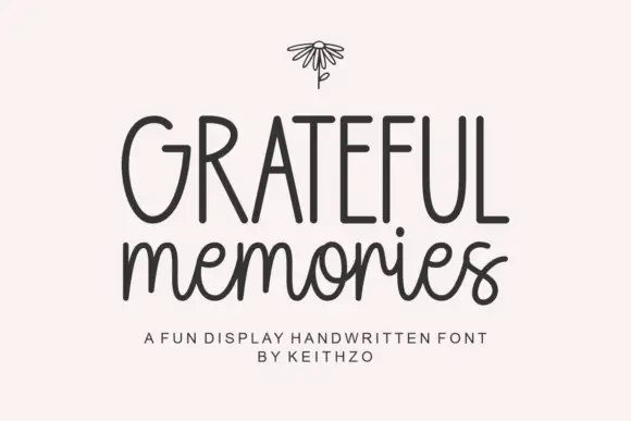
Tall handwritten capitals over a rounded script with a bouncing baseline
Grateful Memories is a handwritten display alphabet in which tall rounded capitals sit above a bouncy connected script, with even weights and fully rounded ends throughout.
Ideas for this font
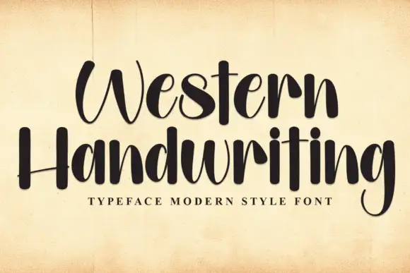
Tall brush handwriting
Western Handwriting is a tall handwritten display in near-black on aged paper: very tall ascenders, a thick-to-thin brush stroke, a bounce across both lines and blunt terminals, with a tracked line beneath naming the category.
Ideas for this font
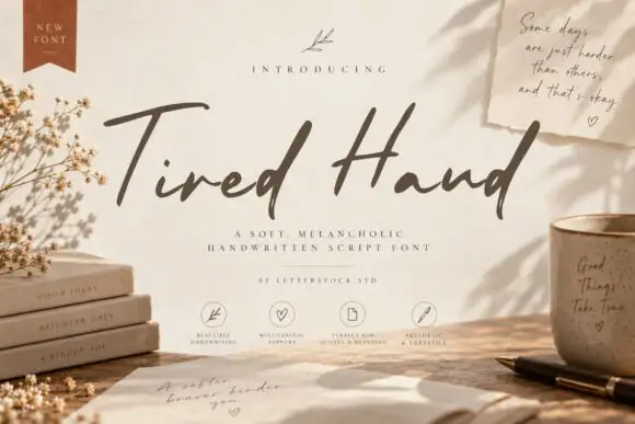
Soft slanted handwriting
Tired Hand is a handwritten script shown on a desk scene: a loose slanted hand with long capitals, uneven baseline movement, thin joins and a light weight, set as one line across the middle with a small presenting line above, a two-line descriptor beneath and four small feature notes along the foot, beside dried flowers, books, a mug and a fanned note in the same hand.
Ideas for this font
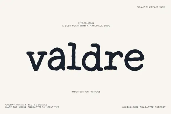
Chunky organic serif with tactile details
Valdre is an organic display serif in near-black on cream: chunky stems, soft irregular serifs and a handmade wobble, drawn as a lowercase word with wide spacing.
Ideas for this font
Same independent foundry
Allow optional Google Analytics to measure visits and catalogue actions. Your search words and notes are not included. Privacy & storage