Modern Grotesque Body

Underwood Typewriter + Sailors
Creates crisp high-hierarchy contrast beneath Underwood Typewriter headlines across menus, websites and labels.
Inspect Sailors specimenDisclosure: MakerFileHub may earn a commission from qualifying purchases via paid links on this page. How our links work.
Narrow typewriter face
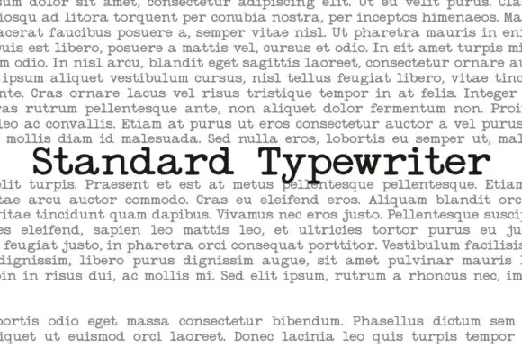
Underwood Typewriter is a narrow typewriter face in black on a page of typeset Latin: the face appears as one line set inside a justified block of grey body text, so it is judged against running copy rather than alone, and the letters are thin with uneven contours and slab feet.
Paid link
Get this fontProject & layout blueprintsAt-a-glance maker compatibility
Fine grain and micro-texture excel in 300 DPI print, sublimation, and screen print rather than small vinyl weeding.
Visual anatomy & craft review
This specimen does something rare and useful: it sets the face inside a paragraph of body text and lets the reader find it, which is the only honest way to sell a typewriter face, because the register depends on the surrounding texture rather than on a single word at display size. The drawing is a narrow serif with thin uneven contours and small slab feet, and the ink impression varies from letter to letter, which is what a real typewriter does. The grey paragraph around it is set in a neutral serif and used as a ground, and that contrast shows the face's darkness and rhythm. Because the strokes are thin and uneven, the face works at body and caption sizes, and the plate is honest about its intended use in a way a display specimen would not be.
Serif, typewriter, narrow, plain
Two-font hierarchy recipes
Tested contrast partners — pairing Underwood Typewriter with grounded secondary typography.
Underwood Typewriter + Sailors
Creates crisp high-hierarchy contrast beneath Underwood Typewriter headlines across menus, websites and labels.
Inspect Sailors specimen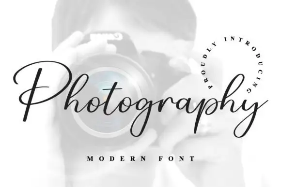
Underwood Typewriter + Photography Font
Adds a warm human signature touch for 1-to-3-word callouts without competing against structured serif capitals.
Inspect Photography Font specimenPractical applications
Concrete hierarchy, scale and production guidance tailored to Underwood Typewriter’s stroke geometry.
A typewriter face carries a memoir without a second display typeface, and the uneven ink gives the page a documentary texture.
Hierarchy & layout recipe
Set the text at 11 pt on a 120 mm measure with 1.45 leading, the chapter openers at 24 pt, and the captions at 8.5 pt. Print one ink on an uncoated cream stock.
Pre-production check
Check the 11 pt text in a printed proof, where a thin stroke can drop out; keep the contrast above 4.5:1. Confirm the 8.5 pt captions read and that the measure holds 65 characters.
A typewriter face gives a letterhead a typed register, and the narrow letters fit a long address on one line. A typed address reads as correspondence.
Hierarchy & layout recipe
A4 letterhead: the studio at 16 pt, the address at 8 pt, and the body at 10.5 pt. Keep 20 mm margins and print one ink on an uncoated stock. Keep the address on a single line at 8 pt.
Pre-production check
Check the 8 pt address on uncoated paper, where a thin contour can fill; keep the size above 9 pt. Confirm the letterhead prints cleanly in an office laser and that the body fits an A4 page.
A typed card reads as a note rather than as marketing, which suits a small press that wants to sound human. A note beats a brochure for a small press.
Hierarchy & layout recipe
A6 card: the greeting at 18 pt, the message at 10 pt, and the imprint at 8 pt. Keep 16 mm margins and print one ink on a cream card. Leave 18 mm at the foot for the imprint line.
Pre-production check
Check the 10 pt message on cream card, where a thin stroke can break; keep the size at 10 pt or above. Confirm the greeting reads at arm's length and that the card takes an envelope.
Technical & licence verification
Confirm included OTF/TTF/WOFF formats, full glyph tables and licence coverage on the live store page before batch production.
Closest visual alternatives
Matched across letterform anatomy, stroke behaviour and craft applications.
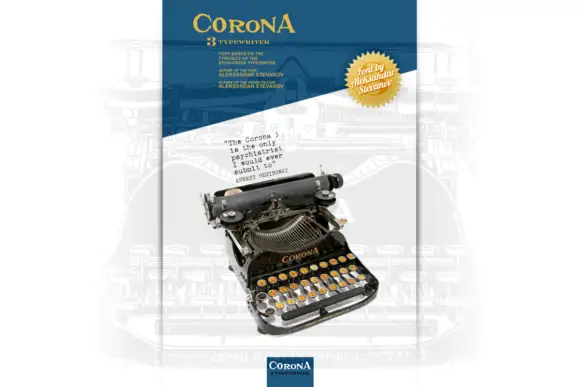
Small typewriter-style specimen presented beside a photographed machine
Corona 3 Typewriter is presented as a narrow poster dominated by a photographed machine: a small black typed sample rises above it, a yellow heading sits across the top and several tiny captions frame the illustration.
Ideas for this font
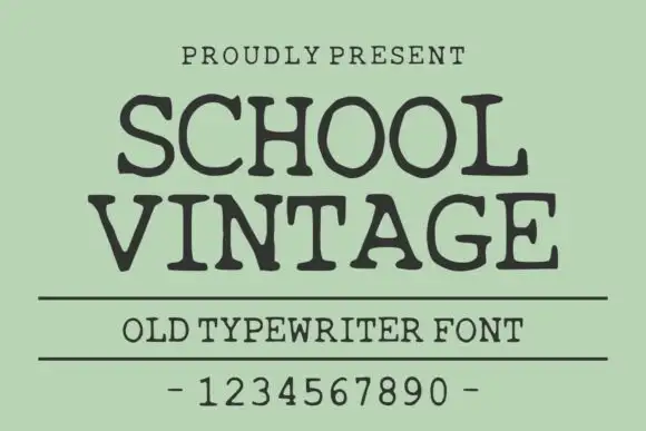
Old typewriter serif with a numeral row
School Vintage is an old typewriter serif in dark ink on sage green: slab serifs with slightly rounded feet, a moderate even stroke, wide spacing, shown with a ruled caption and a full numeral row.
Ideas for this font
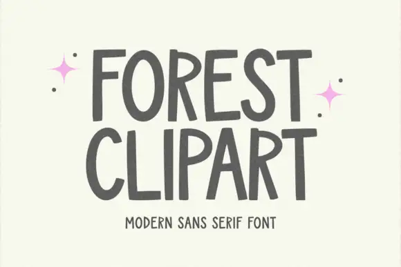
Tall hand-shaped capitals with uneven stroke edges and angled R legs
Forest Clipart draws tall hand-lettered capitals with a deliberately unsteady stroke, keeps the widths uneven, and sets two stacked words on a plain cream ground with small sparkles in the margins.
Ideas for this font
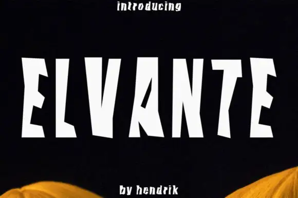
Tall irregular block capitals with wedge-shaped cuts
Elvante shows white uppercase letters with long straight sides and abrupt angled cuts, where the E has sloping arm ends, the V forms a narrow deep notch and the A uses a small triangular counter beside a long diagonal.
Ideas for this font
Same independent foundry
Allow optional Google Analytics to measure visits and catalogue actions. Your search words and notes are not included. Privacy & storage